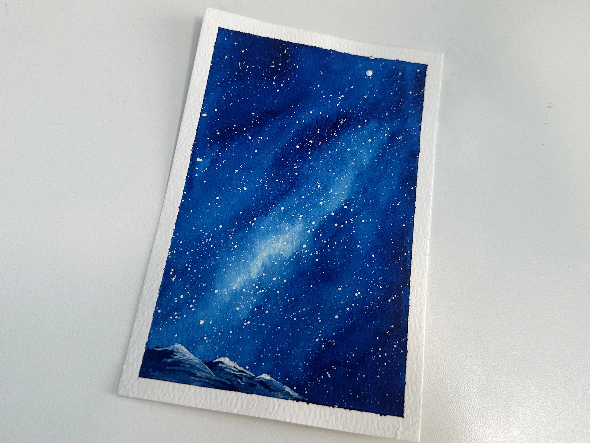
As part of my effort to light a fire under my butt to paint more often, I decided to participate in a 4-day galaxy skies painting challenge that I saw on SkillShare with artist Swathi Ganesha. Click here if you’d like to try a month of SkillShare for free.
Day 1: Monochrome
Day One was a monochrome painting, so just one color. I chose Phthalo Blue from Daniel Smith Watercolor and went to town making a basic diagonal edge to the Milky Way. There was something very freeing about doing all I could with just one color. Click here to watch a time lapse of this painting. A couple of tiny mountains at the bottom added some depth to this one.
I painted the stars using white gouache paint and a splatter method where I tap two brushes together. This is a method I used a lot when I was doing galaxy-dyed shoes and baby carriers a few years ago. I would use acrylic paint and it gave the most awesome and varied sizes of stars, but I had very little control over where they landed, and sometimes I’d end up with an odd-shaped glob of paint that wasn’t round. Also, paint ended up everywhere! Those reasons are why I originally used masking fluid and white pens to make stars for my watercolor paintings, but after using this splatter method again, and with gouache this time, I think it’s going to help me level-up on my galaxy stars.
I have an awesome set of gouache paints from Himi that my sister gave me for Christmas.
Day 2: Duo Chrome
Day Two was Duo Chrome, so two colors. I opted for Phthalo Blue again and added Quinacridone Rose. I haven’t been using very high quality paper for these; just a 4x6 pad that I got from Michael’s. Today the paper bowed down the middle when it was saturated and the paint was pooling along the bottom. I managed to dab the puddle with a tissue in an attempt to salvage it, but I almost tore it up and threw it away. Once I added stars, the painting redeemed itself.
I added a few happy trees and I was happy with how it ended up. Click here to watch the time lapse of this one.
Day 3: Three-Color Seascape
Day three; a three-color seascape, proved to be the most challenging. I have a palette of watercolor from Culture Hustle that I tried to use for all three colors. The lavender and turquoise just weren’t pigmented enough. So attempt one went into the trash. With attempt number two, I tried to use Phthalo Green straight for the aqua shade along the bottom, but it was way too green and I scrapped that one too.
For attempt number three, I premixed that aqua color using Phthalo Green and Cobalt Blue. Then I used Imperial Purple and the bright pink called Runaway from the Culture Hustle Watercolour Palette. I absolutely hated how the colors were coming together when they were wet. But once it dried and I added stars, it was worth saving. After adding some more definition in the ocean at the bottom, it avoided the recycling bin.
Day 4: Dreamy Landscape
Day four was fun because I could use pretty much anything I wanted. I chose to limit myself to only four colors: Indigo, Moonglow (that purple shade), Phthalo Green, and Cobalt Blue. These colors are more muted than the ones I used before, but I still love how they turned out. This time the paper was cooperative and I was happy with how the paint behaved. I tried to be more patient and waited longer after applying paint to see how it spread and I think it paid off.
I opted for a few more happy trees and I love how it turned out. Click here to watch the time lapse of this one being painted.
I had such a fun time with this challenge, maybe I’ll do it again next week but with all different colors. Maybe if I can paint enough of these little paintings, I can have them for sale.


