inserts

Allie & Danny's Baby Shower

Brandi was planning a coed baby shower for her sister-in-law and she asked me to create an invitation and some extras for the shindig. The theme was “a baby is brewing” and Brandi sent me a photo of the bedding set that Allie had purchased for their baby girl. I was able to use some of the same floral graphics for the invitation and I love how it turned out!

Baby Shower Invitation, Baby is Brewing, Alex Tebow Desgisn

Since Allie and Danny don’t live in the same state as where their baby shower took place, we made sure to mention it on the insert that listed their registry information.

Baby Shower Registry Insert Alex Tebow Desgisn

In addition to the invitation, I also made signs for a headband-making station and for a time capsule that guests made for their new baby.

Headband Making Sign Baby Shower Alex Tebow Designs
Baby Shower Time Capsule Sign Alex Tebow Designs

Best wishes to the new parents!!

Cecile & Francis

Cecile and I have been friends for just over 20 years. She grew up in southern France and we met when she stayed with my family through an exchange student program when we were teenagers. The following year, my brother and I saved our summer job money and spent a couple of weeks exploring France with her family hosting us. It happened to be the same summer that France was hosting the World Cup and while we didn't have the funds to attend any games, we got to watch from bars and public venues as France made their way through the quarter and semifinals and eventually won the World Cup. It was an amazing trip, and one I still have very fond memories of. 

Cecile went on to attend college in the United States and fell in love with Francis; an expat from Uganda. They settled in Minneapolis with their kids and this past summer, I was honored to work with both of them on the printed items for their long-awaited wedding. 

IMG_7348.jpg

Their wedding invitation paid homage to their backgrounds with a world map marking Uganda, France, and their home in Minnesota using their wedding colors in teal, navy blue, coral, and copper. I absolutely LOVE how this turned out.

IMG_0328_s.jpg
IMG_0327_s.jpg

They went with Panel Pockets from Cards and Pockets in Imperial Blue with matching envelopes. These are an awesome solution for wedding inserts if you don't want the pomp and circumstance of a traditional pocketfold. The 5x7 panel simply has a pocket on the back for any inserts.

IMG_0334_s.jpg

The two inserts included R.S.V.P. information along with maps and directions to each of the two venues.

IMG_0330_s.jpg

A fun detail that I have been doing more and more for clients is a custom return address stamp. I created what we later named their "family logo" and had it made into a 2" rubber stamp with Hello World Stamps.

Don't stress, the magic of Photoshop allowed me to change their home address.

Don't stress, the magic of Photoshop allowed me to change their home address.

Kelly with Hello World Stamps is amazing to work with and HIGHLY recommended. Cecile went so far as to emboss the stamps for all 200 envelopes that were mailed out. They look wonderful with the metallic copper finish!

My oldest son and I had the privilege of attending Cecile and Francis' wedding this past August. My son is eight and had never attended a Catholic wedding ceremony before. He was confused about why we kept standing up and sitting down, and why he couldn't use the rail for kneeling as a foot rest. But he made it through and had fun dancing with new friends he made at the reception, including Cecile's oldest son.

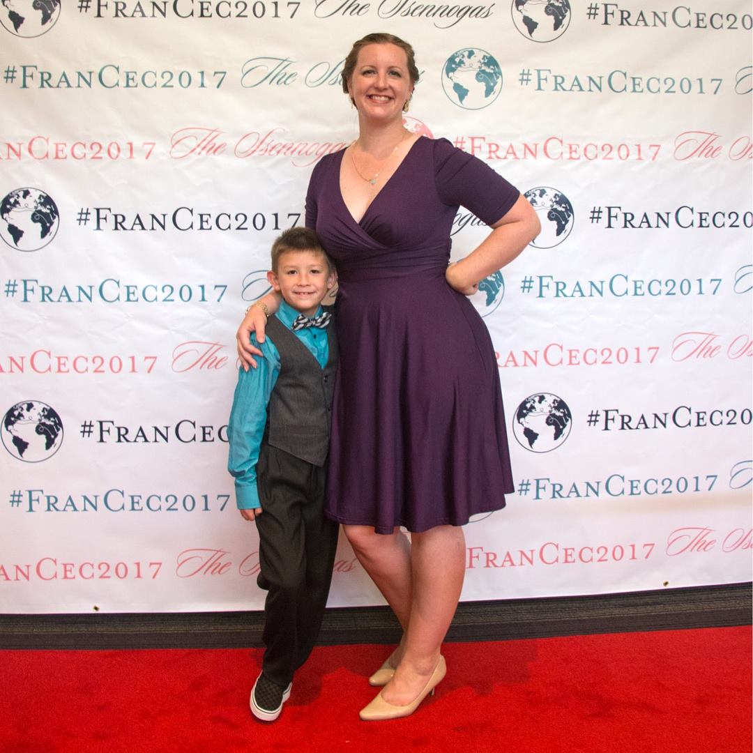
When guests arrived to the reception there was a red carpet and this step and repeat backdrop that Francis had printed with their "logo" and their wedding hashtag. It was so fun to take photos!

20690017_10155564539549725_3924888218482592816_o.jpg

Cecile sent me a few photos from their wedding photographer: 

For wedding favors, Cecile was originally planning to use traditional Ugandan kikoy fabric and sew it into small bags to hold Jordan almonds. But the fabric connection fell through. Then I suggested we create our own kikoy print and have fabric custom printed. She sent me a few photos of different kikoy stripes and I created one that used their wedding colors. Cecile ordered the fabric from SpoonFlower and it tuned out really beautiful! 

Studio220_2017_0484.jpg

In this process, I also learned that Jordan almonds are originally from France! I will try and find my favor and take a closeup photo.

There were also a handful of Reserved signs for family.

Studio220_2017_0650.jpg

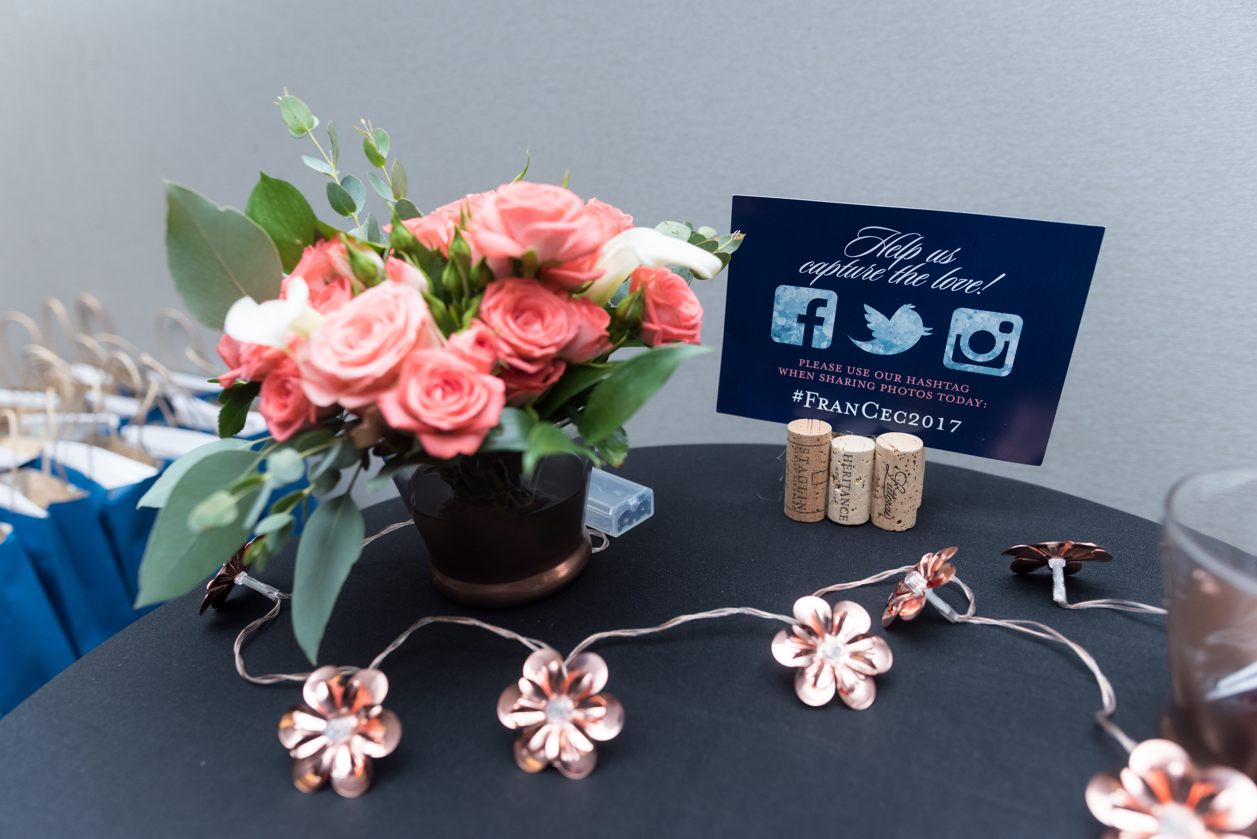
These little signs were scattered throughout the reception too, reminding guests to share photos with their wedding hashtag. 

Studio220_2017_0479.jpg

They printed this giant map in lieu of a traditional guest book. Everyone was encouraged to sign with well wishes and love. It will look wonderful in their home with messages from their guests!

Studio220_2017_0480.jpg

Finally, a few weeks after the big day, we created this thank you card that they sent out to guests.

IMG_3733.jpg
IMG_3734.jpg

We continued the travel theme with the map and turned it into a mock postcard with two of their wedding photos. I really love how this turned out. The back was left with empty space so they could handwrite a thank you message.

IMG_3731.jpg

Cecile and Francis, thank you so much for thinking of me when it was time to create beautiful printed items for your wedding. It was truly an honor to get to play a tiny part in your big day and to actually be there too was just the icing on the cake! Congratulations and I wish you many, many years of joy. XOXO!

Nikki & Damienn

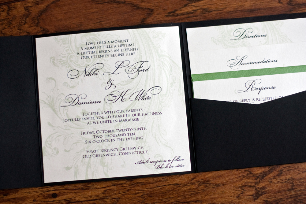
Since my website was hacked a couple of years ago, I'm still getting some older projects added back to my blog. Nikki and Damienn's is one of them. They got married back in 2010, but their invitation still deserves a spot in the blog.

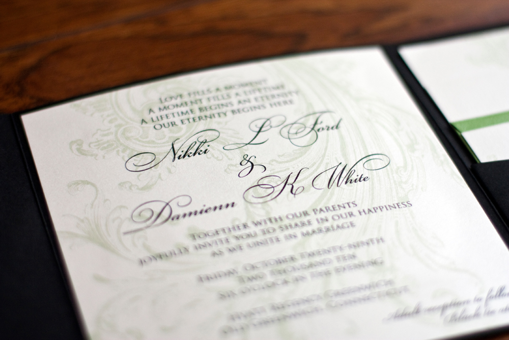
Nikki was such an awesome bride to work with. She was planning a black tie wedding for their families and we wanted the invitation to reflect that. I think we succeeded. 

Extra thanks to Nikki for being gracious enough to send me an invitation and program so I could photograph them for my website. 

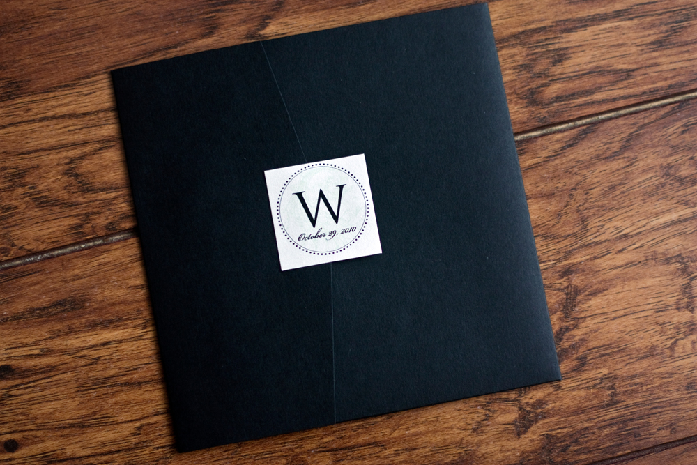
She went with Perfetto pocketfolds from Cards and Pockets in a matte black and the printed items were printed on a metallic pearl card stock. 

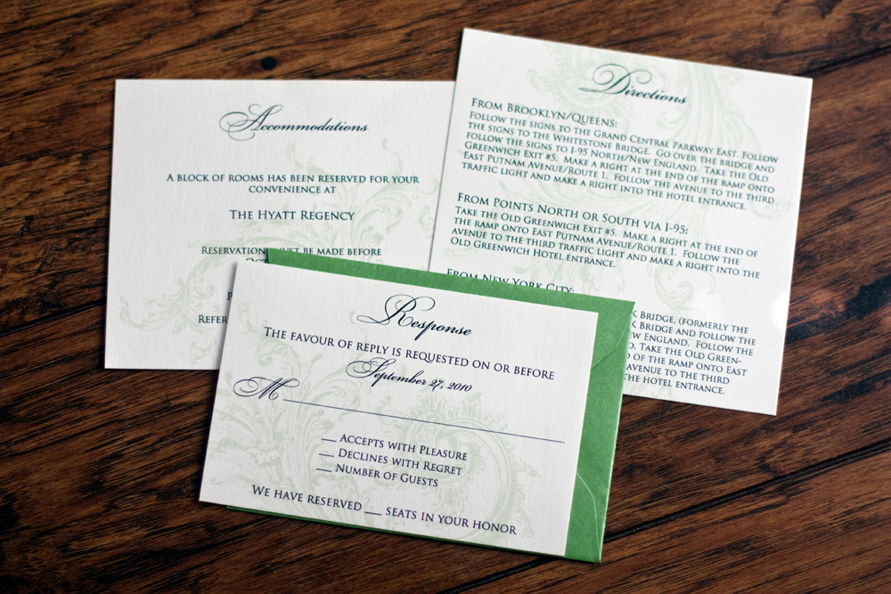
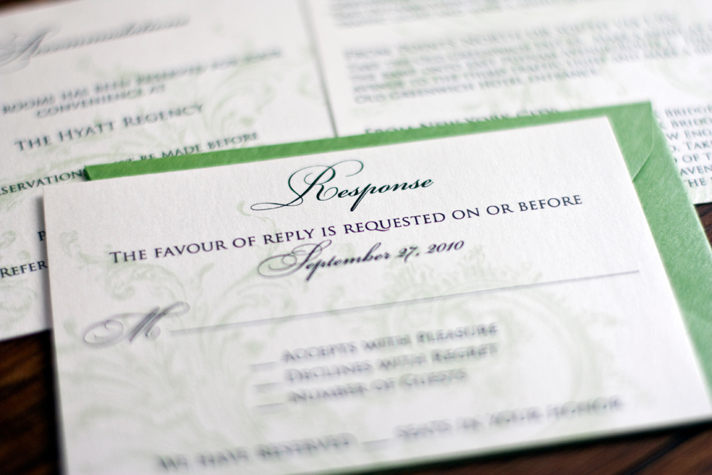
There were just three inserts and love the pop of color that came from the metallic green rsvp envelope. The color is Fairway, also from Cards and Pockets.

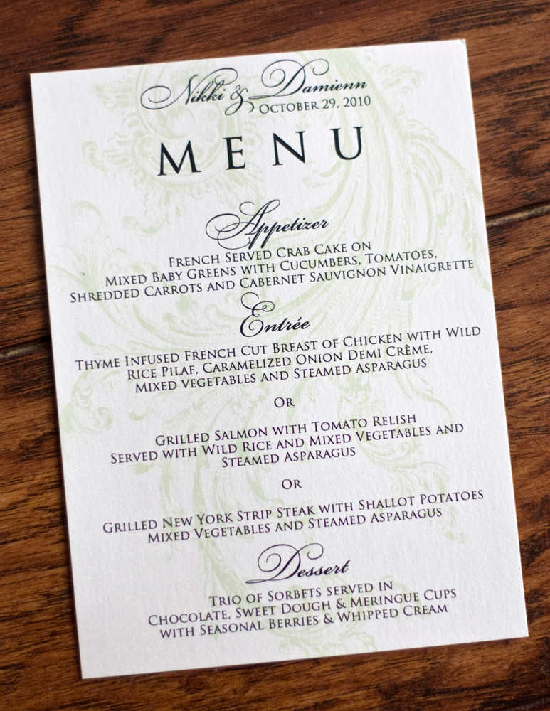
We continued with a menu that was set at each place setting at the wedding reception.

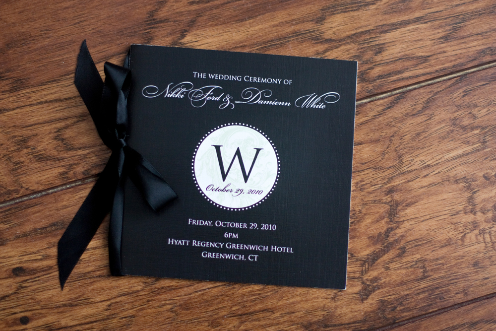
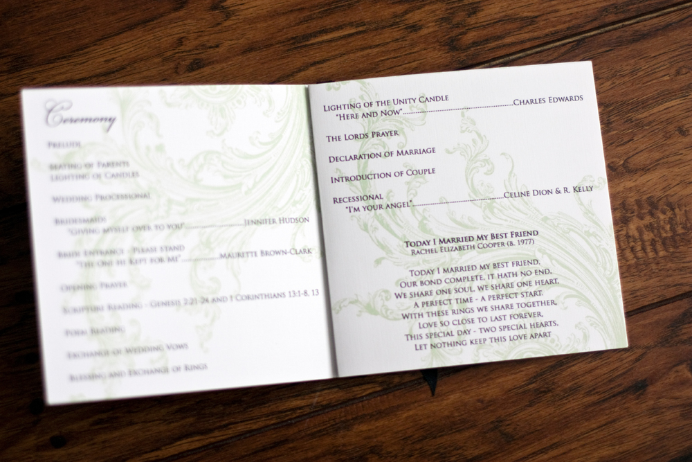
For a wedding program, Nikki wanted to go with an elegant booklet that was bound with black satin ribbon. Kudos to the printing company she used for getting these black covers looking so good.

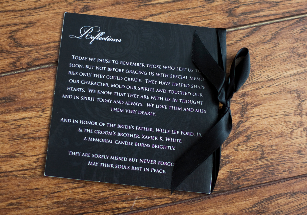
The back cover said thanks to the friends and family members who couldn't be there for the wedding. It's not easy to see, but I was stoked to see that the flourish that we used on their invitations printed beautifully in the background of the cover.

I love how all of these turned out and I hope Nikki and Damienn have enjoyed married life for the last seven-ish years. 

Cindy & Scott

Cindy and Scott were planning a beautiful mid-October winery wedding in northern California and wanted to use simple and straightforward designs for their wedding invitations. I was more than happy to oblidge!

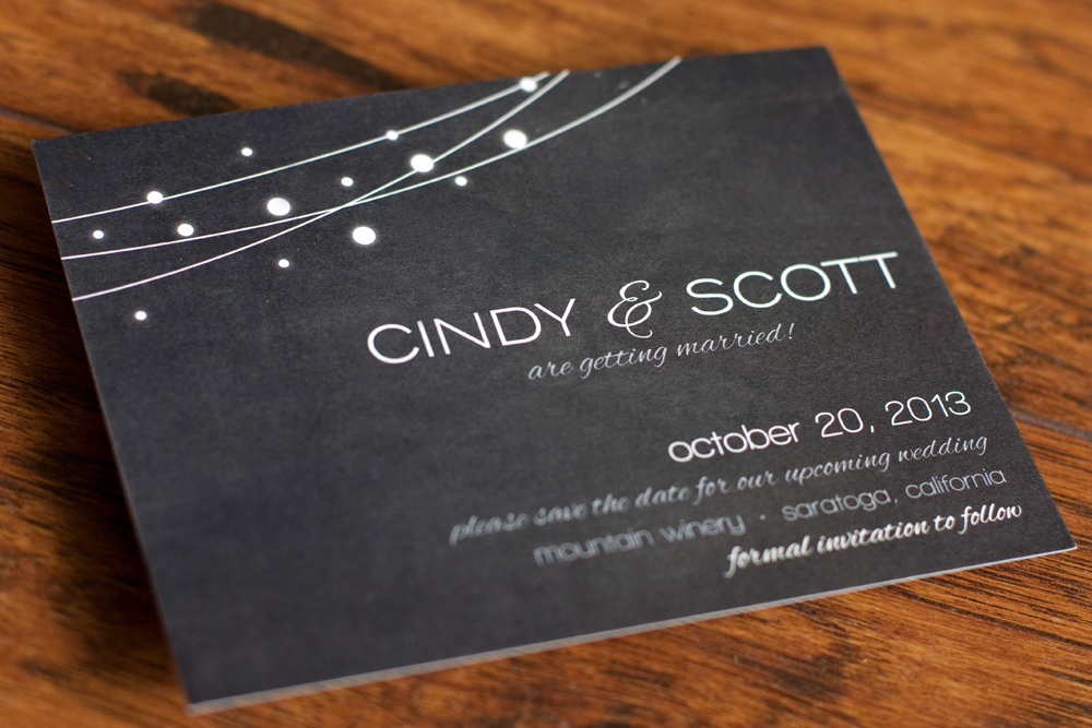
First we created a simple save-the-date with a chalkboard background. Cindy had these printed with VistaPrint. The matte finish really showcased the chalkboard texture.

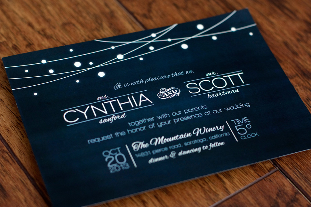
When we got started with the invitation, they wanted to keep the same overall look with a chalkboard background, but incorporate their wedding colors: blue and gray. 

These were printed by FolgerGraphics in Hayward, CA. 

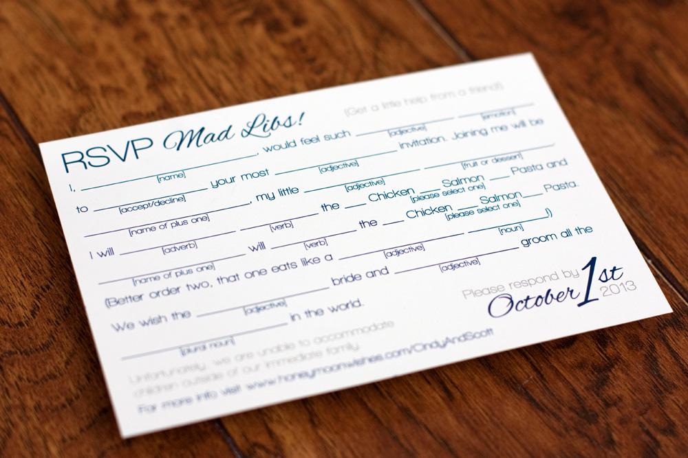
For a response card, Scott had fun creating a Mad Lib for guests to fill out. This was really fun to create for them!

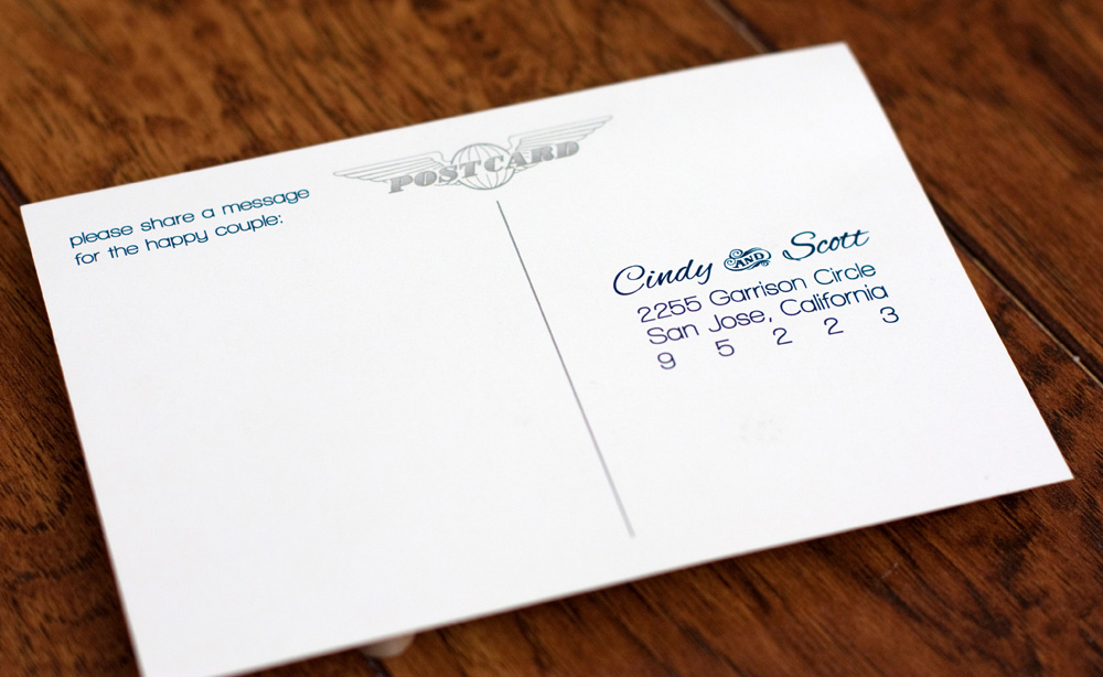
The response card was a simple two-sided postcard. Their address has been changed to protect privacy.

For their wedding day, Cindy's dad (who's a wine maker), bottled his delicious Zinfandel Rosé for guests to toast with and I designed a custom label to go with them. Waterproof labels kept them from wilting when the wine was chilled.

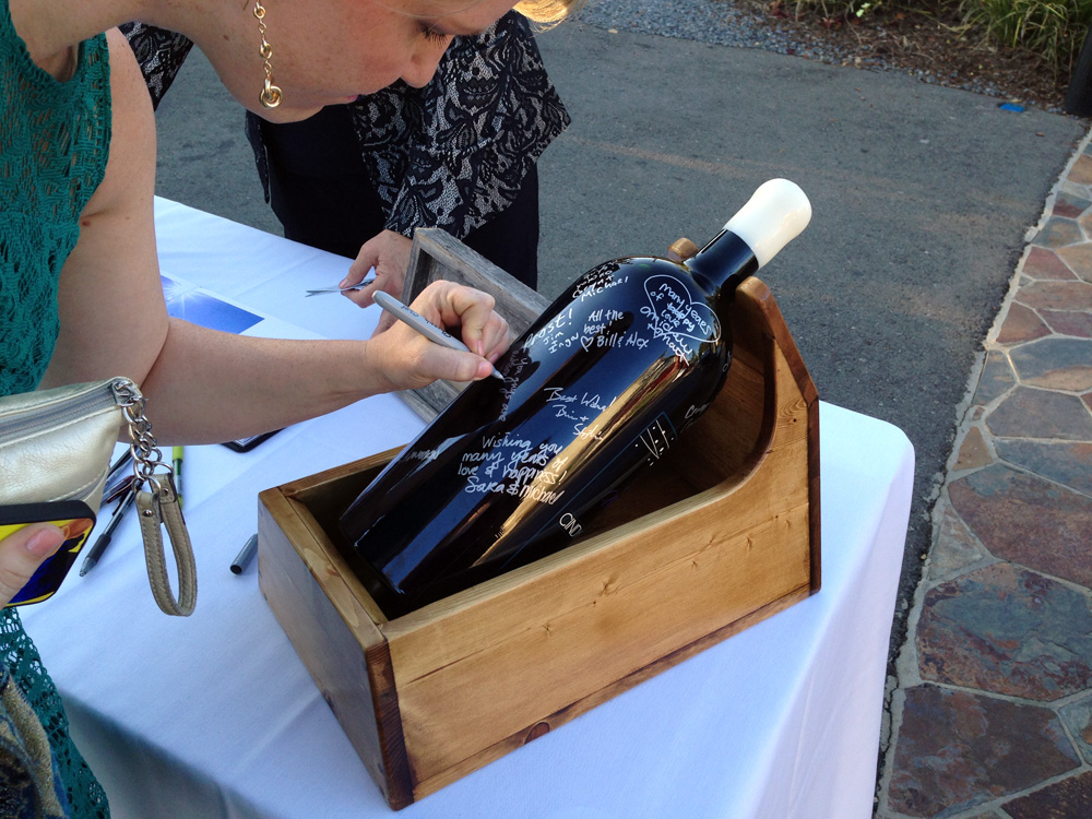
In lieu of a traditional guestbook, Cindy's dad went above and beyond and had a giant wine bottle filled with his delicious Zinfandel wine and engraved with the same label design. He then built a wood mount for the bottle that allowed it to be spun without risk of it rolling off of the table. Guests signed with metallic silver Sharpie markers. This turned out SO cool!! 

The bottling, engraving, and painting was done by Doc's Trophy Shoppe in Napa Valley, CA. They did an amazing job!

Cindy and Scott's wedding was a blast and I really appreciate the invite. Congrats!!
Latiffe & Chris

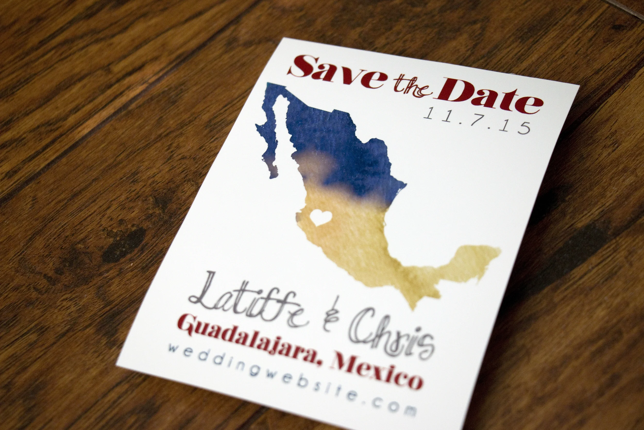
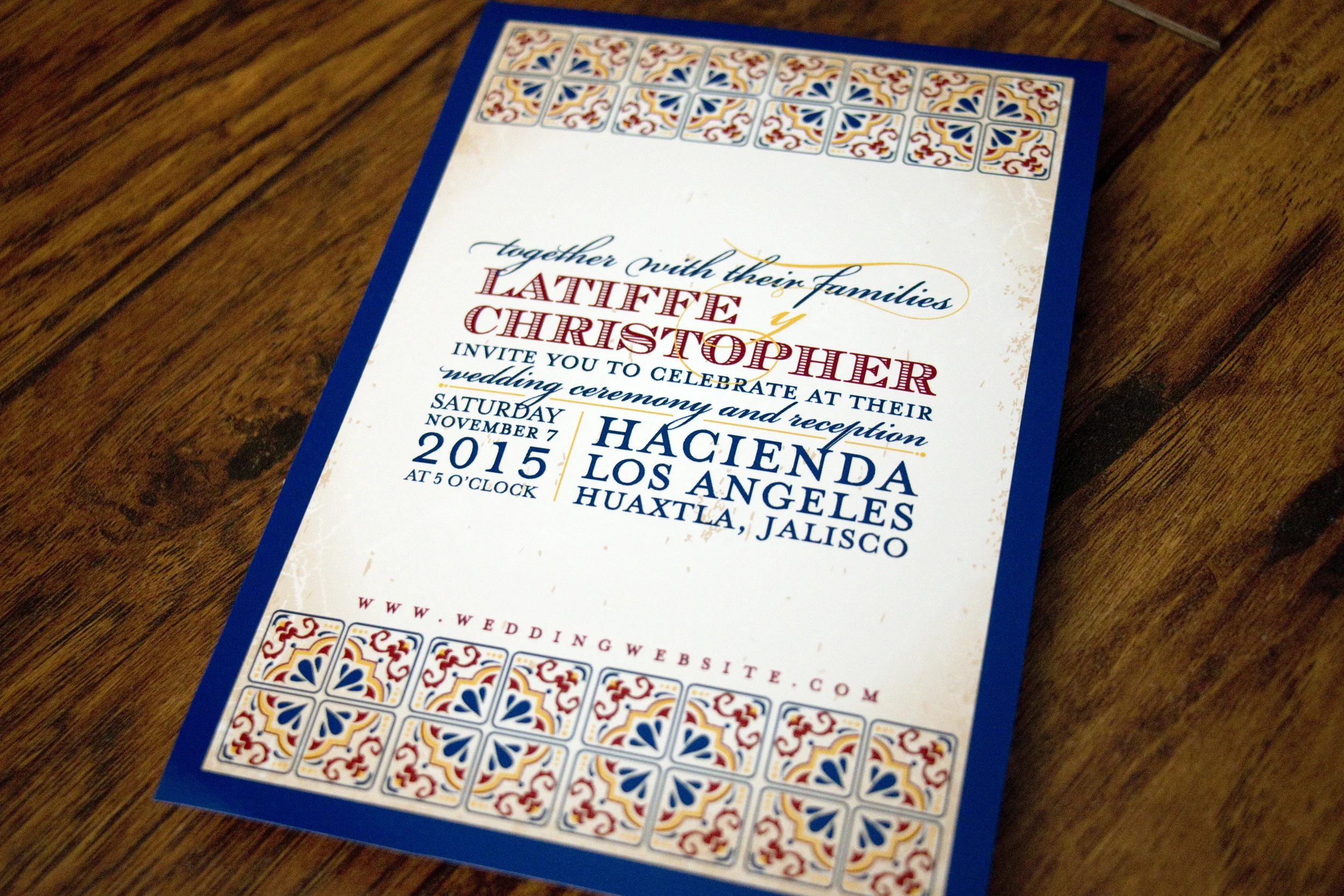
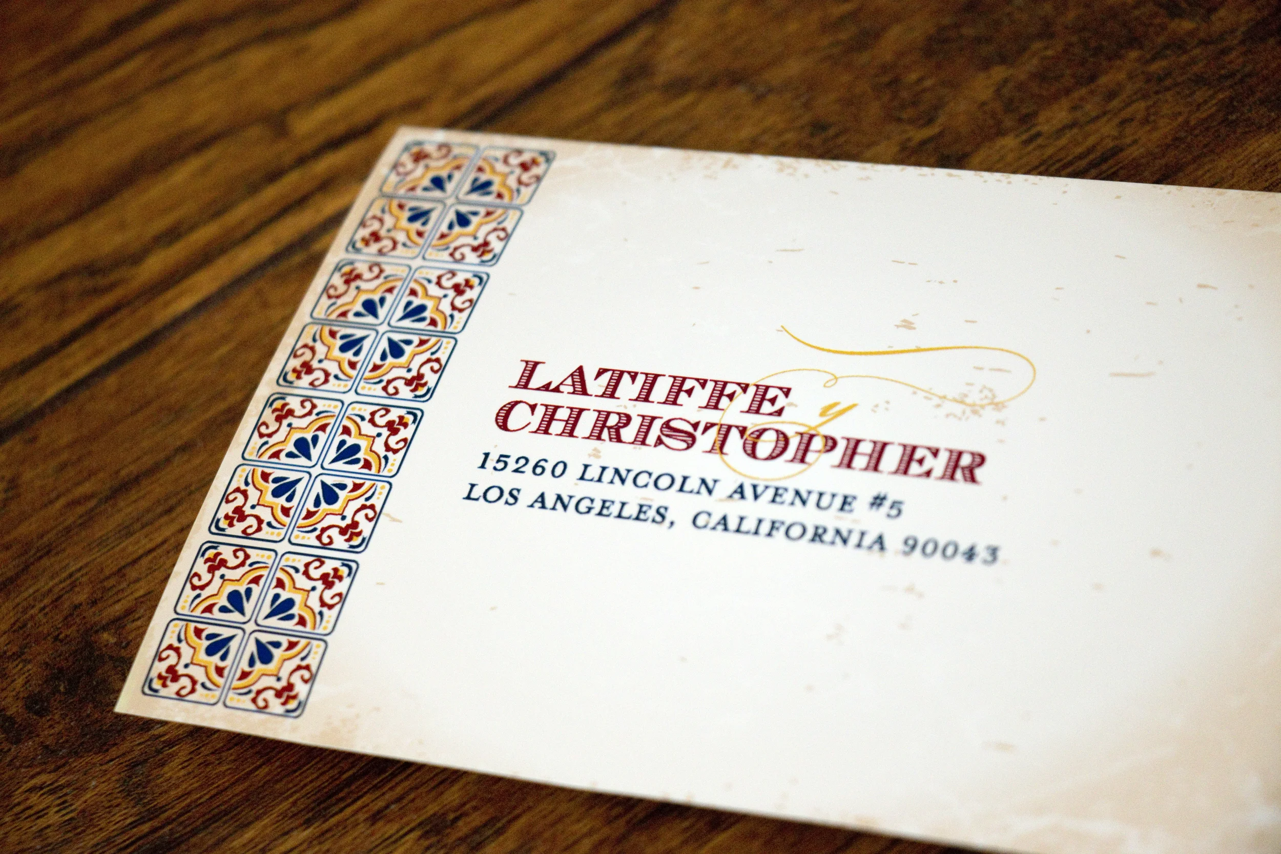
Latiffe and Chris had a gorgeous destination wedding in Guadalajara, Mexico and they wanted their invitations to reflect that in style. We discussed using papel picado graphics, but in the end decided on using Talavera tile as the graphic inspiration. I adore how everything turned out!

But first, here's the save-the-date we created for them. They wanted a simple silhouette of Mexico with an indication on where the wedding would take place.

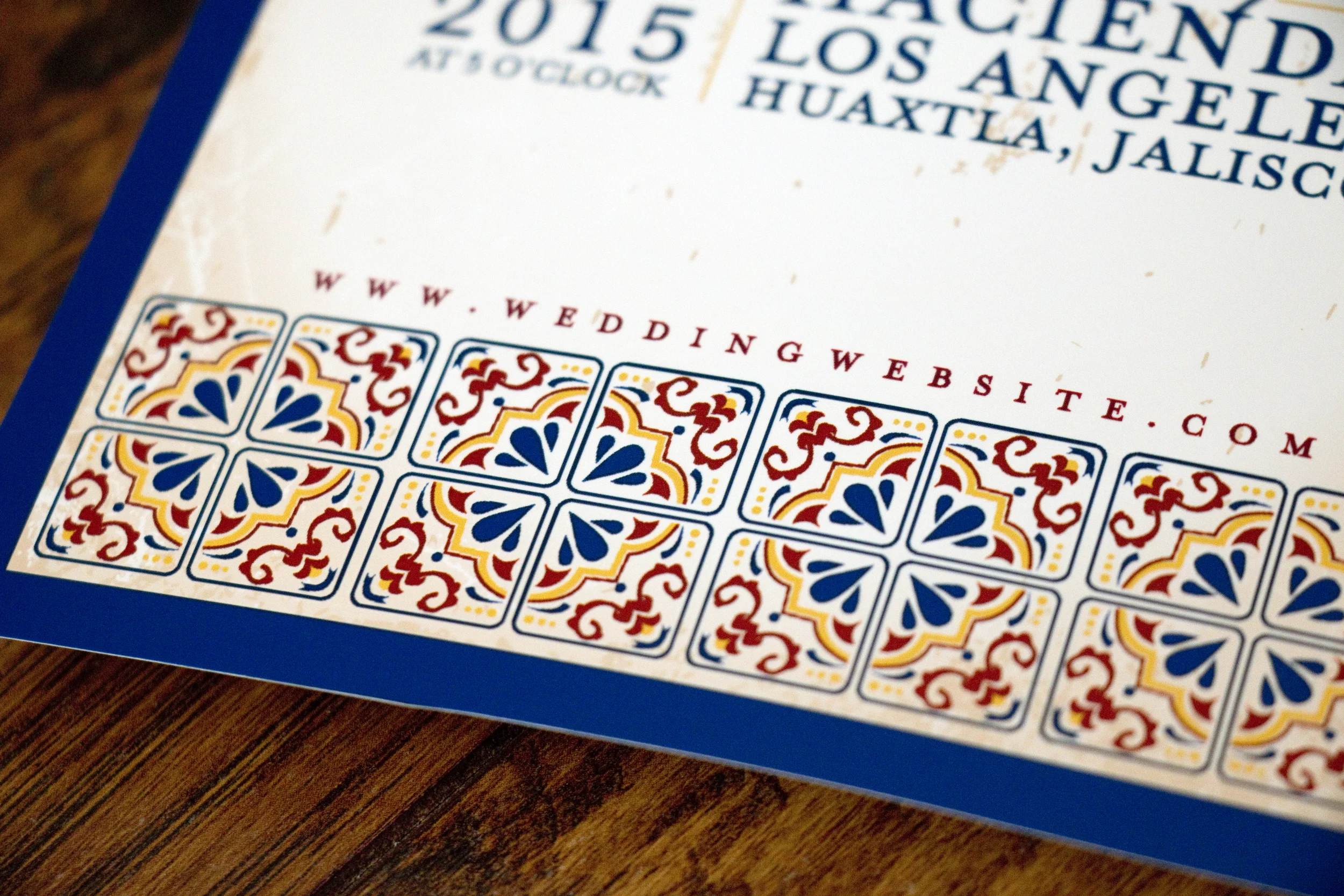
Talavera style pottery comes from Puebla, Mexico (where Latiffe's family is from) and is known for bright colors, geometric designs and for having a white base glaze. It was a wonderful inspiration for this invitation and really fun looking at a variety of beautiful pieces for inspiration.

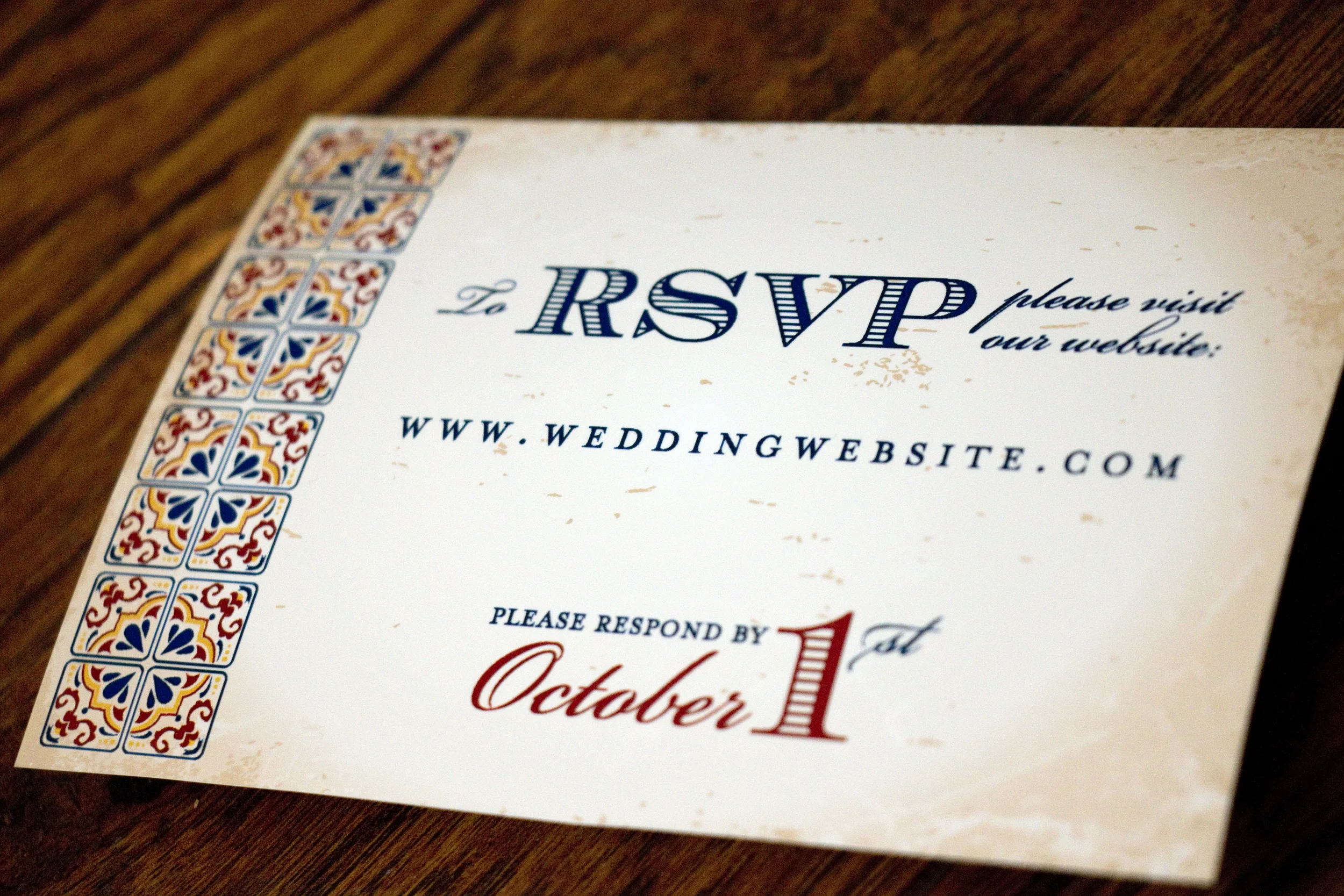
For their RSVP card, we did a very simple, two-sided postcard that directed guests to RSVP on the couple's wedding website. I've changed the URL and their address to protect privacy.

Don't worry, I changed their address!

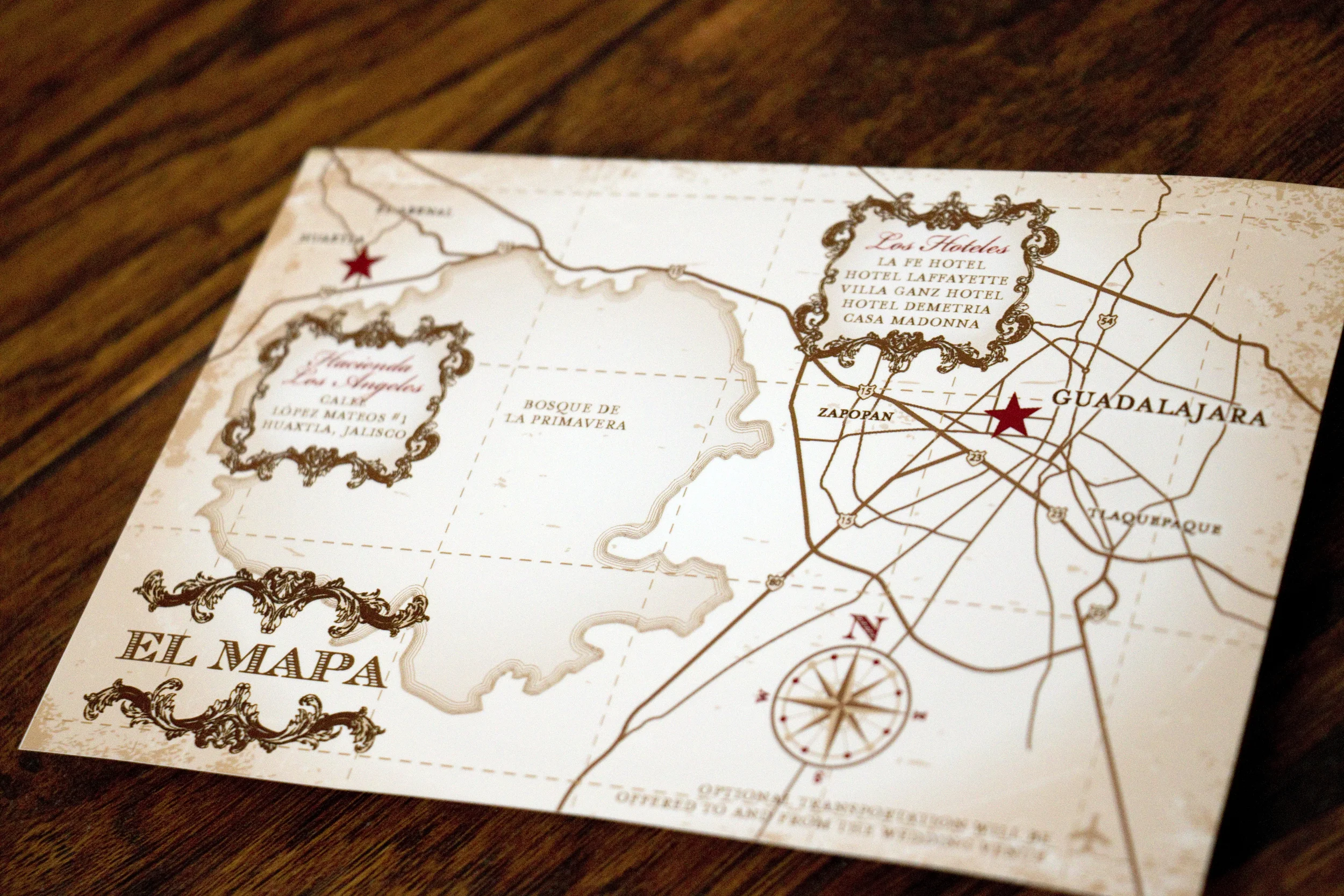
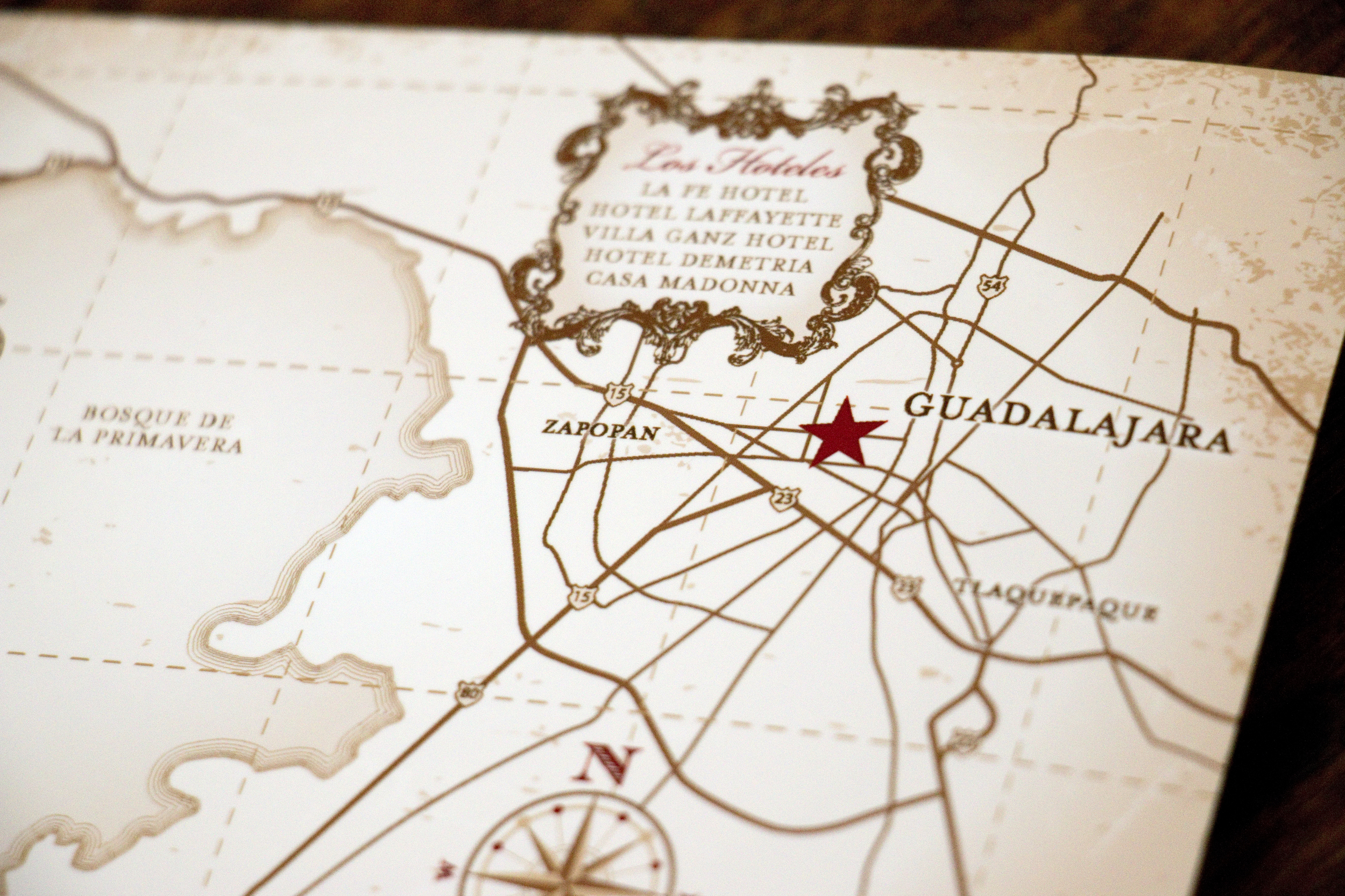
Latiffe asked me to make the map to look a little like a vintage treasure map and I was happy to oblige.

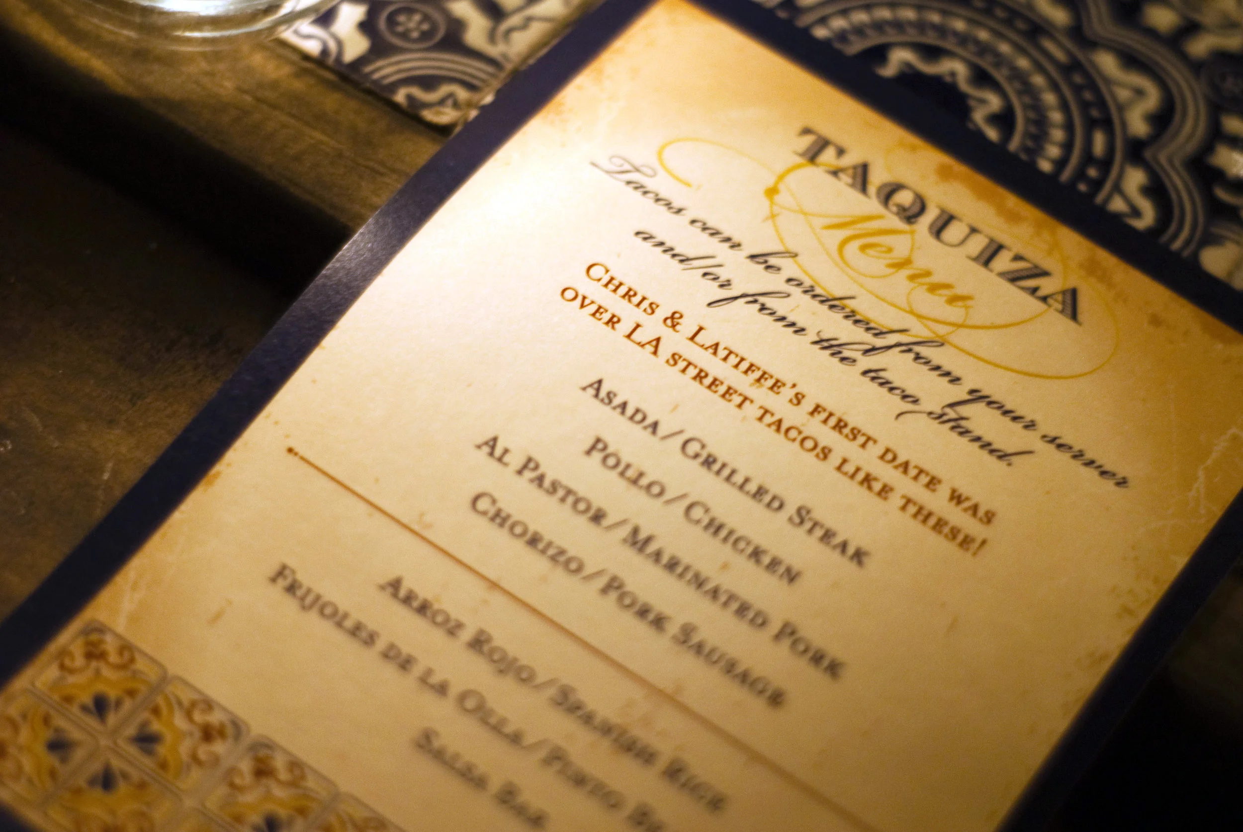
At the wedding reception, they had a taco stand making street tacos for their guests, and I created a menu that sat at each place setting. Photo Cred: Rocio Luna Weddings

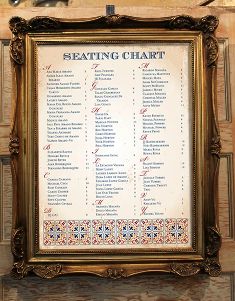
We also created a large seating chart that let guests know where to sit. We weren't able to get a photo of it at the wedding, but this is a mockup of what it looked like:

The wedding looked absolutely gorgeous and it's one I wish I could have attended in person! Congratulations guys!!