vintage

Maverick's Birth Announcement

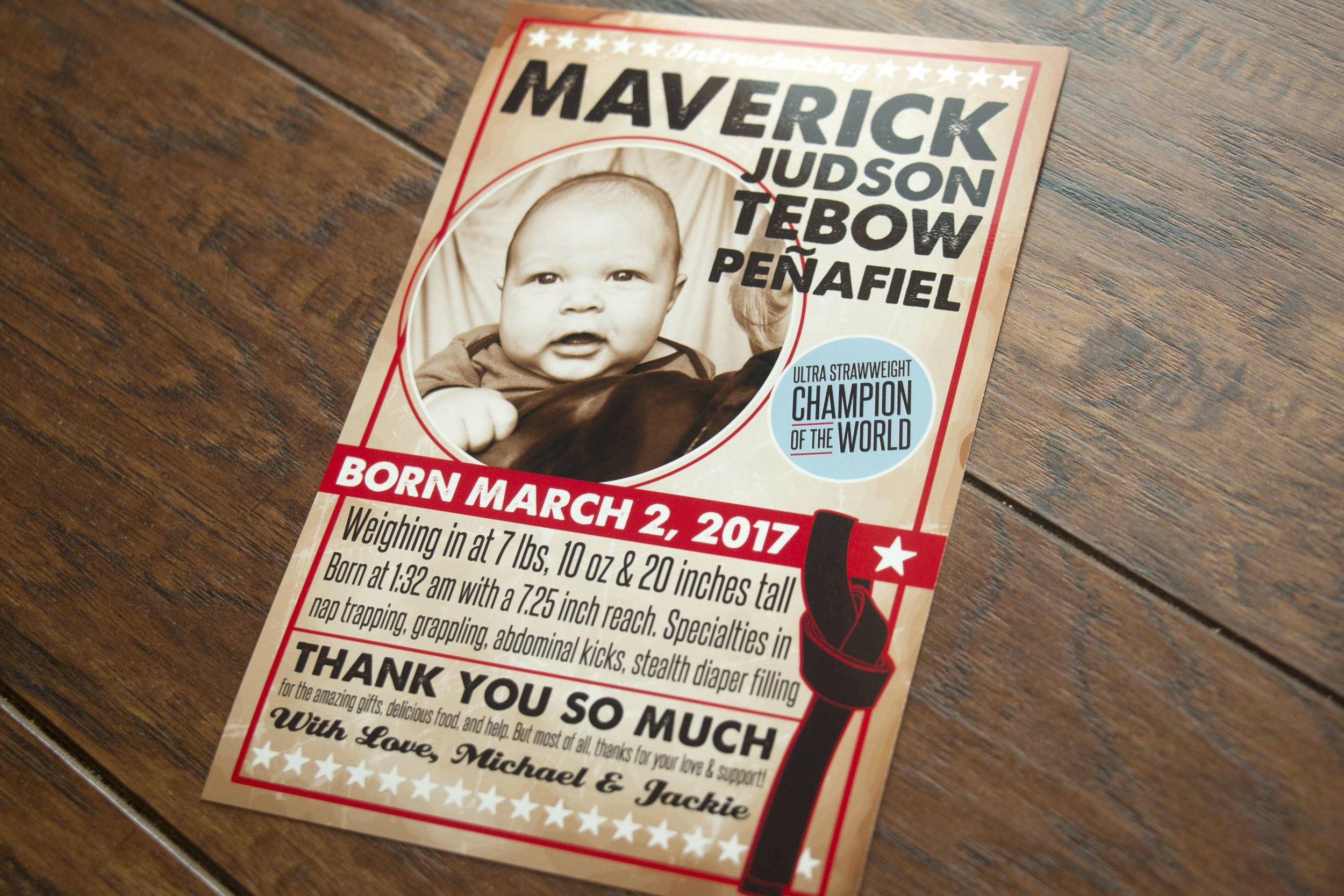
My little sister and her husband welcomed their first child into the world this spring. Maverick was born on the day my sister had an appointment to get her hair cut and colored, but he obviously needed ALL of the attention that day. 

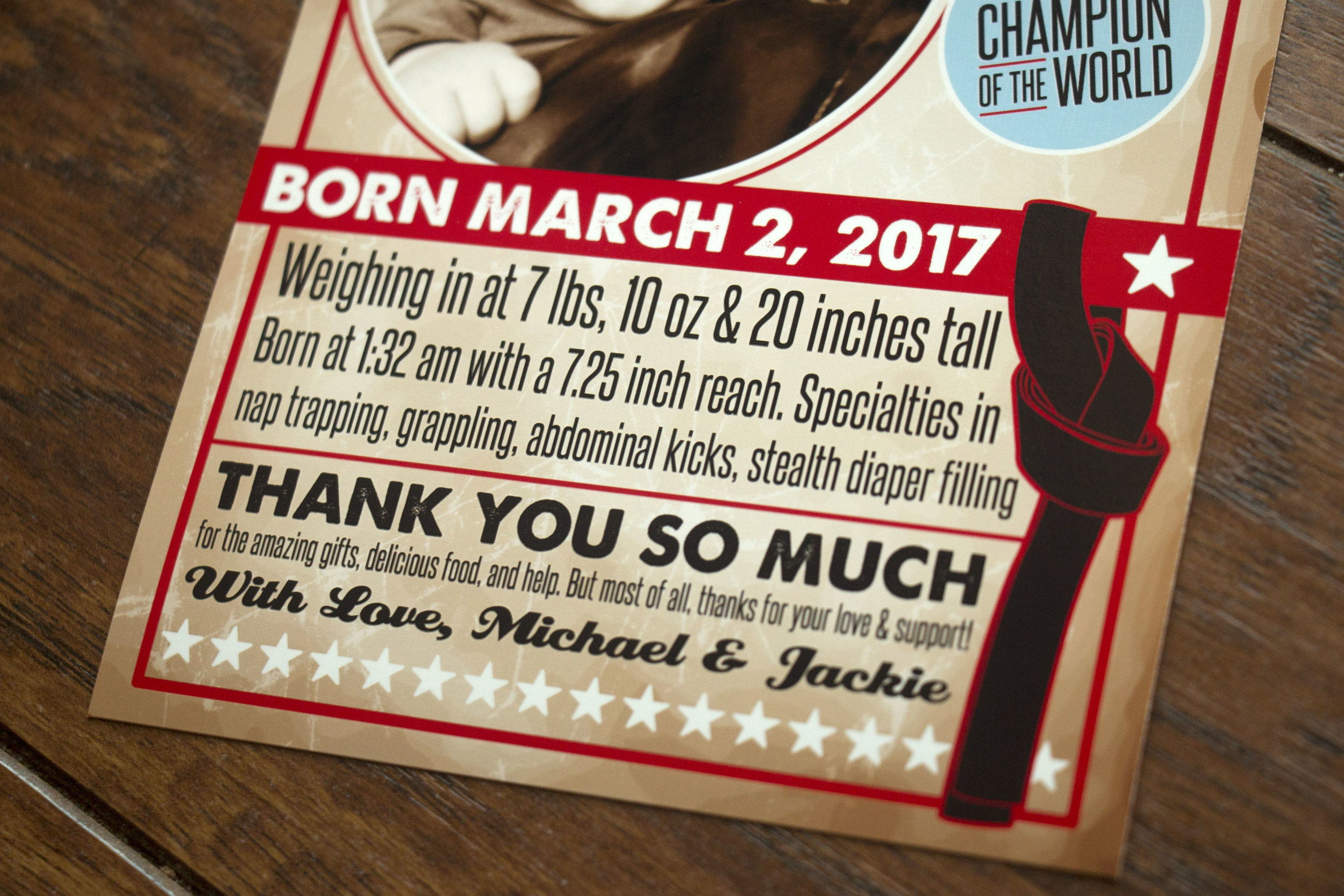
Maverick's daddy is a black belt in jujitsu, and he asked if we could do some sort of "fighter poster" with some made-up stats. I looked up vintage boxing and martial arts posters and came up with this for his birth announcement. I had to look up what the lightest weight class is in jujitsu, I've never heard of a strawweight.  

These were printed by Overnight Prints, and they don't charge extra for double-sided printing. So I put some cute photos on the back. 

Love this little guy!! Welcome to the world Mav!
Bridget's Bridal Shower

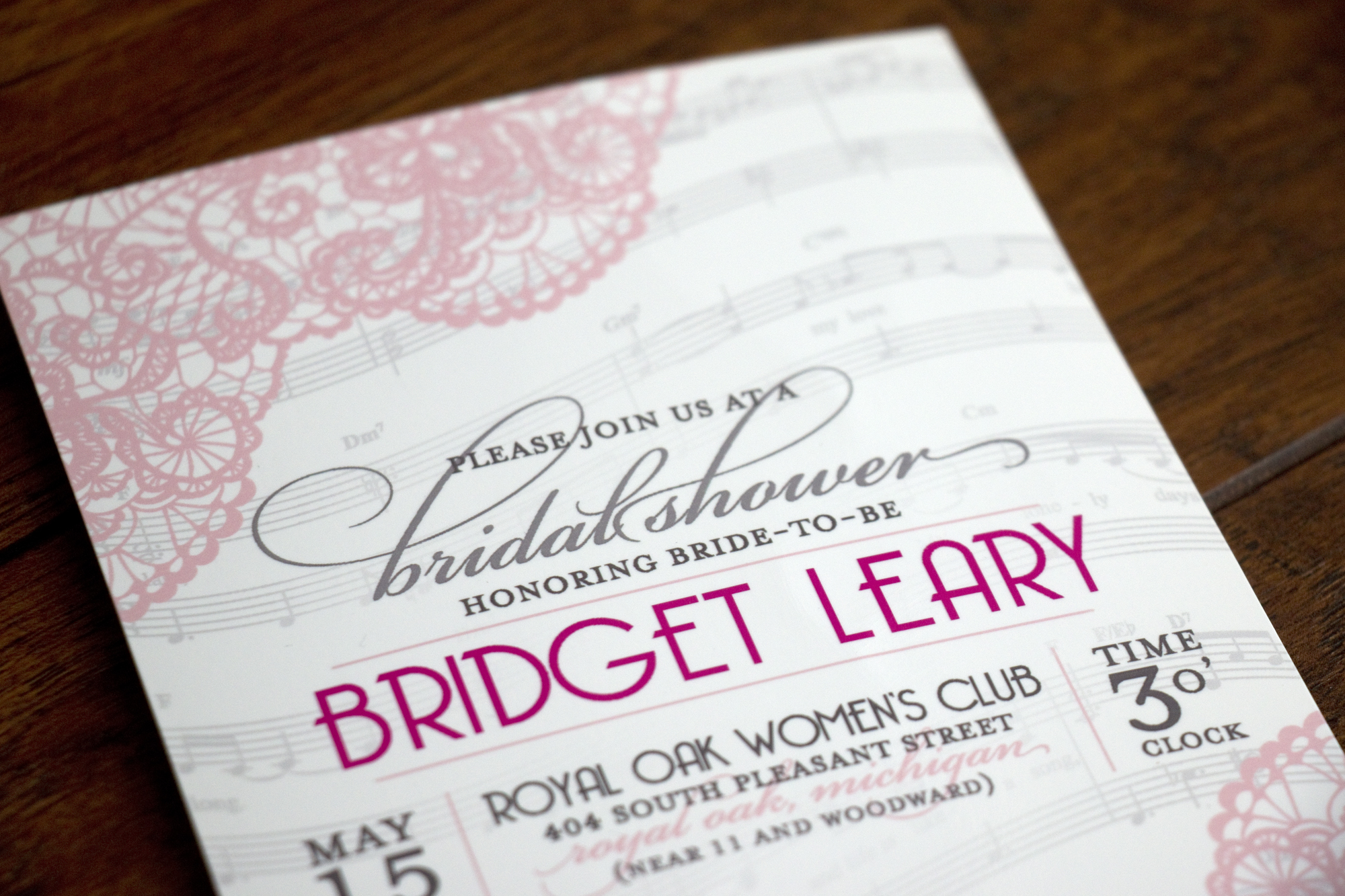
Bridget's future-sister-in-law Miriam asked me to create a bridal shower invitation that included sheet music of some kind since she loves music and musical theater. We kept it very feminine with lace and blush pink as well. I love how the invitation turned out!

We did a simple insert that listed rsvp information along with where Bridget was registered. 

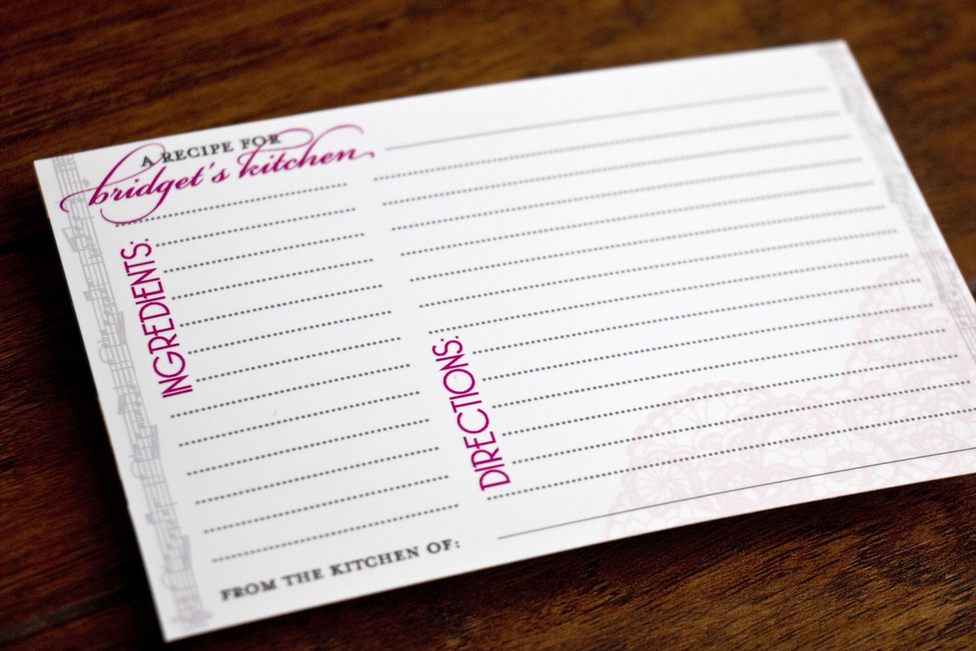
The third thing we created I absolutely love! We created 4x6 recipe cards that were mailed with each invitation. Guests were encouraged to write down a favorite recipe that was inserted into the plastic sleeves of a photo album (hence 4x6 instead of 3.5x5). When put all together, Bridget was presented with a cookbook to start her married life with. Miriam did this with a her friend Ashley's bridal shower too!

I hope the party was a blast, stay tuned for a post sharing Bridget's wedding invitation!!

Latiffe & Chris

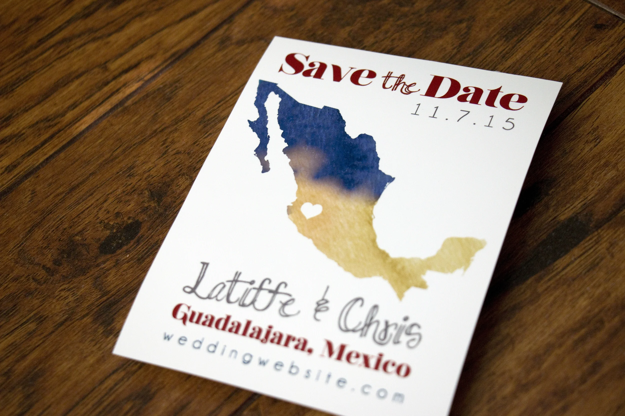
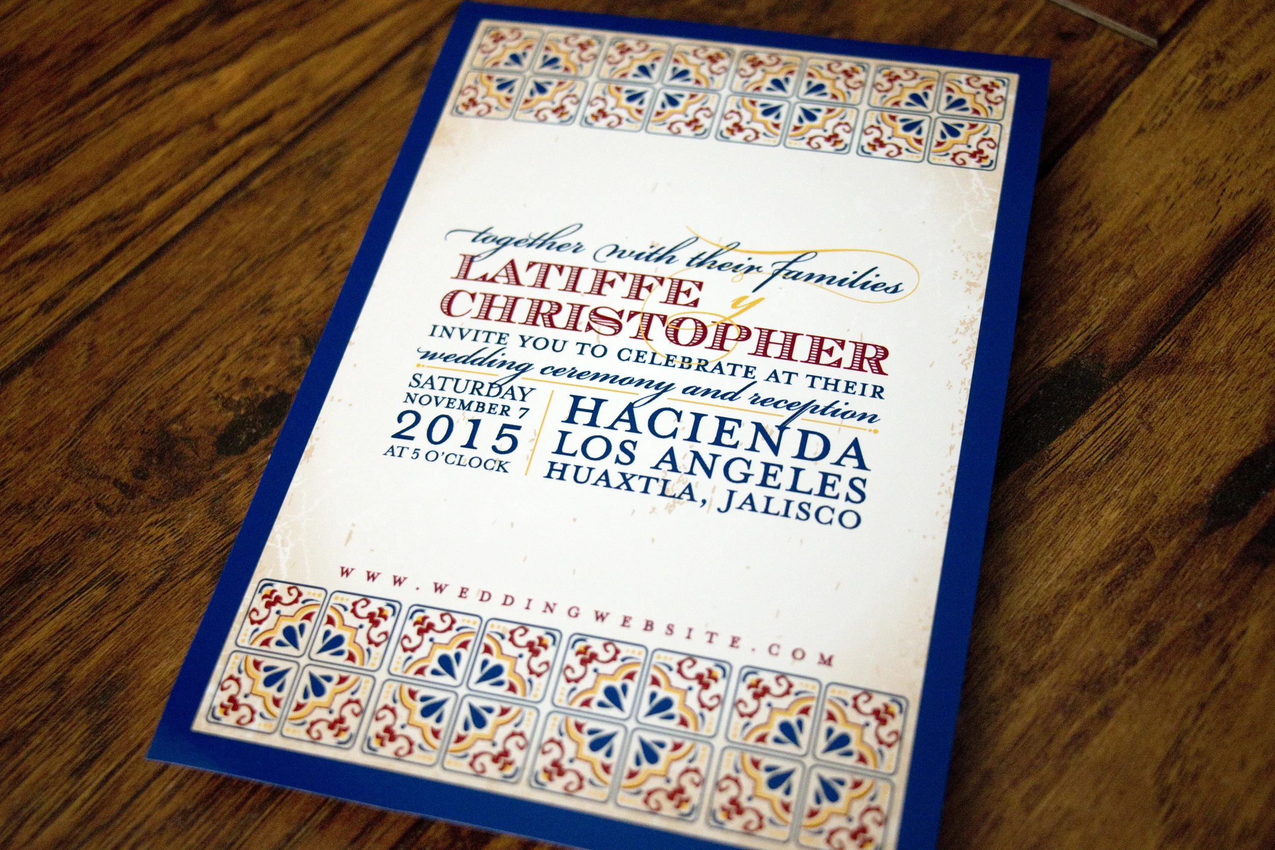
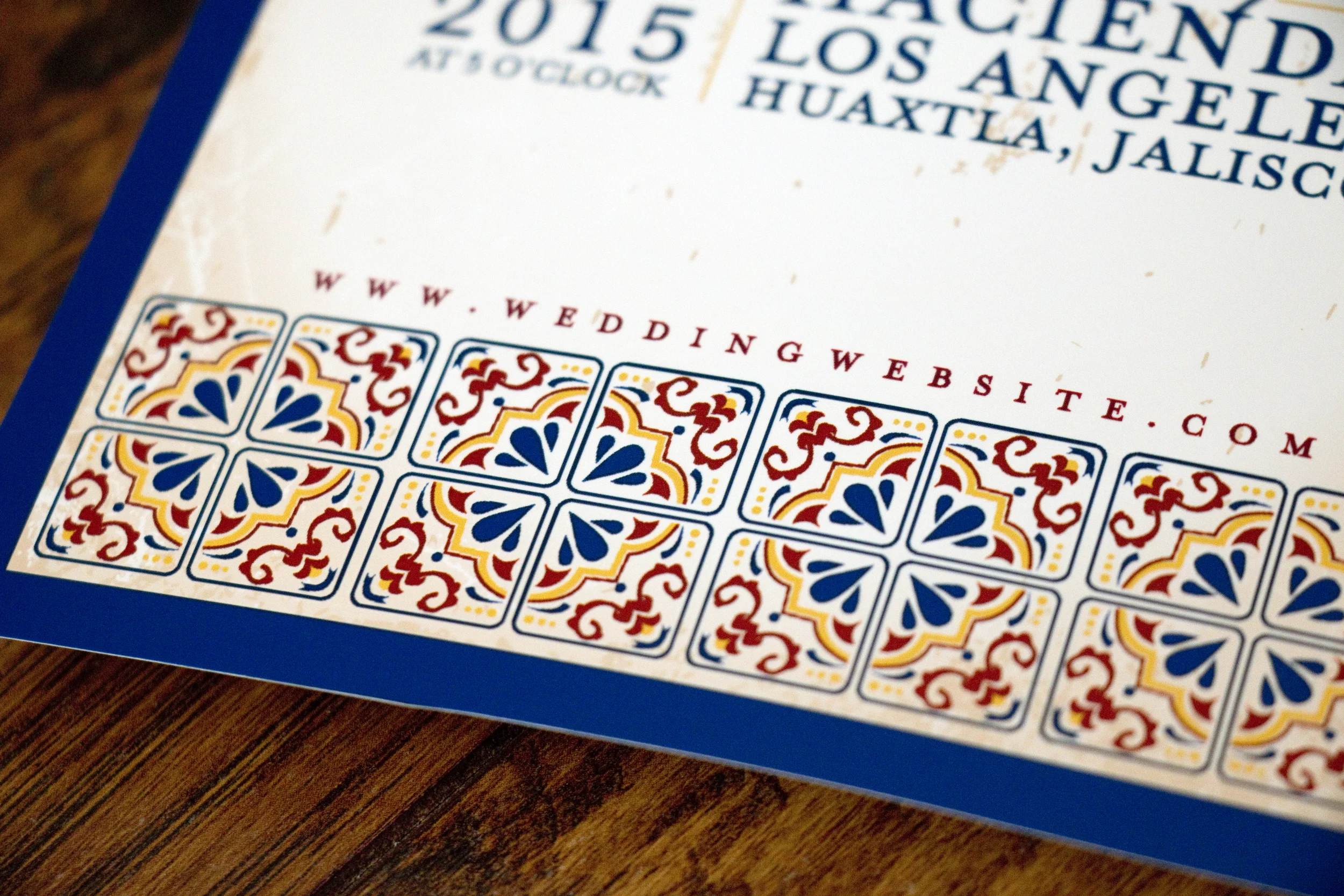
Latiffe and Chris had a gorgeous destination wedding in Guadalajara, Mexico and they wanted their invitations to reflect that in style. We discussed using papel picado graphics, but in the end decided on using Talavera tile as the graphic inspiration. I adore how everything turned out!

But first, here's the save-the-date we created for them. They wanted a simple silhouette of Mexico with an indication on where the wedding would take place.

Talavera style pottery comes from Puebla, Mexico (where Latiffe's family is from) and is known for bright colors, geometric designs and for having a white base glaze. It was a wonderful inspiration for this invitation and really fun looking at a variety of beautiful pieces for inspiration.

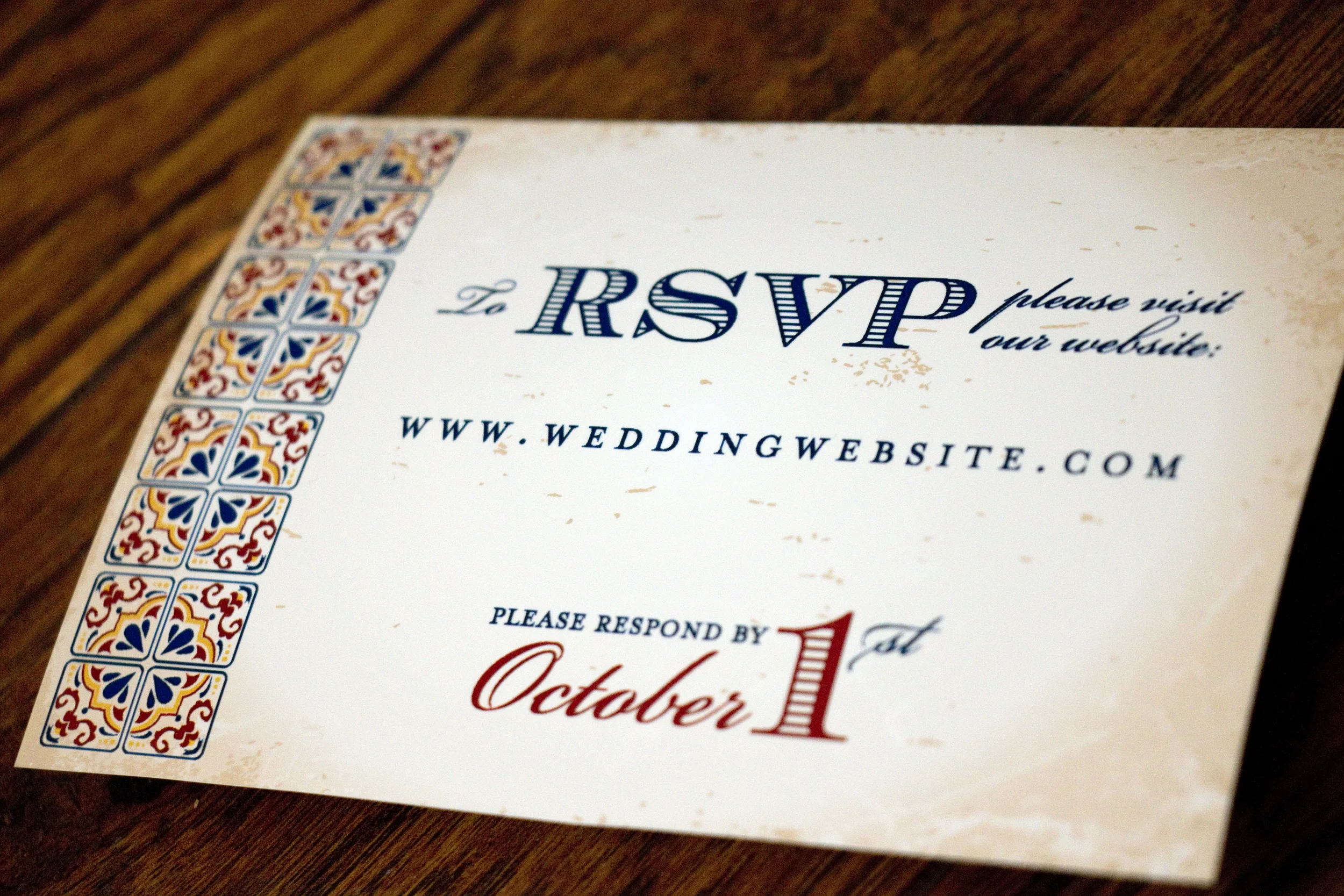
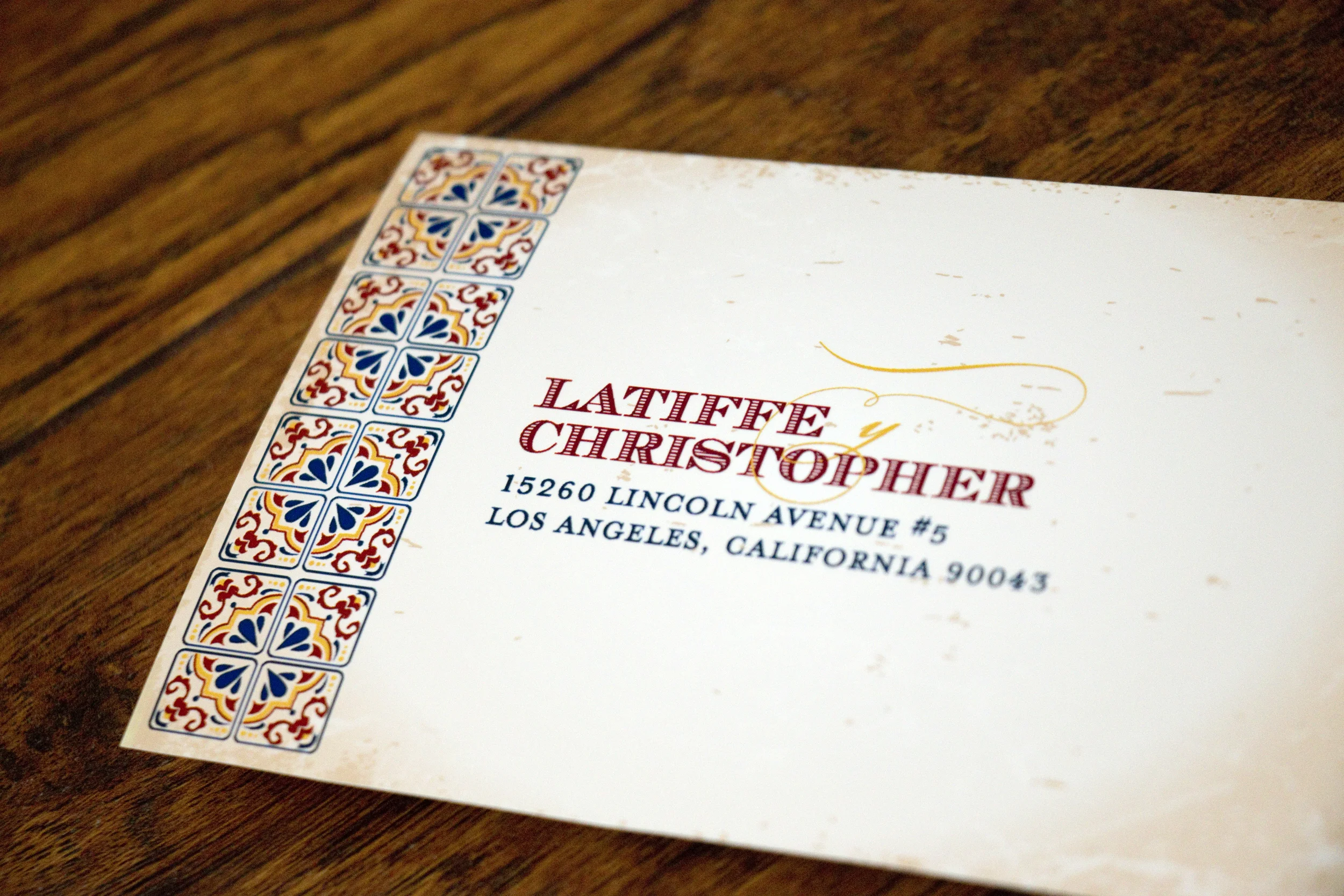
For their RSVP card, we did a very simple, two-sided postcard that directed guests to RSVP on the couple's wedding website. I've changed the URL and their address to protect privacy.

Don't worry, I changed their address!

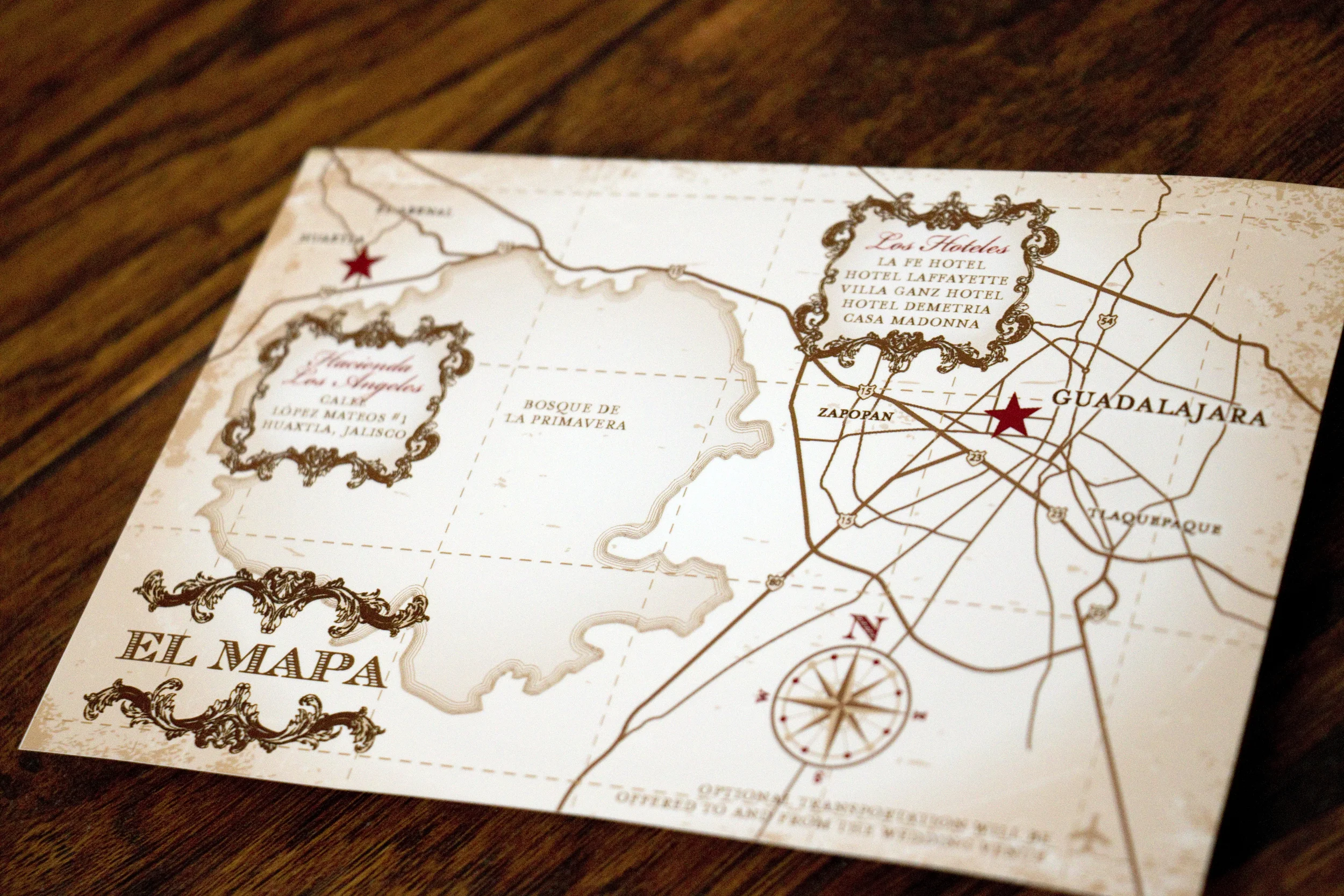
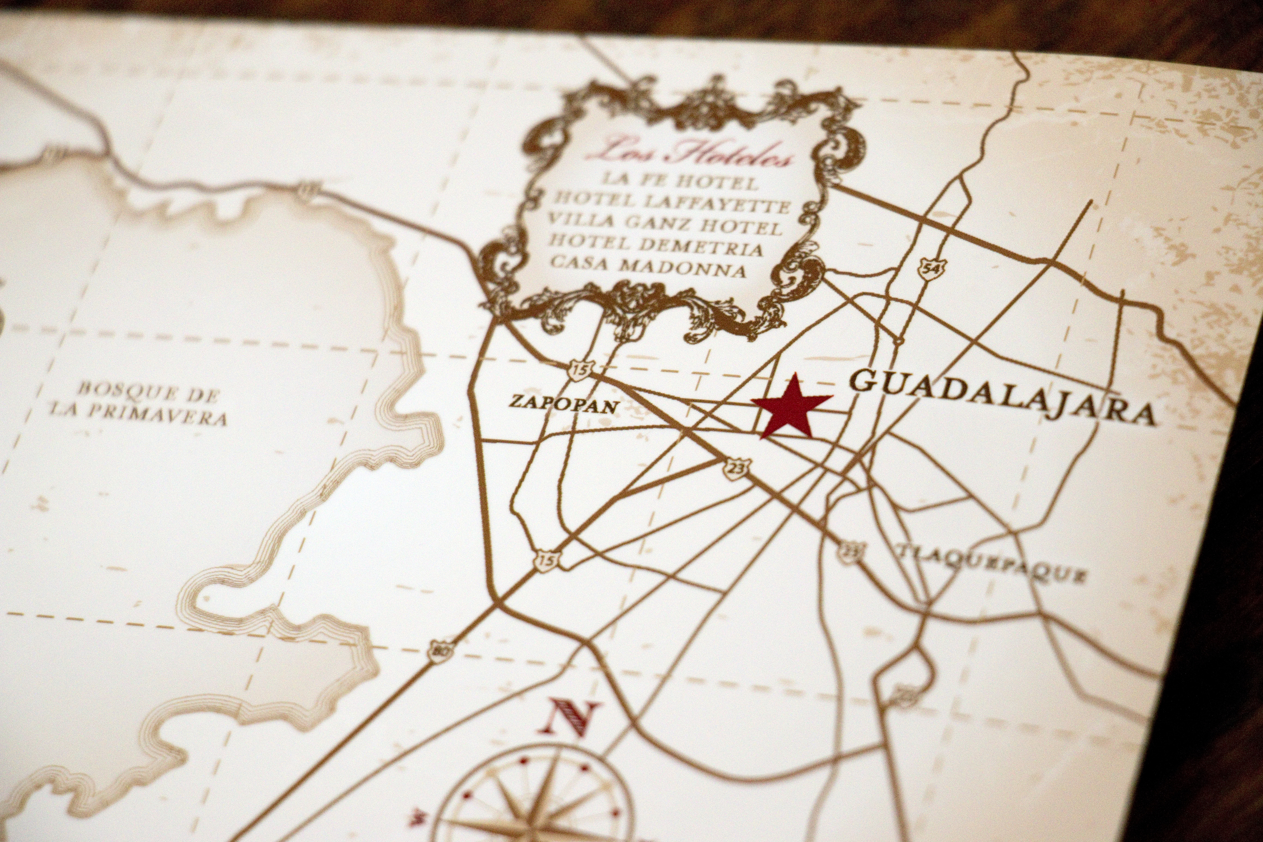
Latiffe asked me to make the map to look a little like a vintage treasure map and I was happy to oblige.

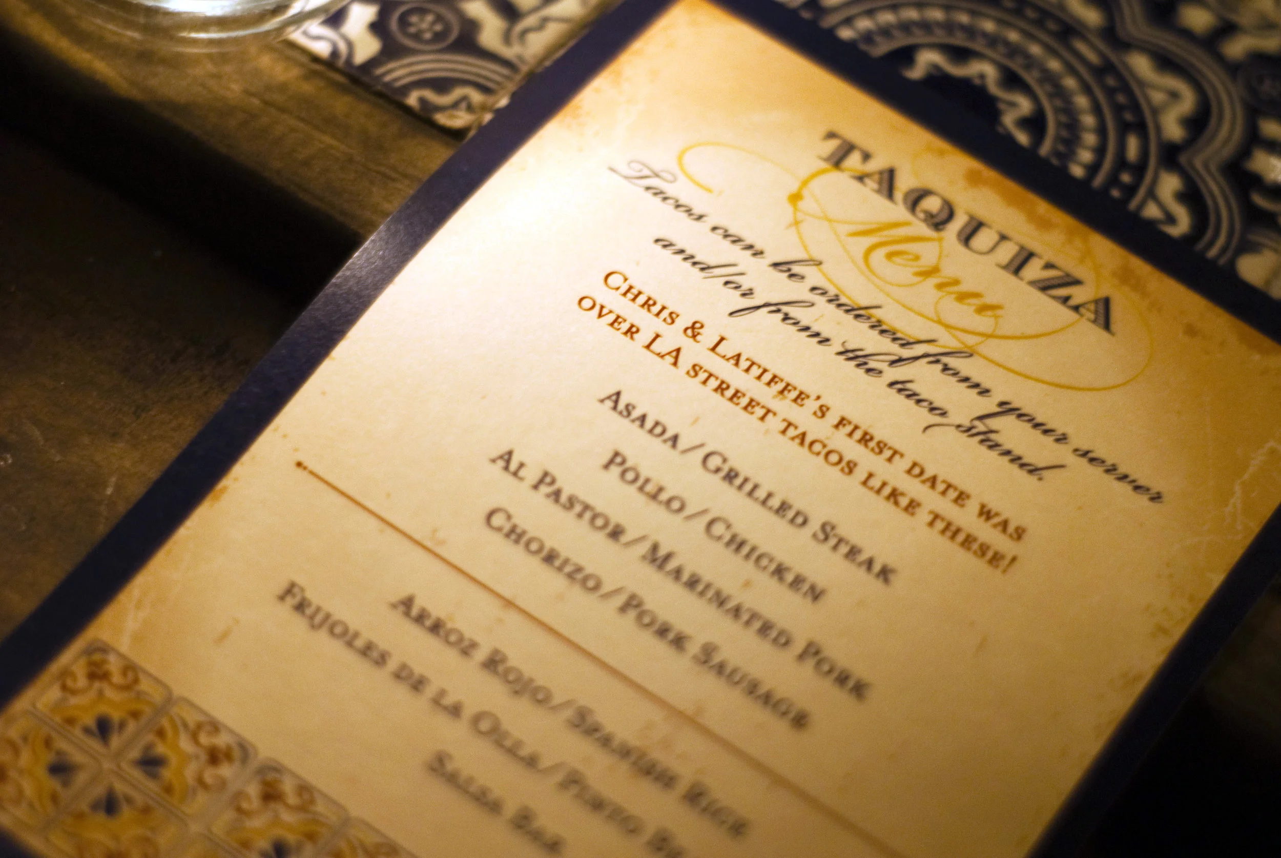
At the wedding reception, they had a taco stand making street tacos for their guests, and I created a menu that sat at each place setting. Photo Cred: Rocio Luna Weddings

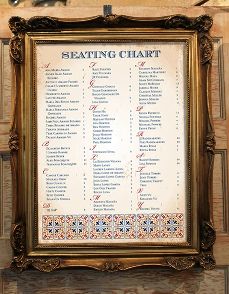
We also created a large seating chart that let guests know where to sit. We weren't able to get a photo of it at the wedding, but this is a mockup of what it looked like:

The wedding looked absolutely gorgeous and it's one I wish I could have attended in person! Congratulations guys!!

Alexis and Matt

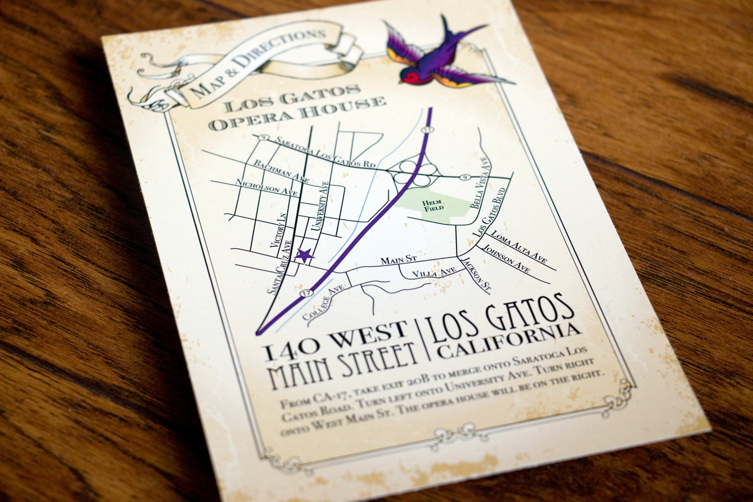
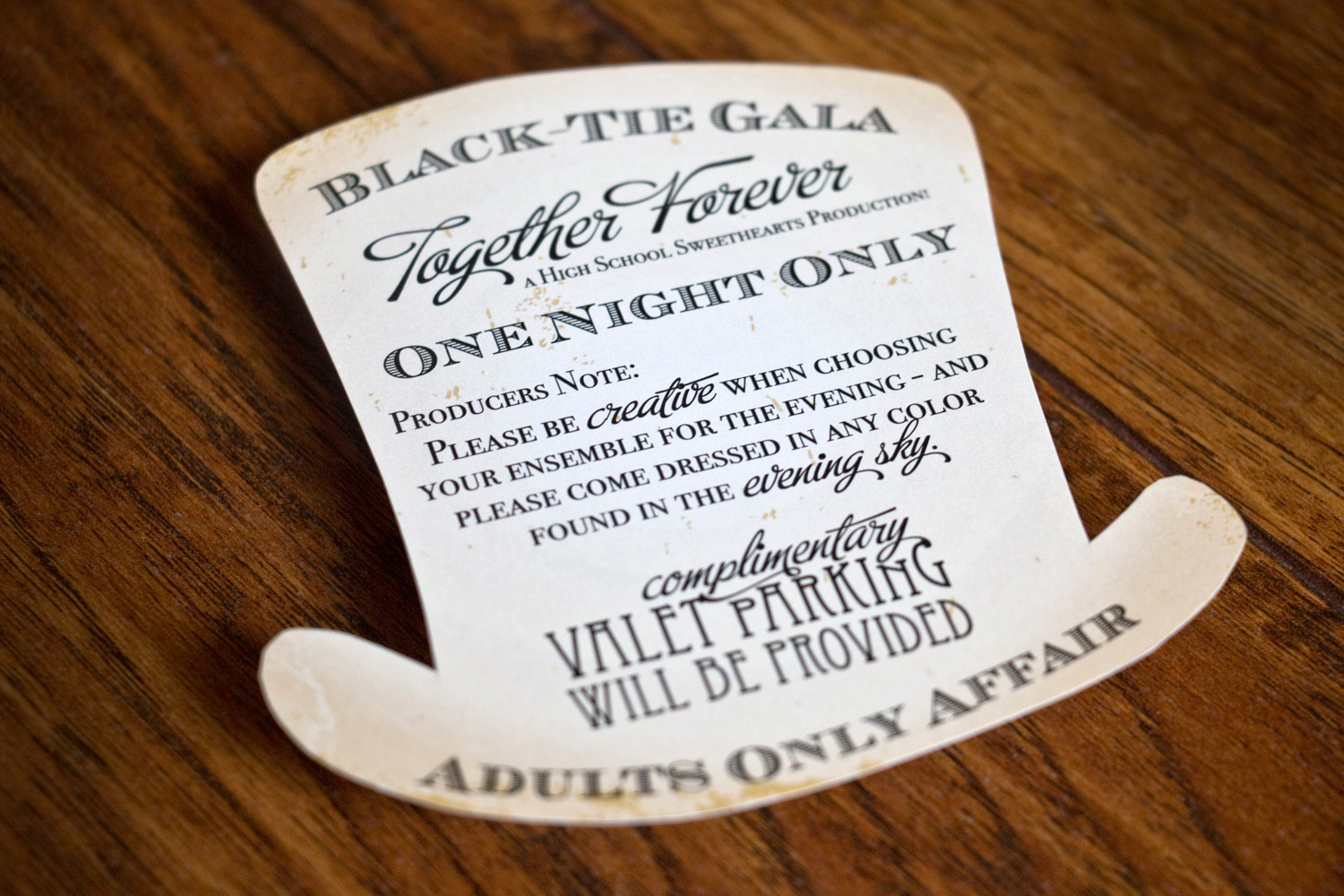
I had a blast working with Lexi on the items for her and Matt's wedding. She wanted a mix of different theme elements to tie in with their wedding venue (an old Hollywood-style theater) and her own personal style. I really love how everything turned out.

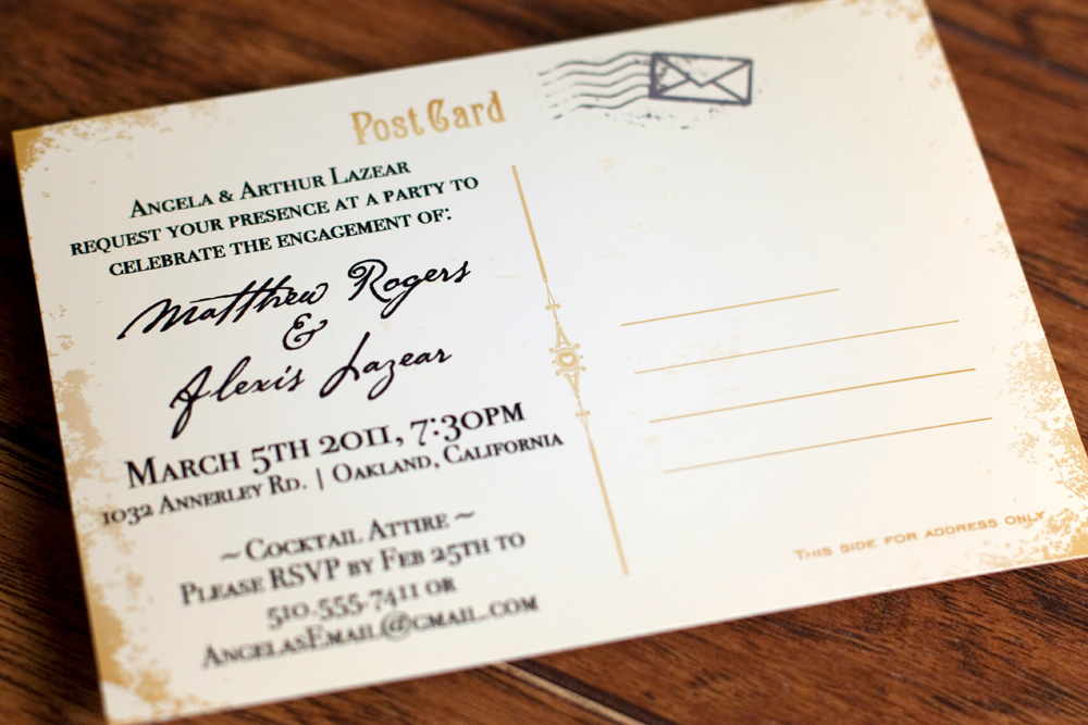
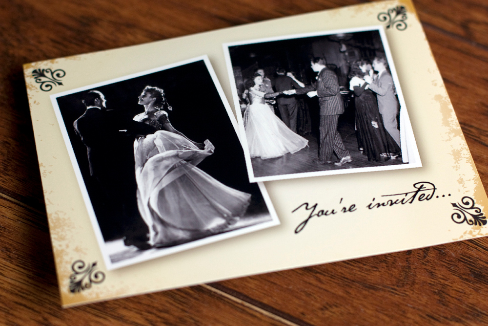
We went old Hollywood for their vintage, postcard engagement party invitation:

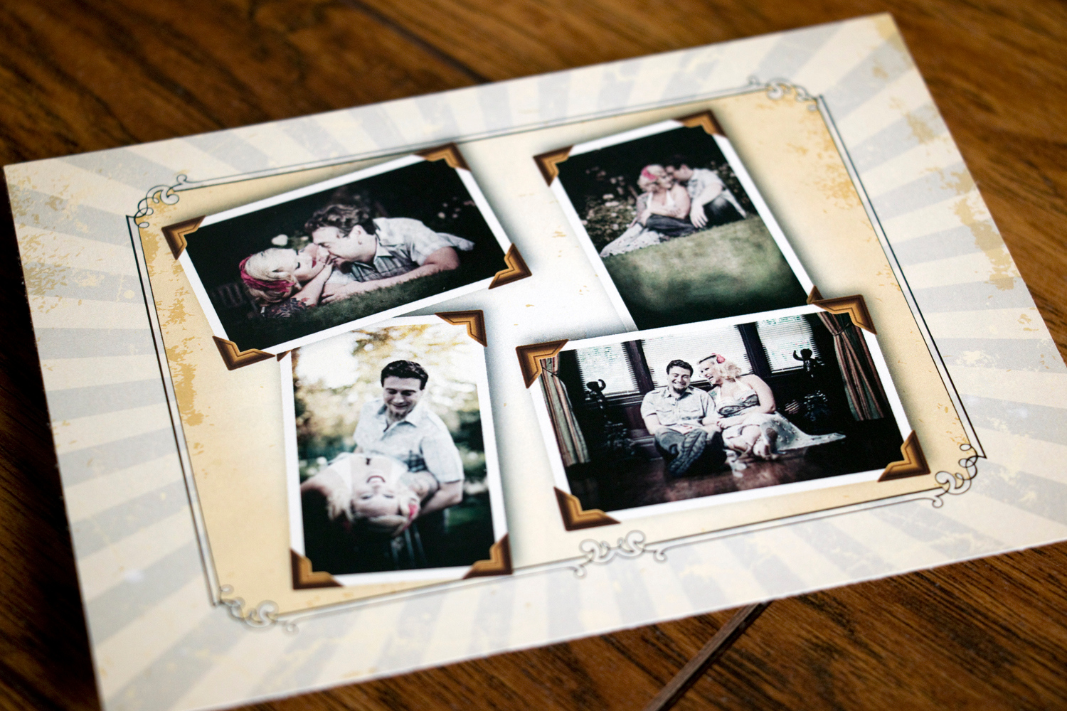
For the save-the-date, we continued with a vintage feel and added some rockabilly style to compliment their engagement photos:

From there we kept the same fonts and graphic elements for their invitation, which was a ton of fun to work on!

For inserts we created a map and an insert directing guests to rsvp online.

The last little insert was to let guests know details about the reception. And yes, Lexi and Matt cut out each insert into the shame of a top hat!

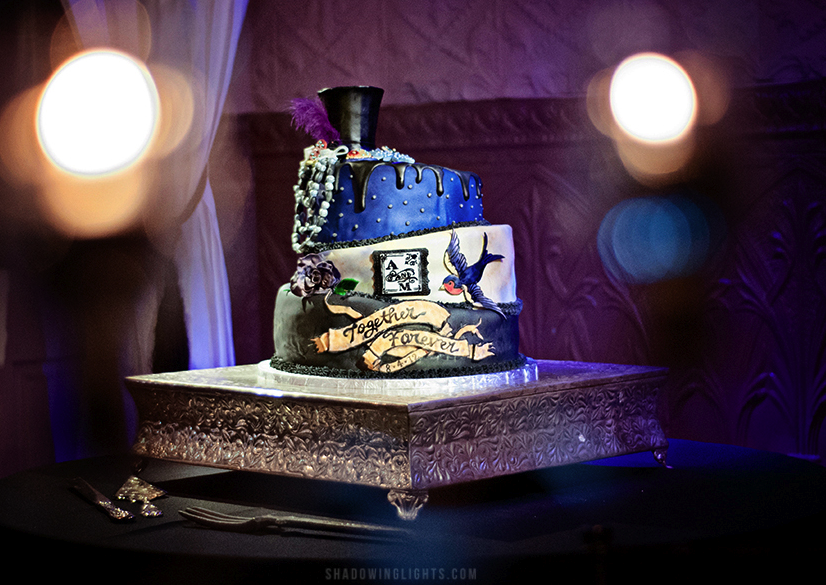
We created signs for a few things at the wedding along with a border to go with photos printed from their photo booth and a large poster of the couple that mimicked a movie poster. Lexi gave the graphics from the invitation to her baker and elements were added to their wedding cake. Neato!

Image by 

This wedding was a ton of fun to work on and it looks like the big day was a blast. Congrats!