menu

Emily & Shane

Emily contacted me last summer about creating a wedding invitation for her December wedding. She and Shane are both avid cyclists and they fell in love with the invitations I created for Melissa & Patrick. So I was happy to create something that fit the colors and style for their wedding. 

Emily was gracious enough to send me one of their invitations. They went with a gatefolded invitation with just one RSVP card insert.

IMG_7363.jpg

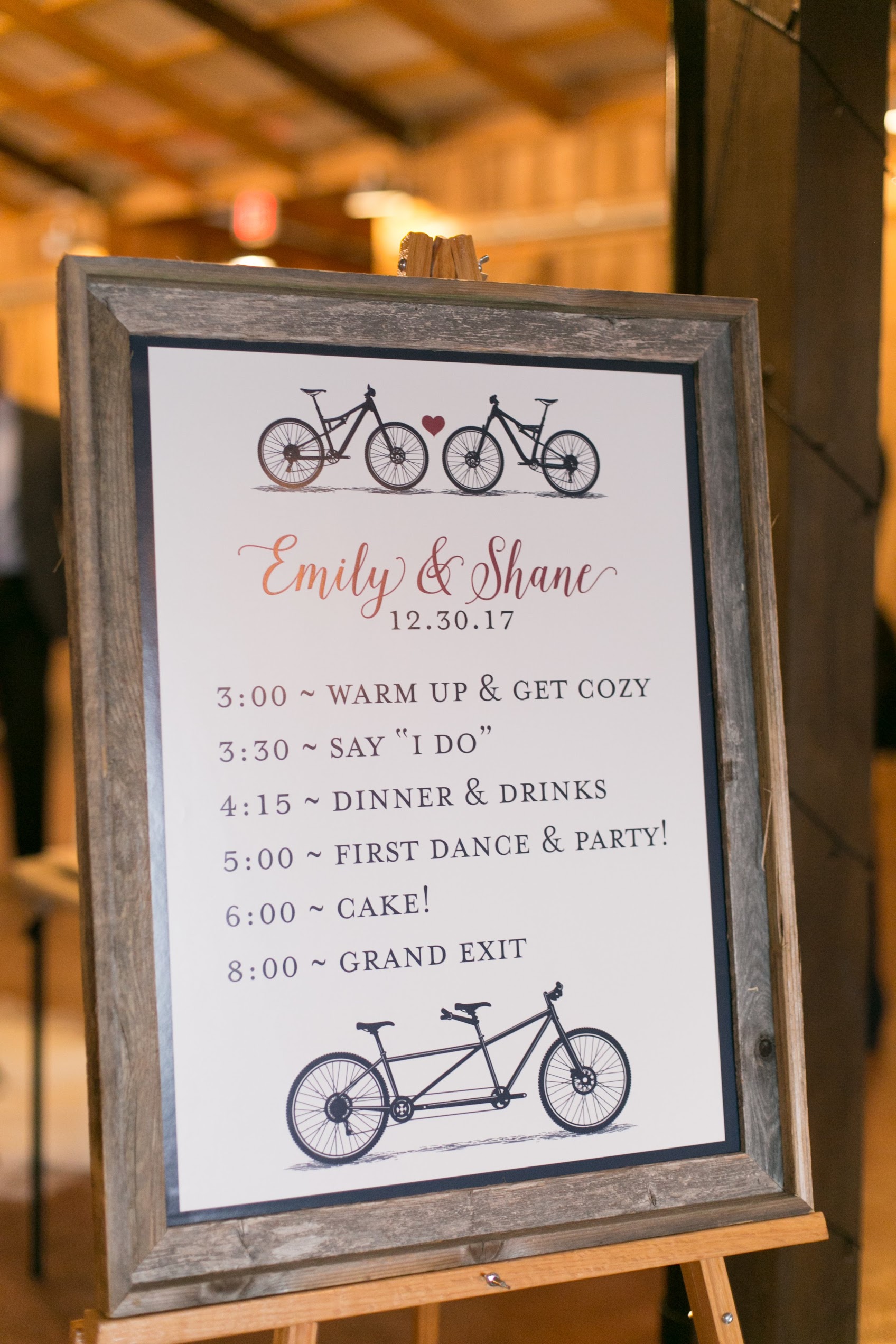
The sillhouettes of the bicycles and the tandem bicycle are all of Emily and Shane's actual bikes!

IMG_7355.jpg

They had everything printed on a lovely linen card stock, it really added a classy texture.

IMG_7356.jpg
Don't stress, I changed their address.

Don't stress, I changed their address.

For the wedding itself, we also created some fun signs. These photos were taken by their awesome wedding photographer Ashley Russ. If you click on any of the photos below, you'll head over to her website. 

This sign is my favorite: "I've got a fever! And the only prescription is more BIKE bell!" I wonder how many guests got the fun SNL reference. Guests wrote their well wishes onto the wood boards displayed in the background. It will make for some really cool wall art for their home.

Rather than print out a hundred or so programs for guests, they printed one large program that sat in an entryway for guests to know the afternoon's schedule.

They had a local food truck that specializes in fancy grilled cheese providing dinner for the evening. Yum!

It looks like it was a really lovely wedding, congratulations Shane and Emily!!
Nikki & Damienn

Since my website was hacked a couple of years ago, I'm still getting some older projects added back to my blog. Nikki and Damienn's is one of them. They got married back in 2010, but their invitation still deserves a spot in the blog.

Nikki was such an awesome bride to work with. She was planning a black tie wedding for their families and we wanted the invitation to reflect that. I think we succeeded. 

Extra thanks to Nikki for being gracious enough to send me an invitation and program so I could photograph them for my website. 

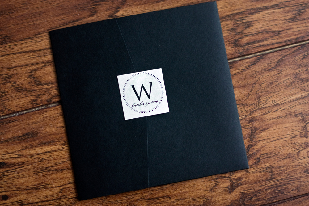
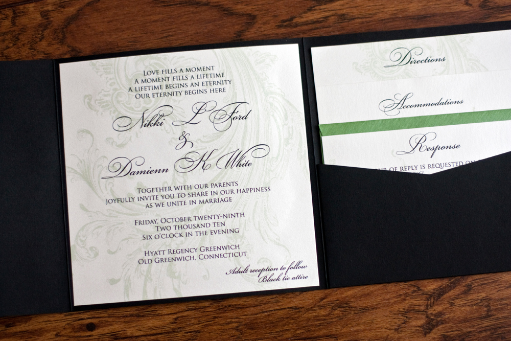
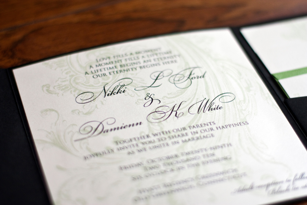
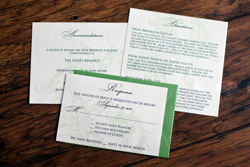
She went with Perfetto pocketfolds from Cards and Pockets in a matte black and the printed items were printed on a metallic pearl card stock. 

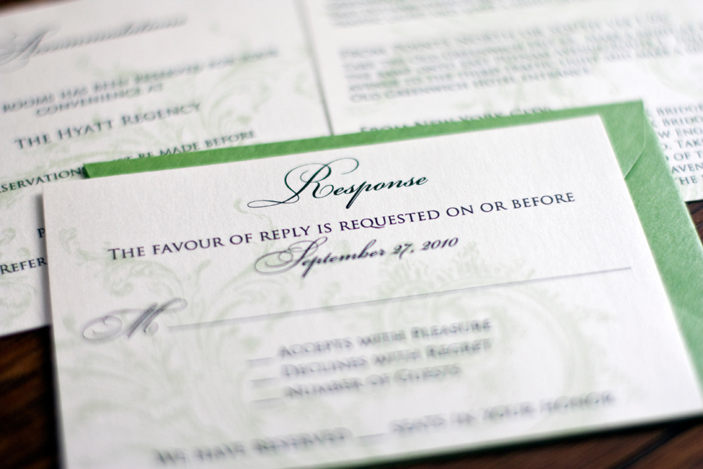
There were just three inserts and love the pop of color that came from the metallic green rsvp envelope. The color is Fairway, also from Cards and Pockets.

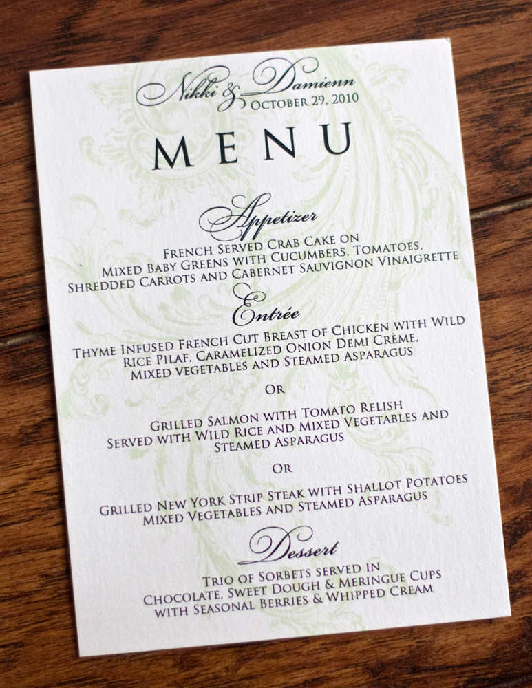
We continued with a menu that was set at each place setting at the wedding reception.

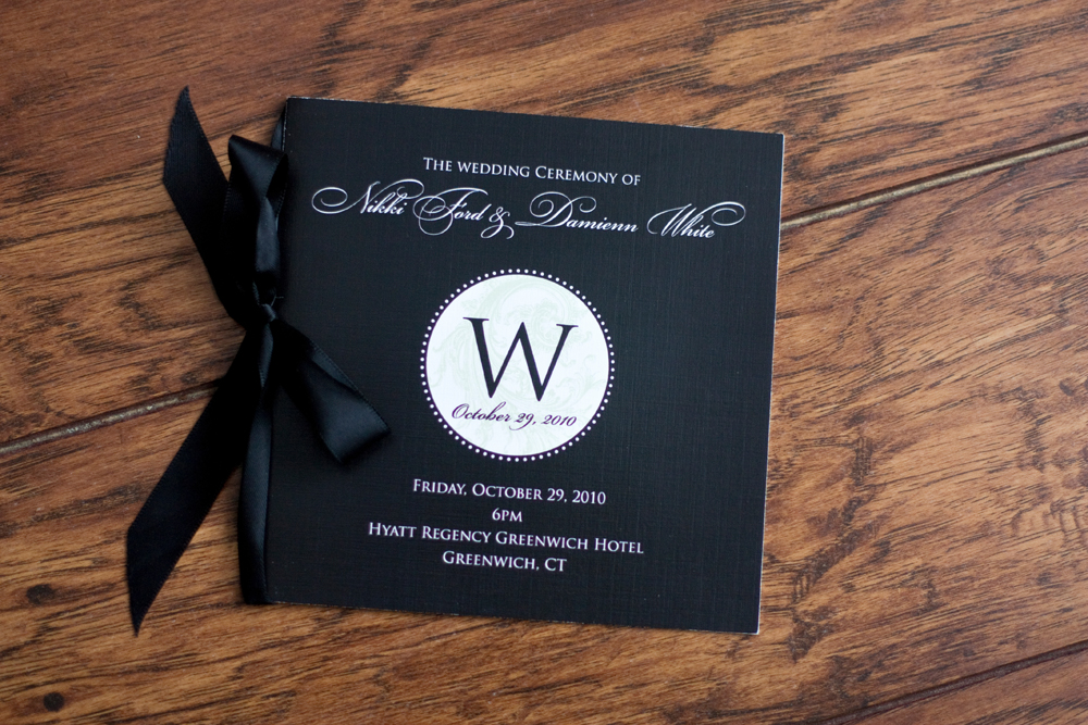
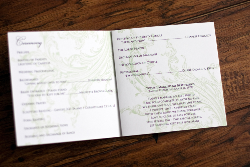
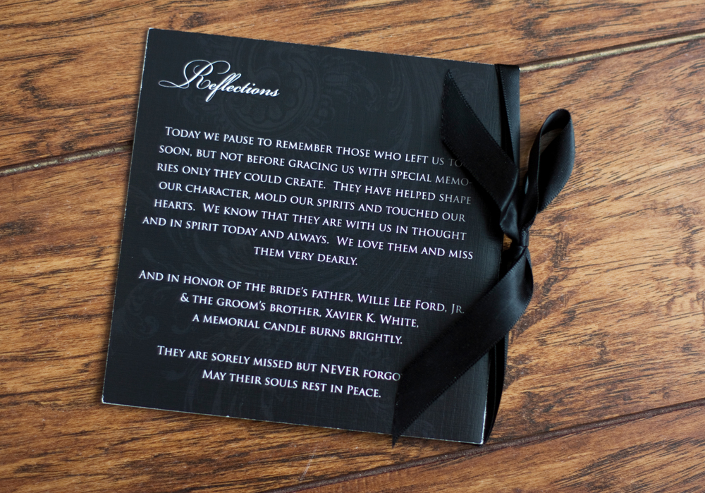
For a wedding program, Nikki wanted to go with an elegant booklet that was bound with black satin ribbon. Kudos to the printing company she used for getting these black covers looking so good.

The back cover said thanks to the friends and family members who couldn't be there for the wedding. It's not easy to see, but I was stoked to see that the flourish that we used on their invitations printed beautifully in the background of the cover.

I love how all of these turned out and I hope Nikki and Damienn have enjoyed married life for the last seven-ish years. 

Latiffe & Chris

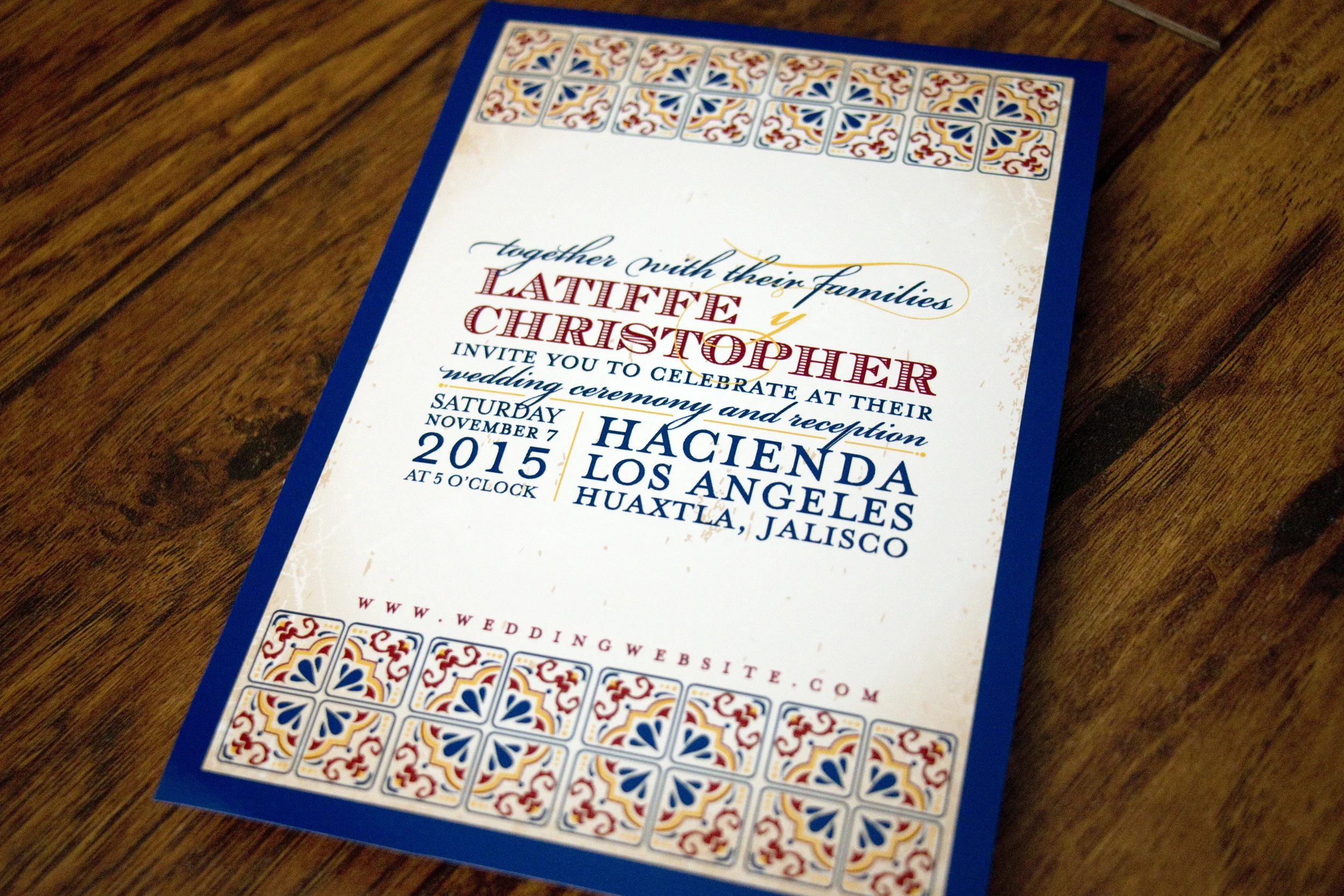
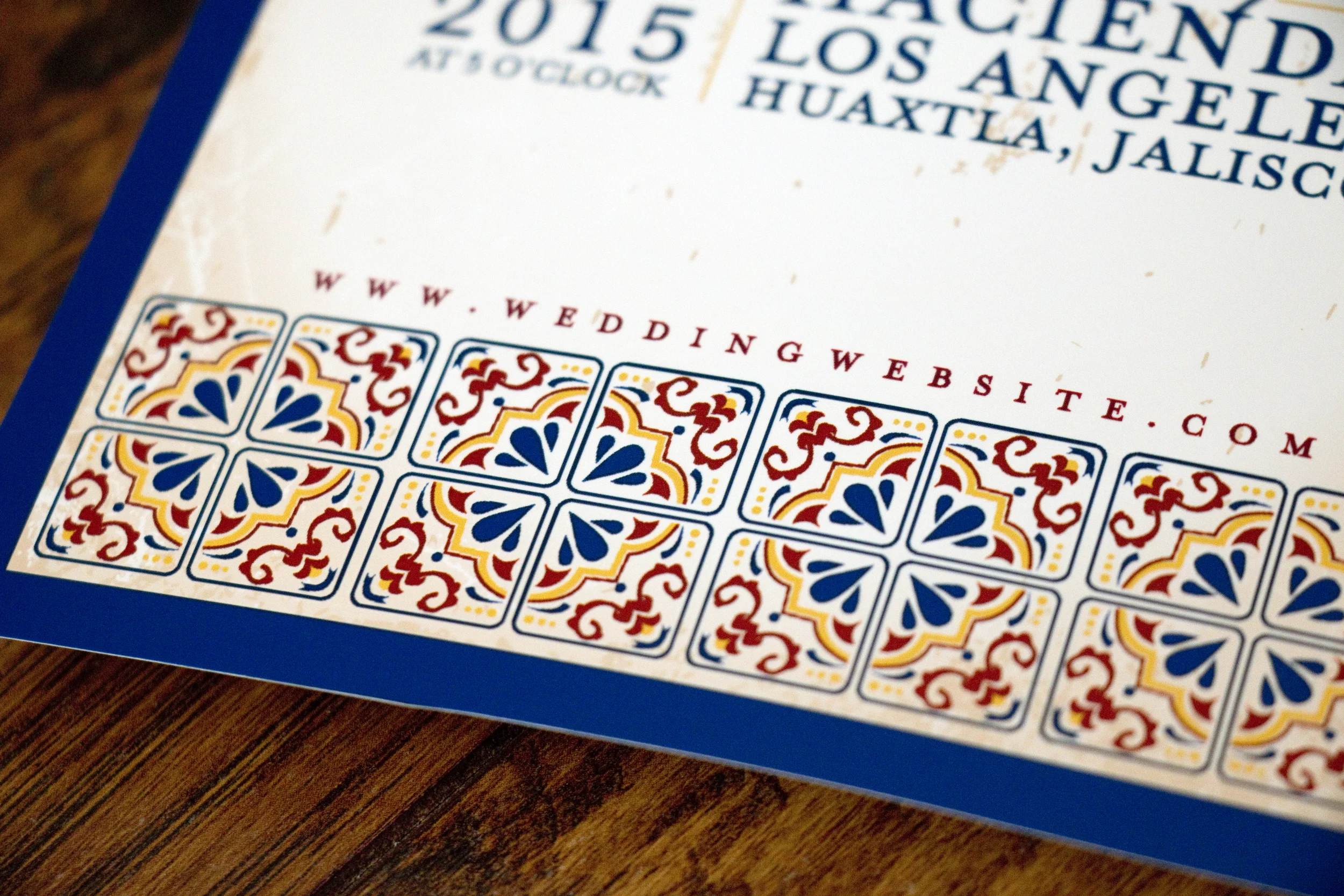
Latiffe and Chris had a gorgeous destination wedding in Guadalajara, Mexico and they wanted their invitations to reflect that in style. We discussed using papel picado graphics, but in the end decided on using Talavera tile as the graphic inspiration. I adore how everything turned out!

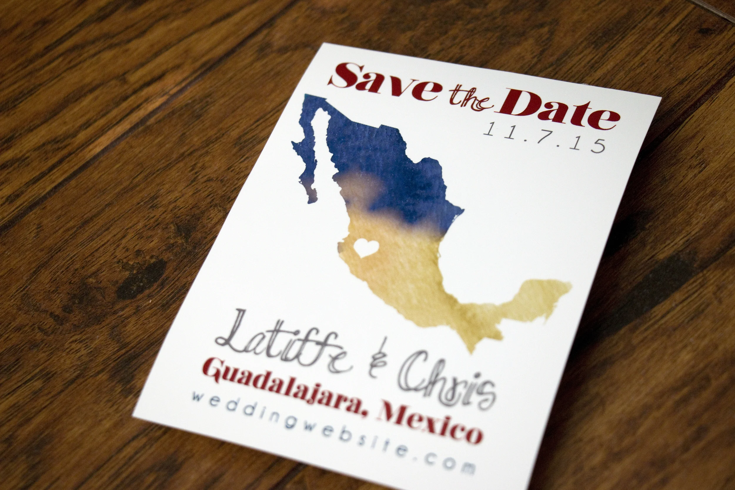
But first, here's the save-the-date we created for them. They wanted a simple silhouette of Mexico with an indication on where the wedding would take place.

Talavera style pottery comes from Puebla, Mexico (where Latiffe's family is from) and is known for bright colors, geometric designs and for having a white base glaze. It was a wonderful inspiration for this invitation and really fun looking at a variety of beautiful pieces for inspiration.

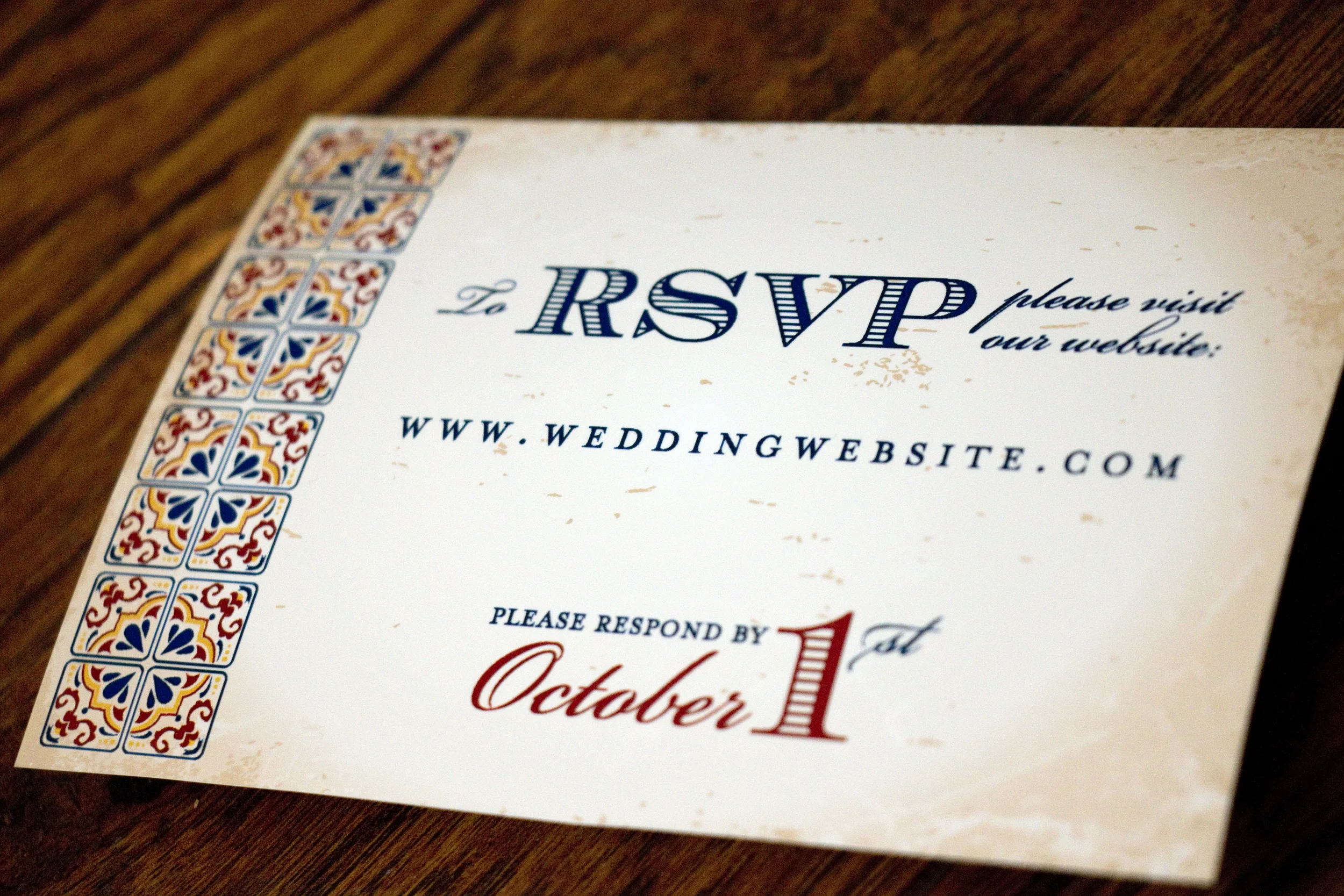
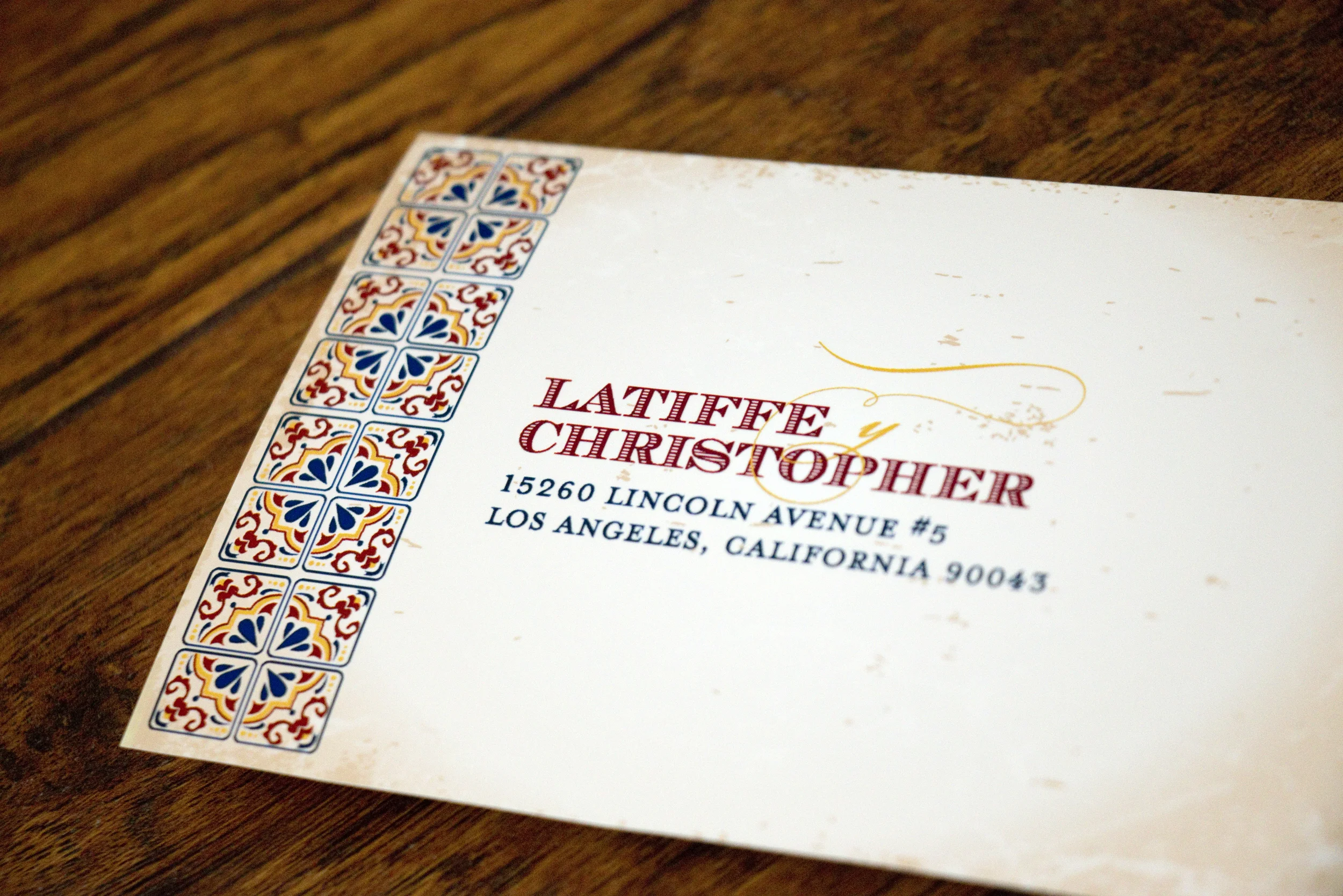
For their RSVP card, we did a very simple, two-sided postcard that directed guests to RSVP on the couple's wedding website. I've changed the URL and their address to protect privacy.

Don't worry, I changed their address!

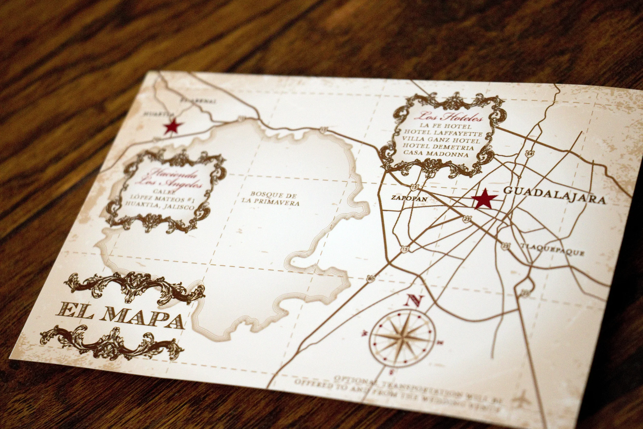
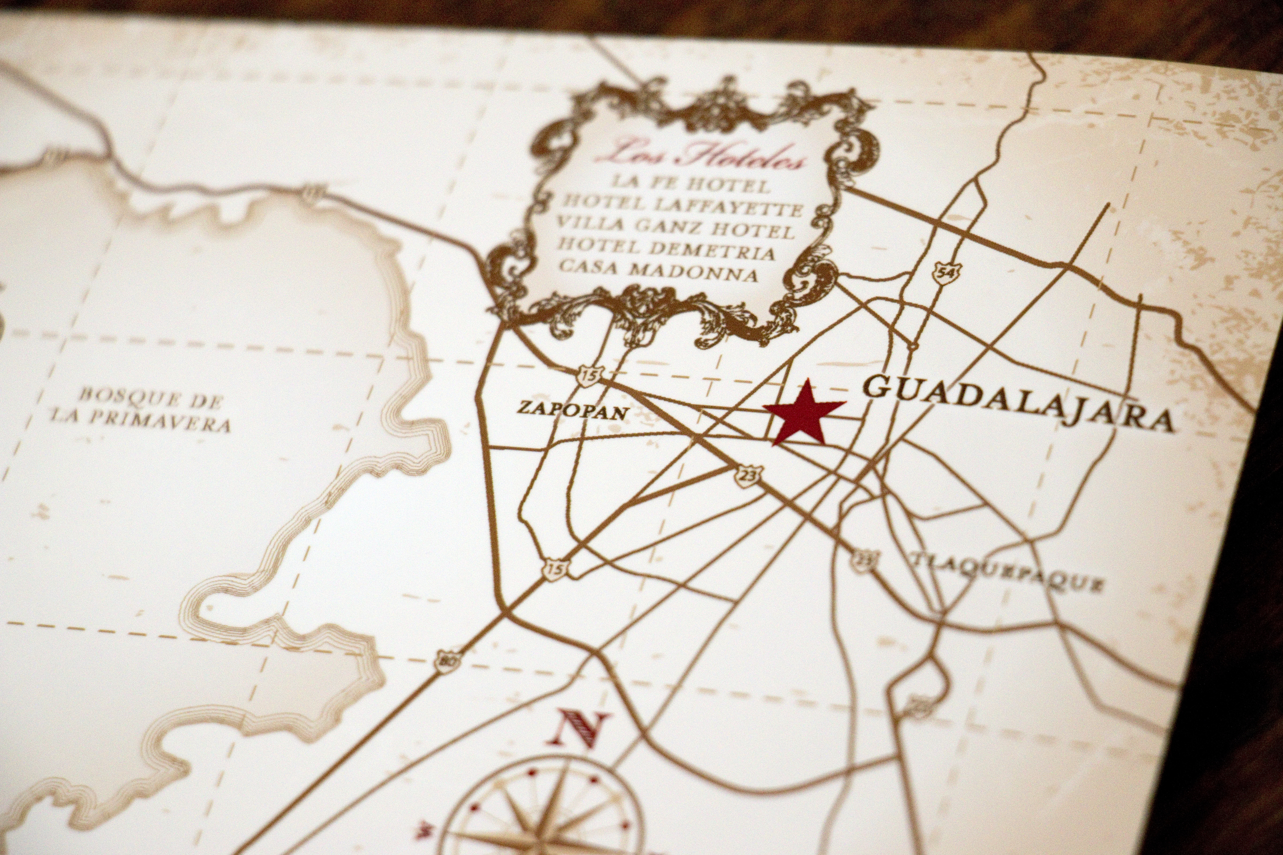
Latiffe asked me to make the map to look a little like a vintage treasure map and I was happy to oblige.

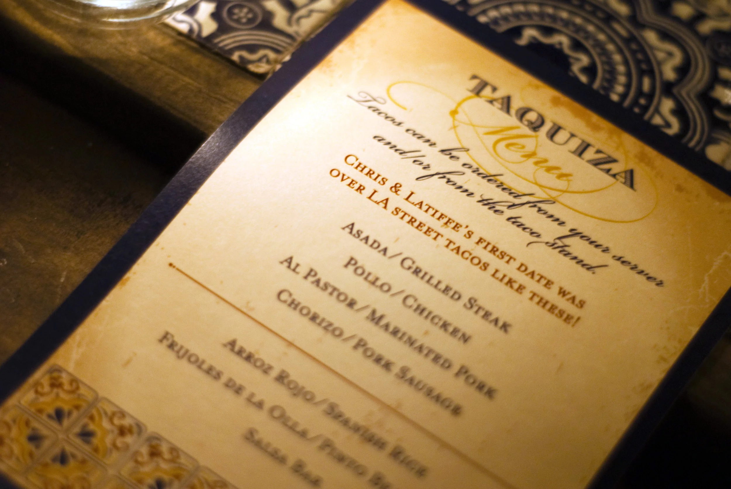
At the wedding reception, they had a taco stand making street tacos for their guests, and I created a menu that sat at each place setting. Photo Cred: Rocio Luna Weddings

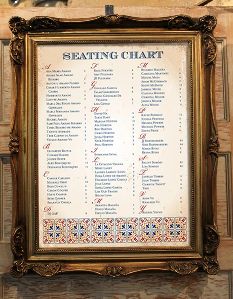
We also created a large seating chart that let guests know where to sit. We weren't able to get a photo of it at the wedding, but this is a mockup of what it looked like:

The wedding looked absolutely gorgeous and it's one I wish I could have attended in person! Congratulations guys!!

Kari & Nathan

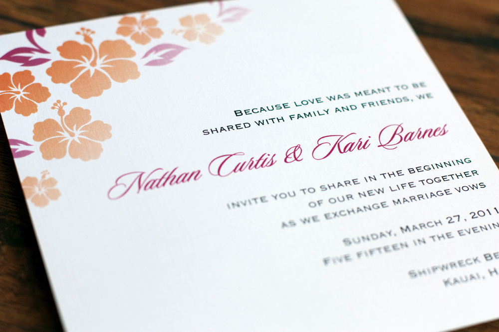
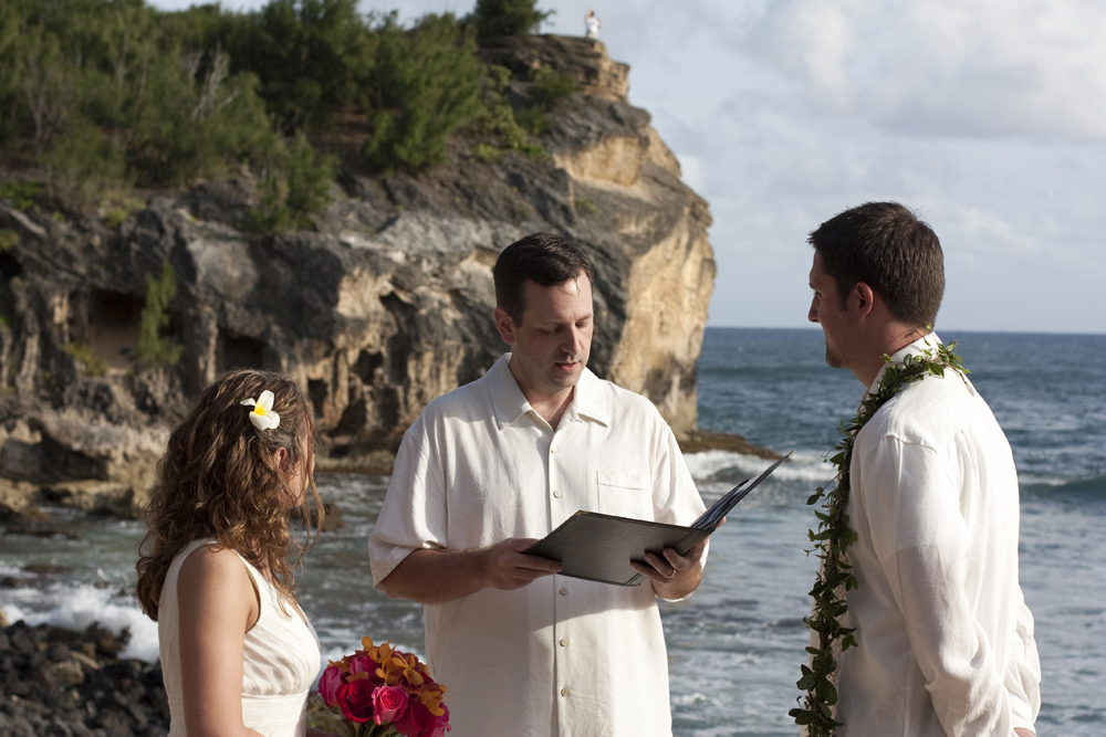
My cousin, Kari and her fiancé, Nathan were planning a destination wedding in Kauai and they loved the invitations I created for Joanna and Matt. So we stuck with the same basic design and added elements to make it their own. 

Everything was printed on linen card stock by Cards and Pockets. We also created wraparound address labels and the envelopes were from Paper Source. 

Friends and family members who had already committed to attending were the only ones who received an invitation. The inserts included a map to the ceremony and reception. (This was the very first time I saw less-than-stellar print quality come from Cards & Pockets. The blocks of color didn't print as vibrant as they should have.)

There was also an invitation to attend a luau with the bride and groom and their family in lieu of a traditional rehearsal dinner.

The back showed a map on how to get there.

This was one destination wedding I was thrilled to get to attend!
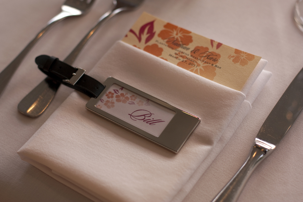
The long tables were decorated with orchids and ripe pineapples that smelled amazing. At each place setting was a menu that I designed with their graphics and an engraved luggage tag that served as both a place card and a wedding favor. Each guest's initials were engraved on the back of the luggage tag.

It was an absolutely GORGEOUS wedding and such an honor to get to contribute a little, take some photos, and share the special day with Kari and Nathan. 

Congratulations!!

Melinda and Alex

I had the pleasure of working with Melinda on the items for her June wedding. She wanted to go with a winery theme, but she didn't want grapevines or grapes on the invitations. She saw the wine ring invitations I created for Allison and Eion and she wanted to do something similar.

Many thanks to Melinda and her wedding photographer for the lovely photos!!
JF Hannigan Photography

Images by JFHannigan

Images by JFHannigan

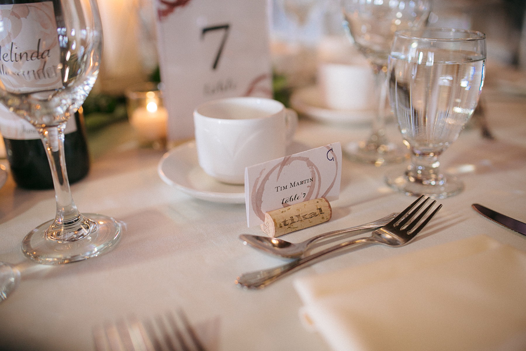
We also created place cards and table numbers for the reception.

Image by JFHannigan 

Image by JFHannigan 

Image by JFHannigan

Image by JFHannigan

Image by JFHannigan

Image by JFHannigan

Image by JFHannigan

Image by JFHannigan

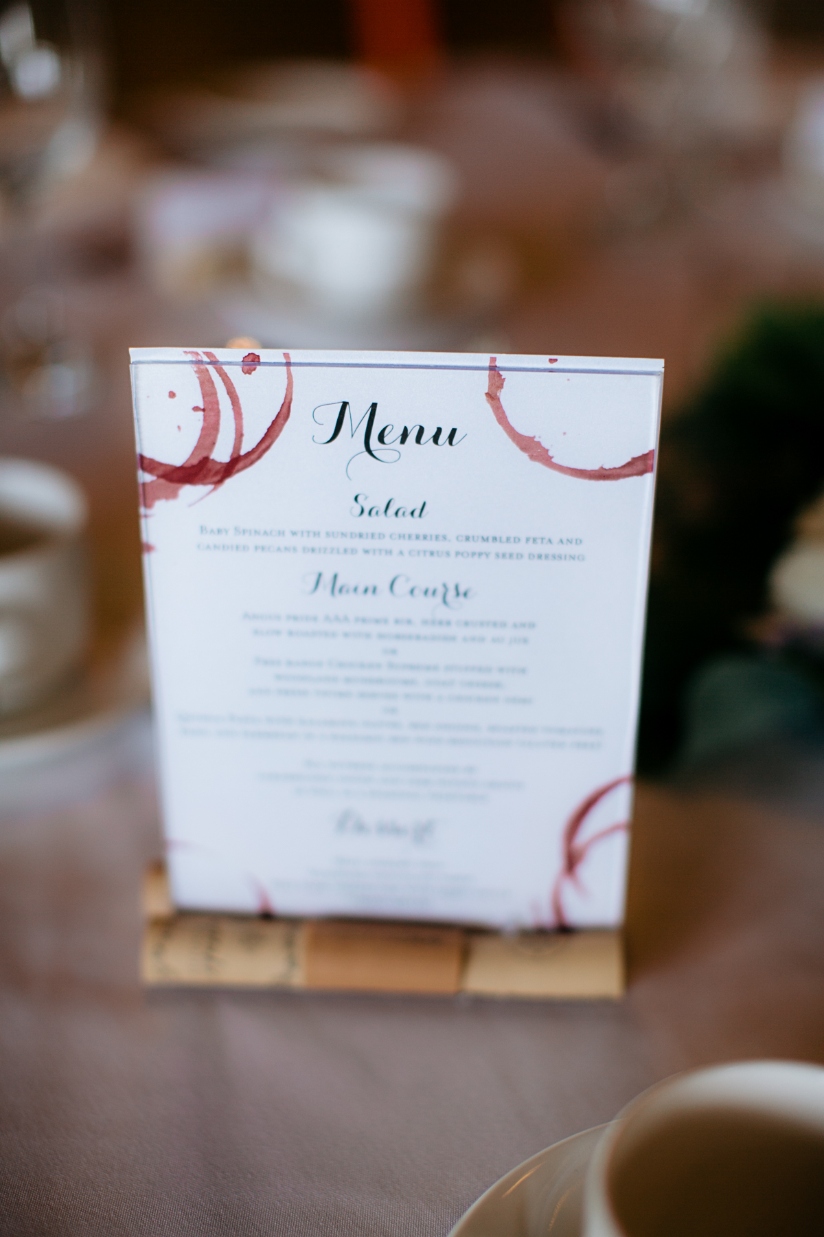
A menu also sat at each table.

Image by JFHannigan

Image by JFHannigan

Last we created a seating chart that Melinda had framed with wine corks. It turned out so awesome!

Images by JFHannigan

Images by JFHannigan

Thank you again Mel and congrats!!