My kids and I have been students of taekwondo for about a decade. My oldest and I both have our 1st Dan black belts and my youngest will test for his this spring. You can read about my TKD journey here and here.
I have done a lot of graphic design work for our studio over the years too. My taekwondo master is involved with the Utah State Taekwondo Association and last month she asked me to create a poster for a state championship tournament.
We haven’t had a state tournament in Utah since 2019. In 2020, all tournaments were cancelled (remember that pesky pandemic?). Then, when tournaments started coming back, USA Taekwondo changed things up. They created regional Grand Prix tournaments that were required for athletes to qualify for Nationals. This essentially rendered our state tournament moot.
Martial arts tournaments are expensive to run and difficult to organize, so I get it. Why put on a tournament if we don’t have to? My kids competed in 2022 because our West Grand Prix was in Reno, NV (driving distance for us) and Nationals was home in Salt Lake City. Last year, we opted out of taekwondo tournaments because they were in Portland, OR and Jacksonville, FL. That was more expensive travel than we wanted to do.
USA Taekwondo has decided that our state tournament can be a qualifier for athletes who want to compete at Nationals… they just have to win gold or silver in their event(s). Awesome news for our athletes and even more awesome for athletes who want to get a little tournament experience, but want to have to travel to get it.
Back to the poster…
I did a quick Google search for taekwondo posters to see what others have done in the past. Most have photos of taekwondo athletes and since we haven’t had a tournament since 2019, I didn’t want to use old photos. Instead, I searched through my own photos of athletes from our studio at various events over the years and turned them into cartoons using Procreate on my iPad.
First I made a save-the-date graphic. I didn’t even know the tournament venue yet!
These are the two photos that I used for this first graphic. I took them at a sparring event we hold every few months at our studio. The first photo is of my son sparring his friend attempting to kick him in the head. He missed, haha!
I drew the athletes on separate layers and exported them separately so I could move them around independent from each other. This allowed me to make my son look a little larger and more proportional to his opponent, who’s like six inches taller than him. It also let me adjust the two girls sparring so Irene is making better contact with her opponent.
Oh, the random stuff that went through my head when creating these… including having to put them all in long-sleeved, white uniforms, gloves, and competition footwear called Daedo socks.
Most tournament posters feature sparring athletes because, let’s be honest, it’s one of the most exciting events to watch. Now that I know more about other events, like poomsae (forms), I enjoy them, but sparring always draws the most spectators.
Even so, I wanted to include more events, so off to my photo archive I went. This is the final poster once they figured out a venue and the little details:
Here are the various photos I used:
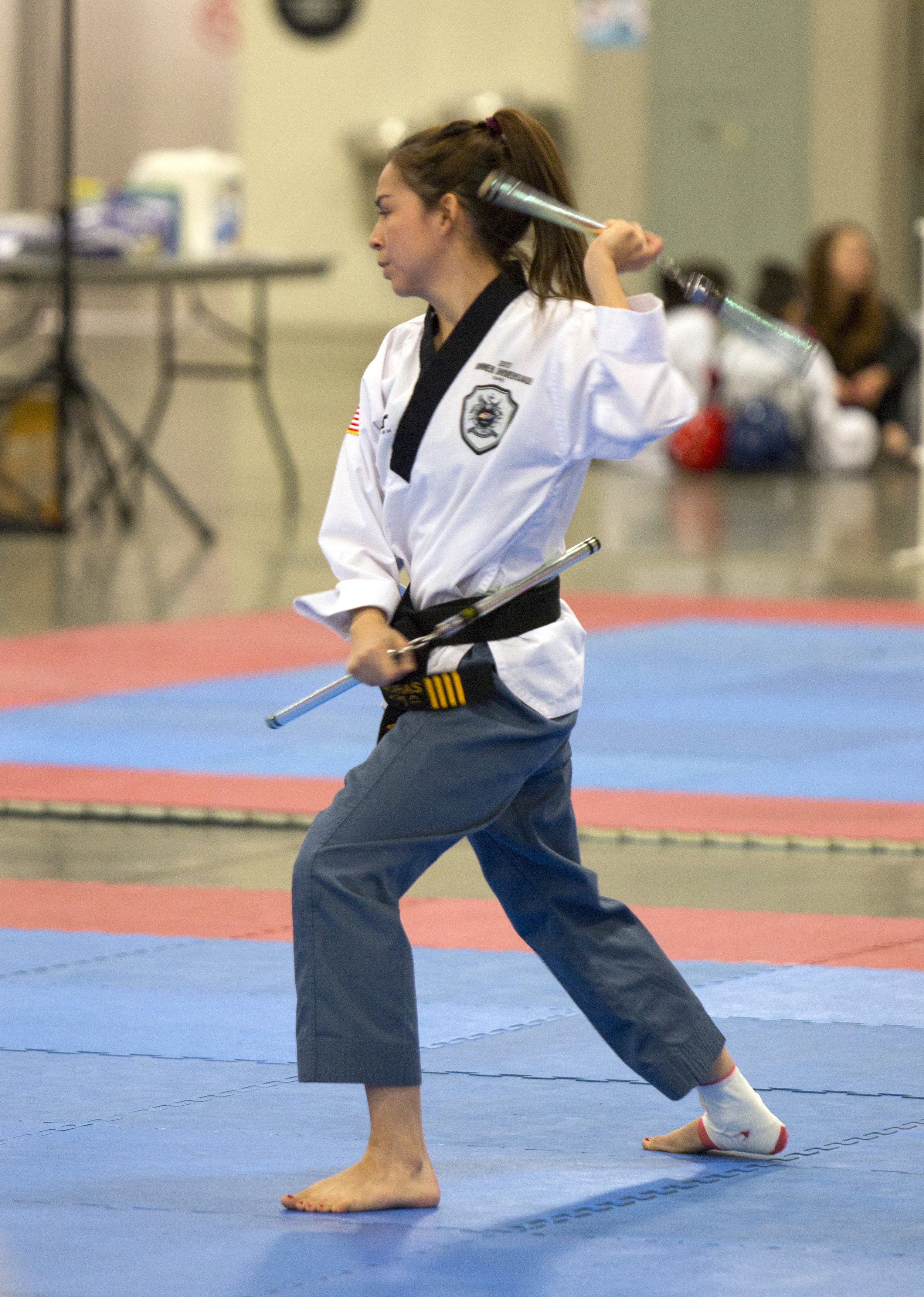
I snapped this photo at the 2018 state tournament of one of my instructors, Master Samy Moras as she competed in nunchucks. I was still learning the right settings for shooting indoors, hence the motion blur. She composed a YouTube video about that tournament you can watch here.
This photo is from the same state tournament of my friend Liam, doing a flying side kick as part of his board breaking routine.
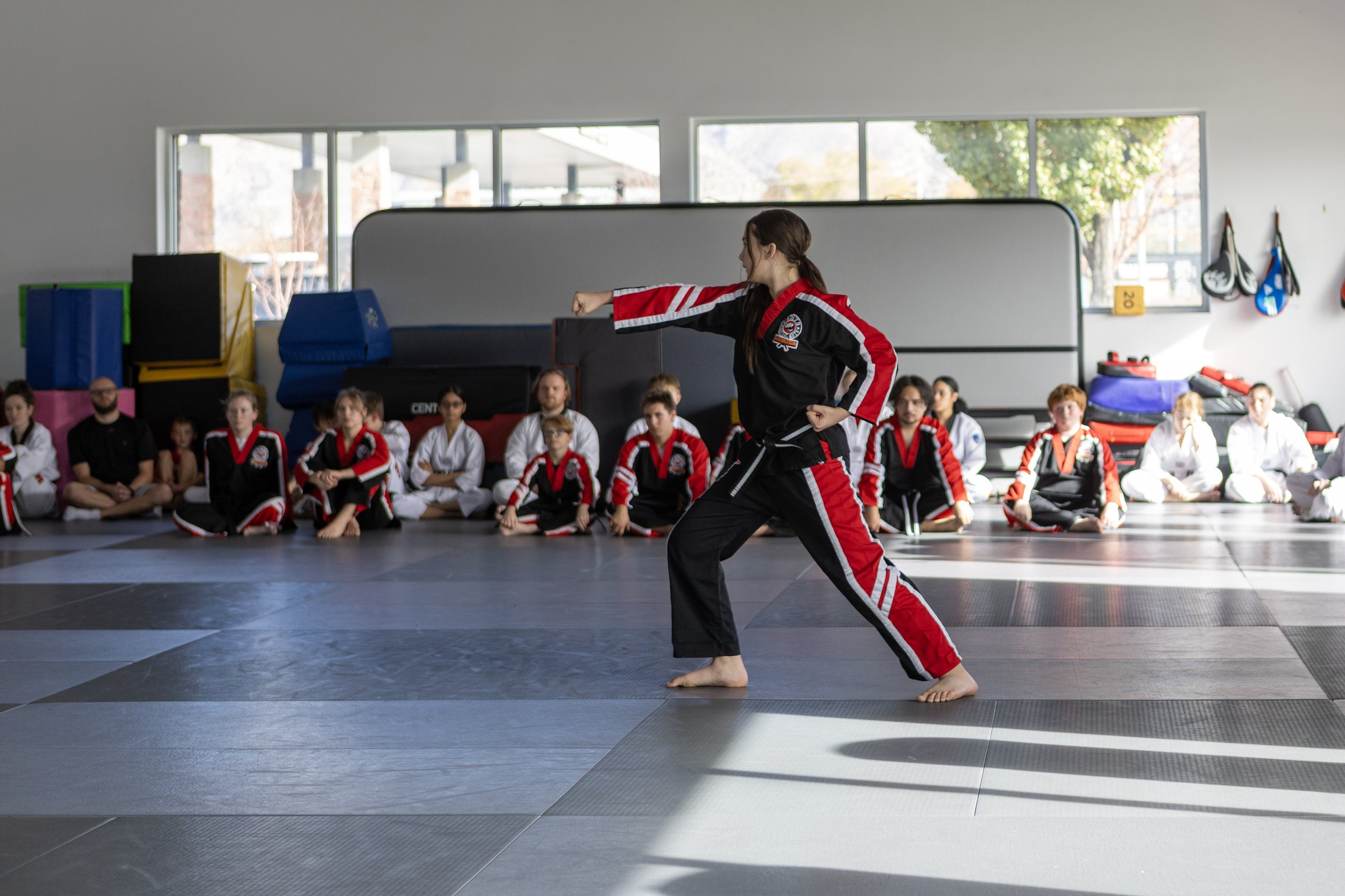
A fellow student, Breanna demonstrating the black belt form keumgang in last spring’s black belt test. She was testing for her 2nd Dan black belt.
A former instructor, Logan doing a beautiful flying side kick during his 2nd Dan black belt test a few years ago.
A fellow student, Mirai, demonstrating poomsae during her black belt test last year.
I’m pretty happy with how the final poster turned out. I even managed to redesign the Utah State Taekwondo Association logo to something a bit more legible. Their old logo used a tough font to read and it never actually said “Association” on it. It said “Championships.” That redesign was tweaked even more this week to the final logo below:
What a fun project to work on! It was really soothing working in Procreate on these drawings and having fun with the folds and wrinkles of the uniforms. Plus, I was able to take my iPad with me to the trampoline park when my kids had a play date.
Now the most pressing issues: Are my kids going to compete? Am I??? My kids have done it before. They’ve competed in sparring, poomsae, and board breaking. I’ve never competed. I’ve never wanted to spend the money or stress about having to learn and essentially cram new poomsae in a short period of time. So we’ll see.