weddings

Raquel & Mark

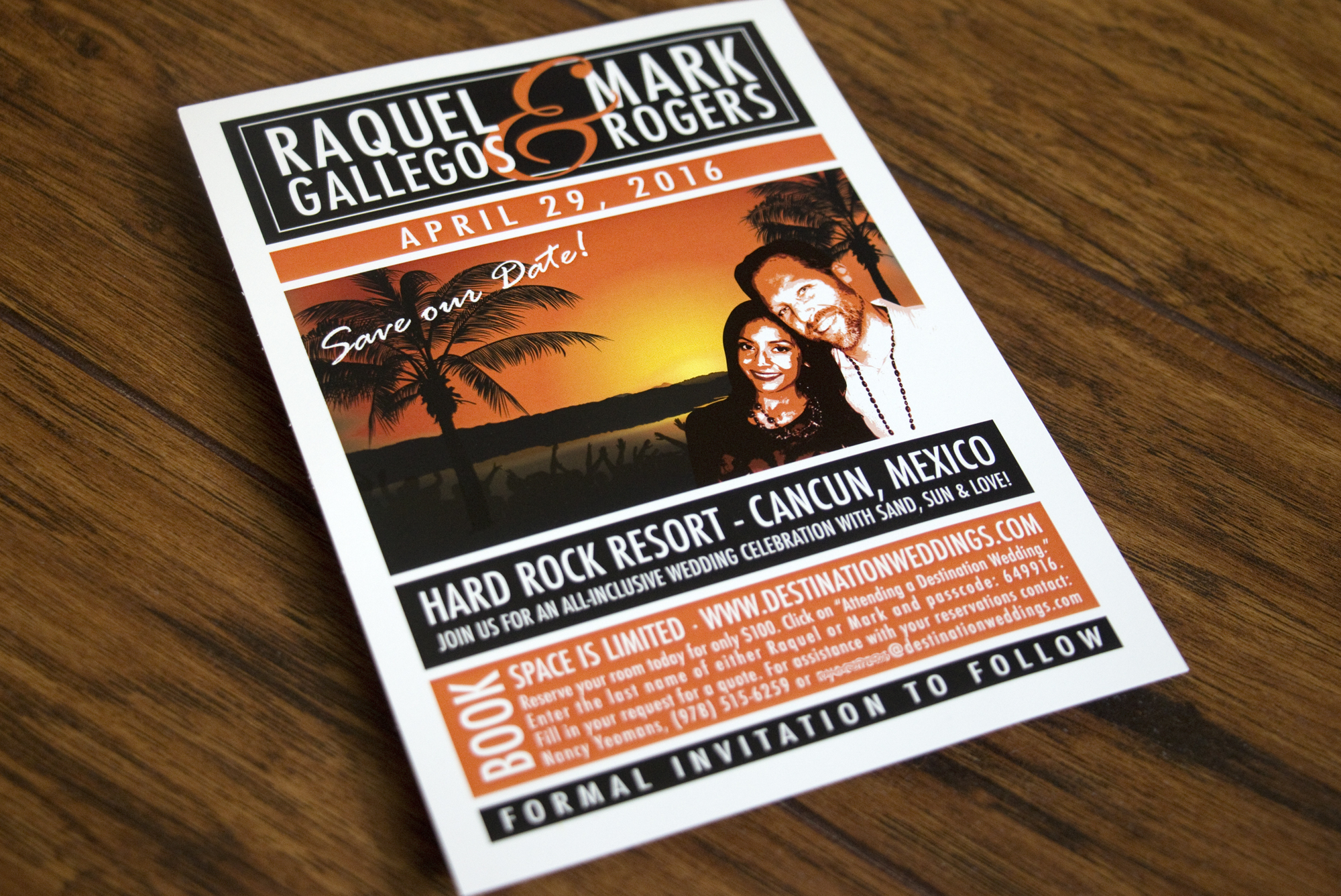
I had the privilege of working with Raquel on the invitations for her wedding a few months back. She and Mark were planning a destination wedding at the Hard Rock Resort in Cancun, Mexico.

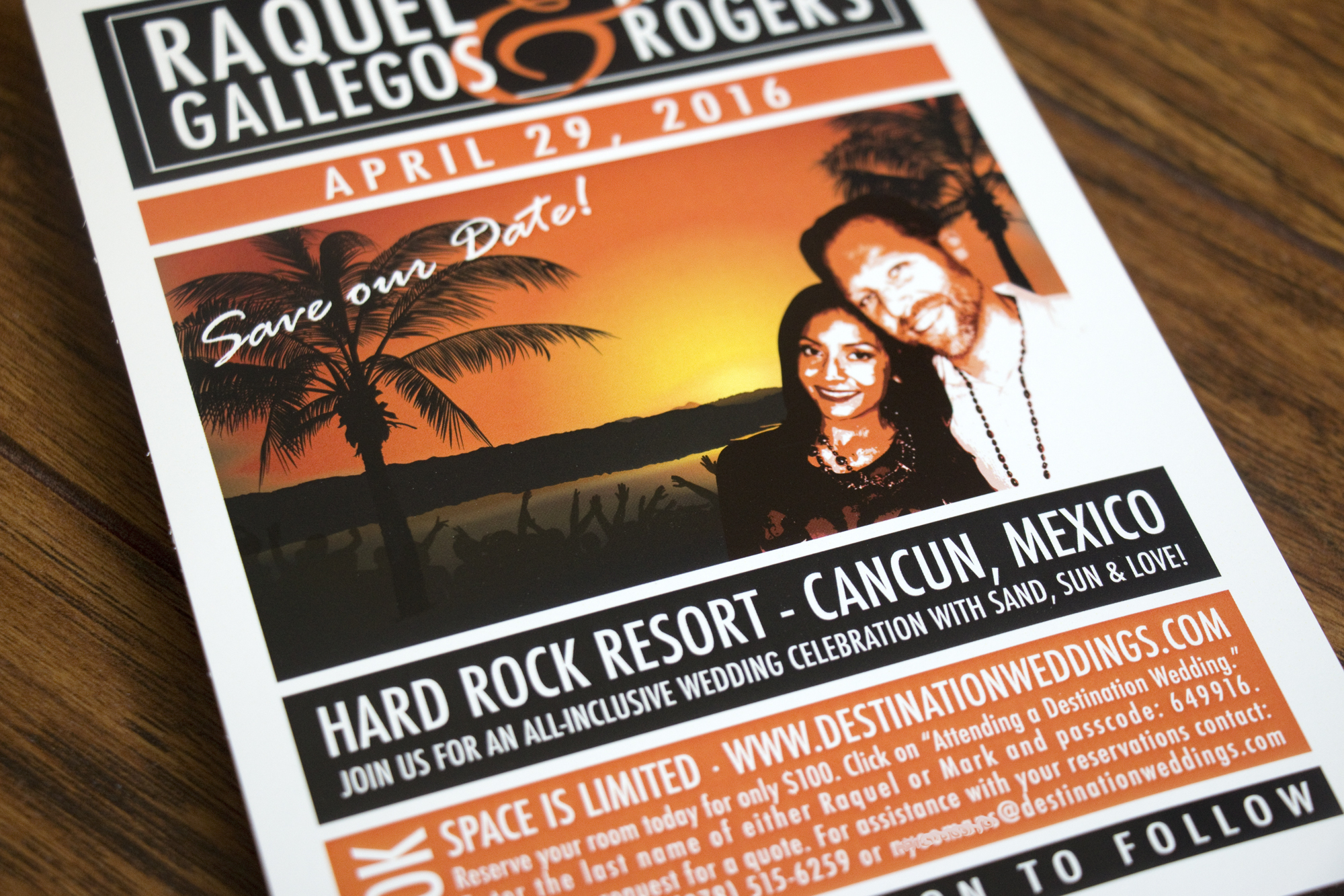
First we did a fun safe-the-date. She wanted to incorporate a little bit of a concert poster vibe and also let her guests know they if they were planning to come, they needed to book their trip as soon as possible. 

Can you see their adoring fans, subtly in the background of their sunset. The reservation information has been changed to protect privacy.

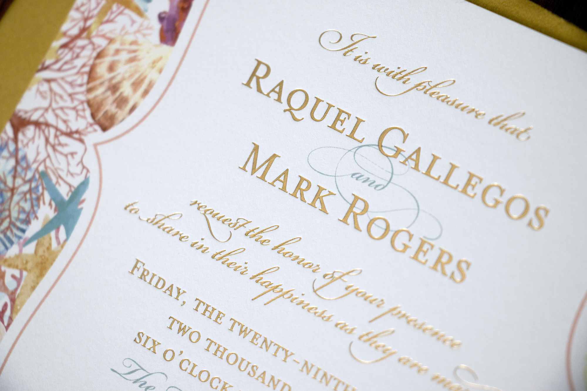
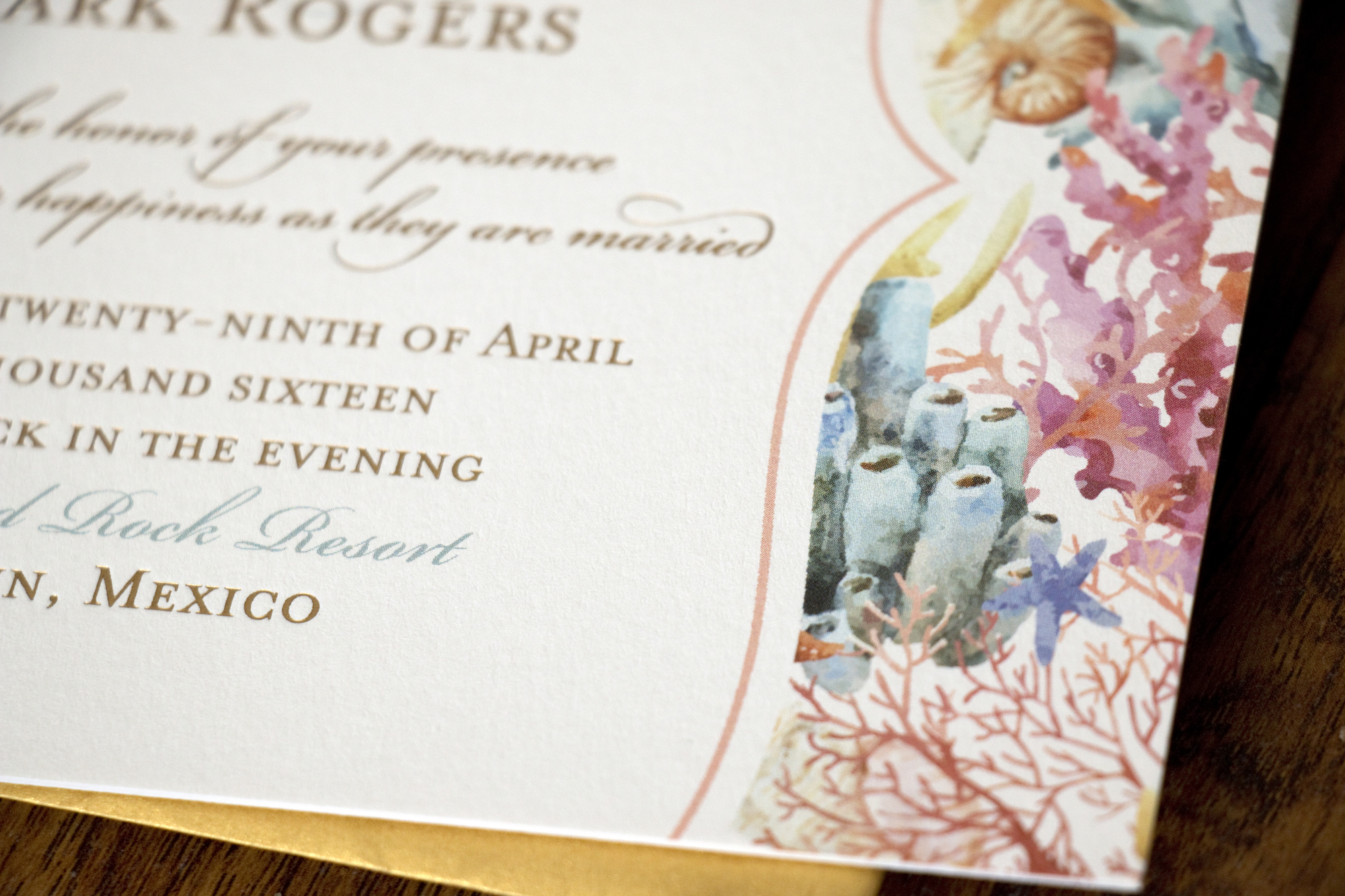
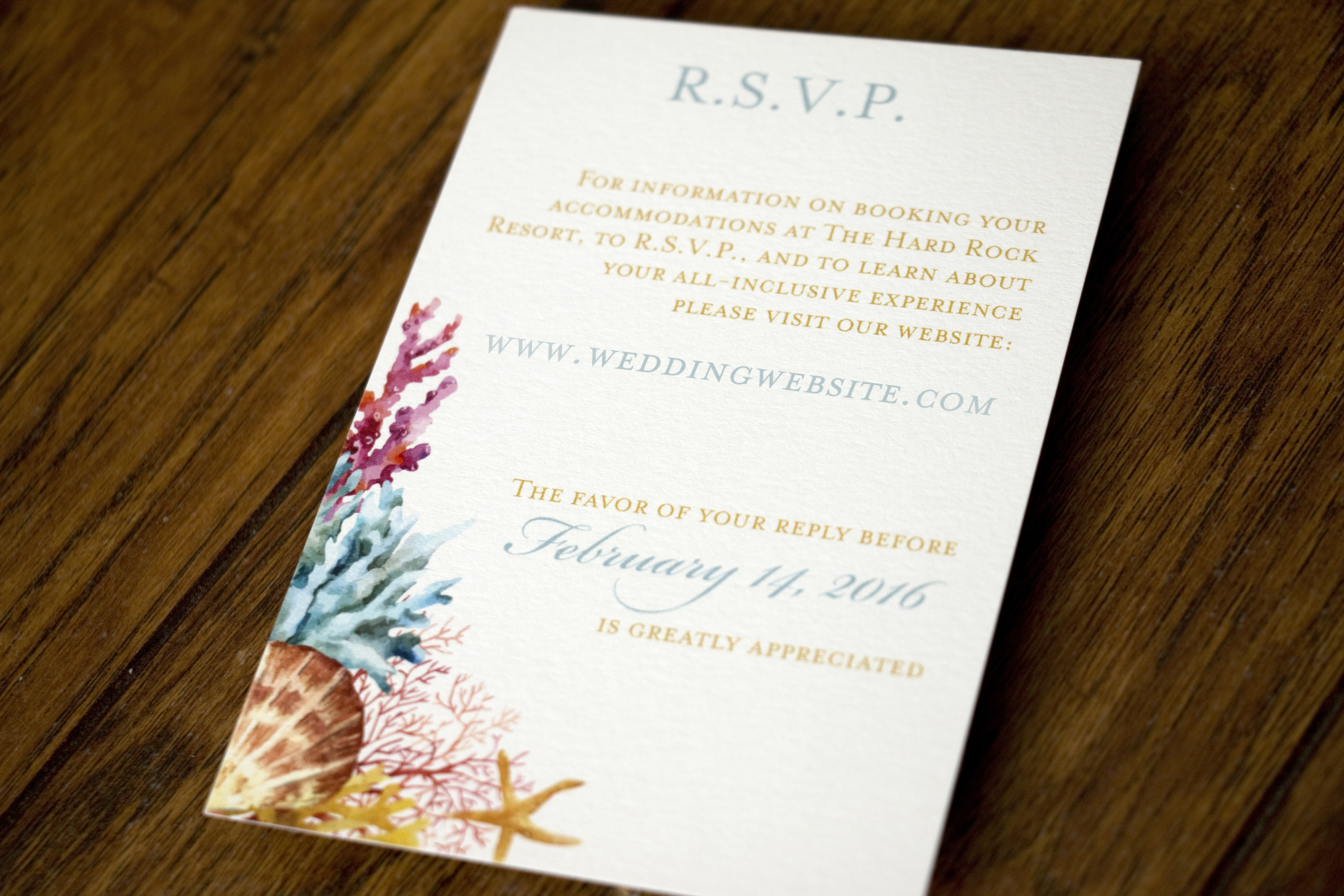
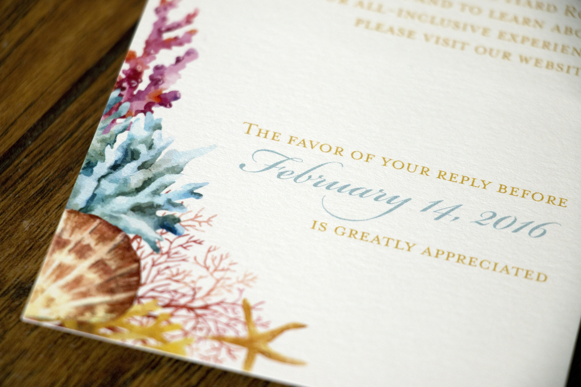
When it was time to create their wedding invitations, they wanted to incorporate ocean life in watercolor and have it look very elegant. I really love how they turned out!

The upgraded their printing and had the gold text printed with metallic gold foil. I LOVE how it turned out!!

We did a simple RSVP card that directed guests to share their responses on the couple's wedding website. I changed their website URL to protect privacy.

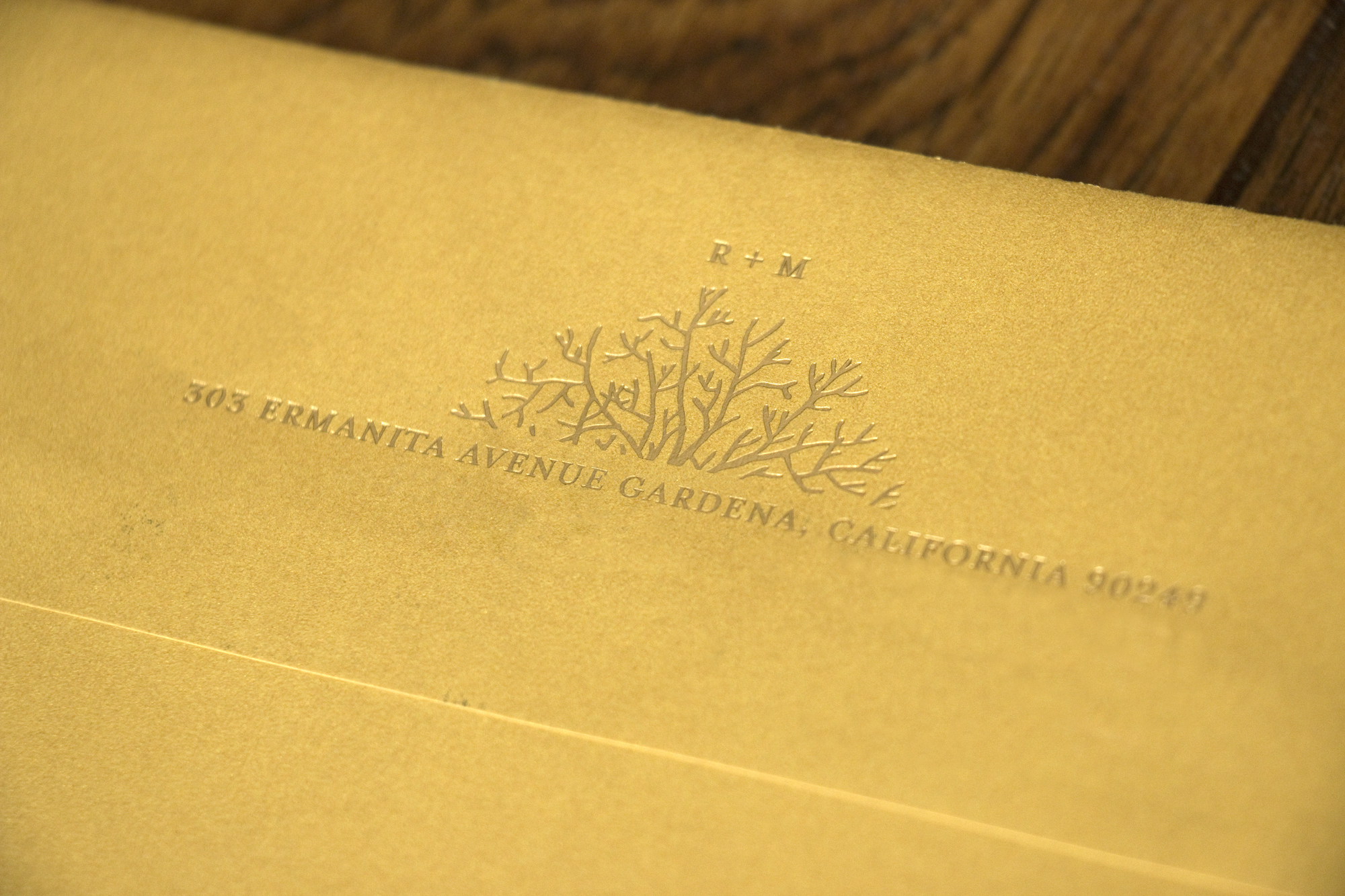
Lastly, I created a simple coral graphic that they had printed in gold foil on the back of their gold envelopes. This was such a subtle detail that I really love. And yes, I changed their address in Photoshop. 

I am so in love with how this invitation turned out, it almost makes me want to plan another wedding. Almost. 

Congratulations Mark and Raquel, I hope your Cancun wedding was amazing!!
Kari & Nathan

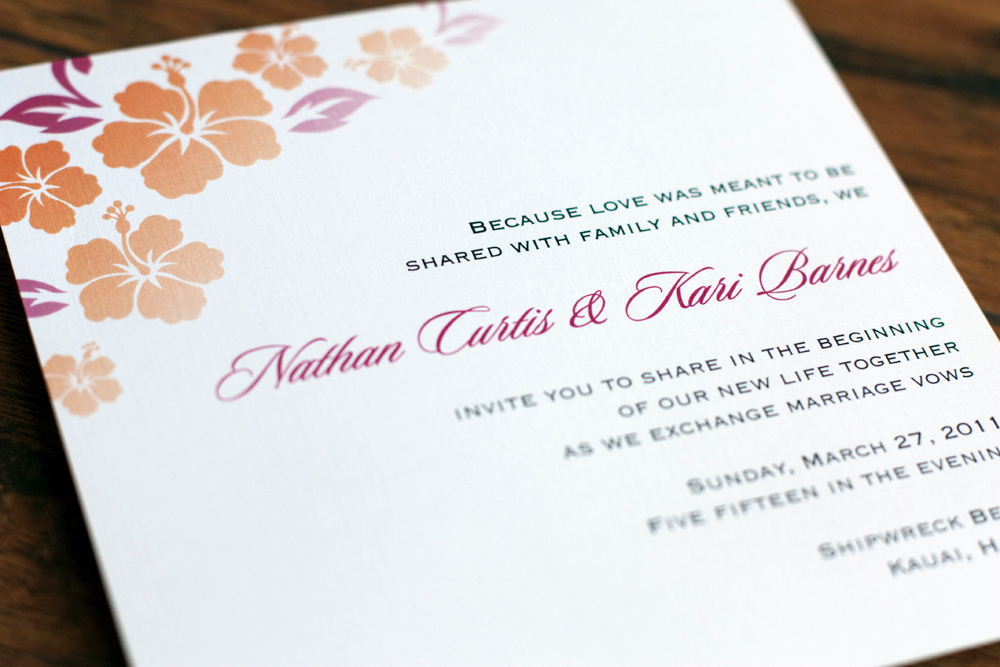
My cousin, Kari and her fiancé, Nathan were planning a destination wedding in Kauai and they loved the invitations I created for Joanna and Matt. So we stuck with the same basic design and added elements to make it their own. 

Everything was printed on linen card stock by Cards and Pockets. We also created wraparound address labels and the envelopes were from Paper Source. 

Friends and family members who had already committed to attending were the only ones who received an invitation. The inserts included a map to the ceremony and reception. (This was the very first time I saw less-than-stellar print quality come from Cards & Pockets. The blocks of color didn't print as vibrant as they should have.)

There was also an invitation to attend a luau with the bride and groom and their family in lieu of a traditional rehearsal dinner.

The back showed a map on how to get there.

This was one destination wedding I was thrilled to get to attend!

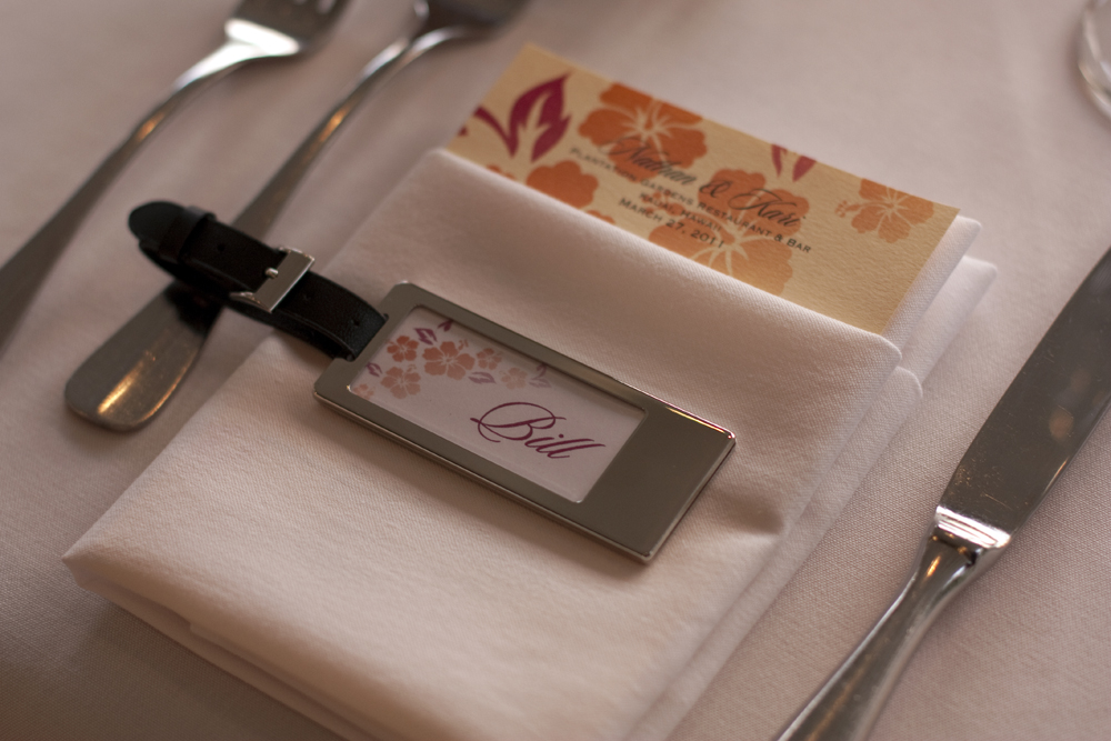
The long tables were decorated with orchids and ripe pineapples that smelled amazing. At each place setting was a menu that I designed with their graphics and an engraved luggage tag that served as both a place card and a wedding favor. Each guest's initials were engraved on the back of the luggage tag.

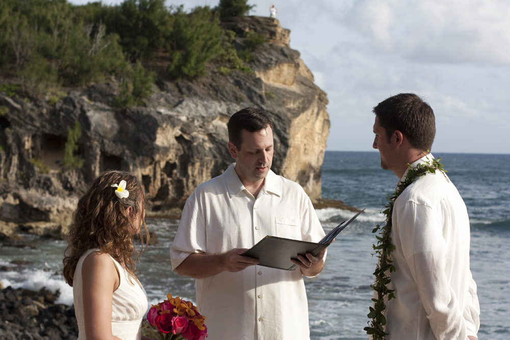
It was an absolutely GORGEOUS wedding and such an honor to get to contribute a little, take some photos, and share the special day with Kari and Nathan. 

Congratulations!!

Sharon & Cesar

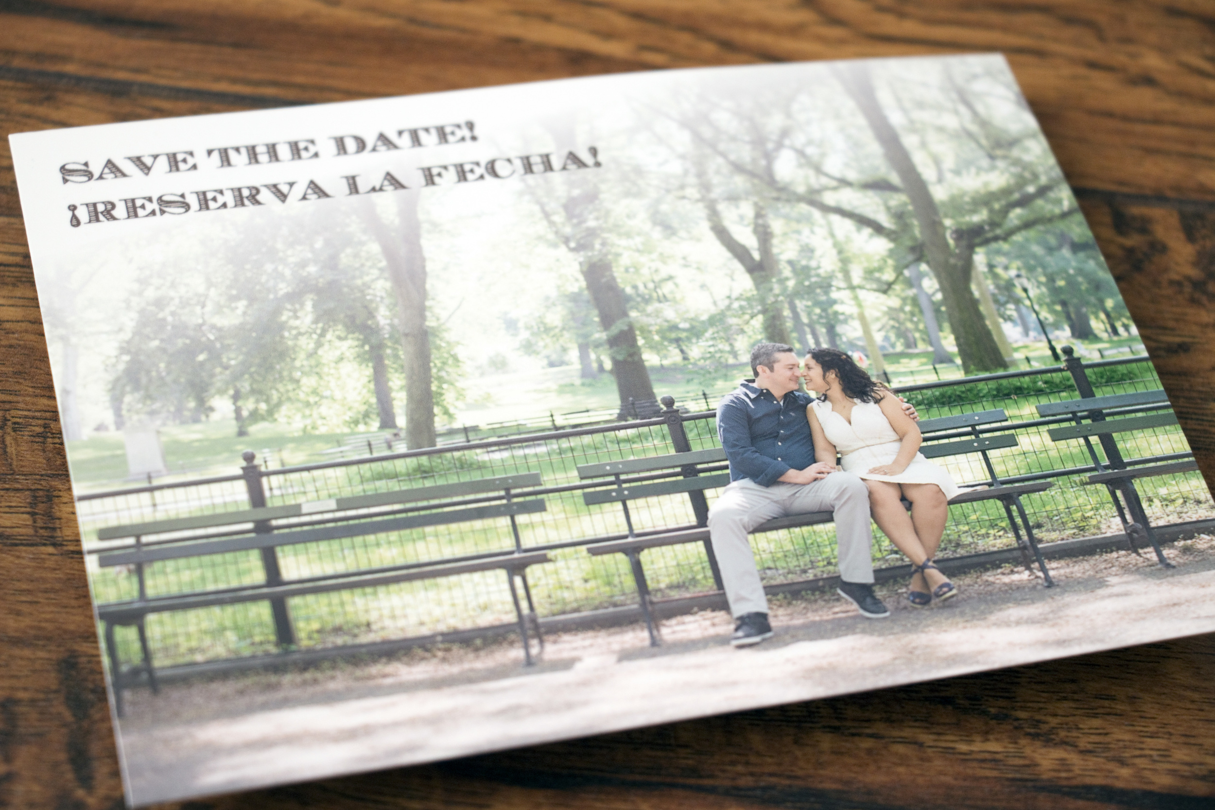
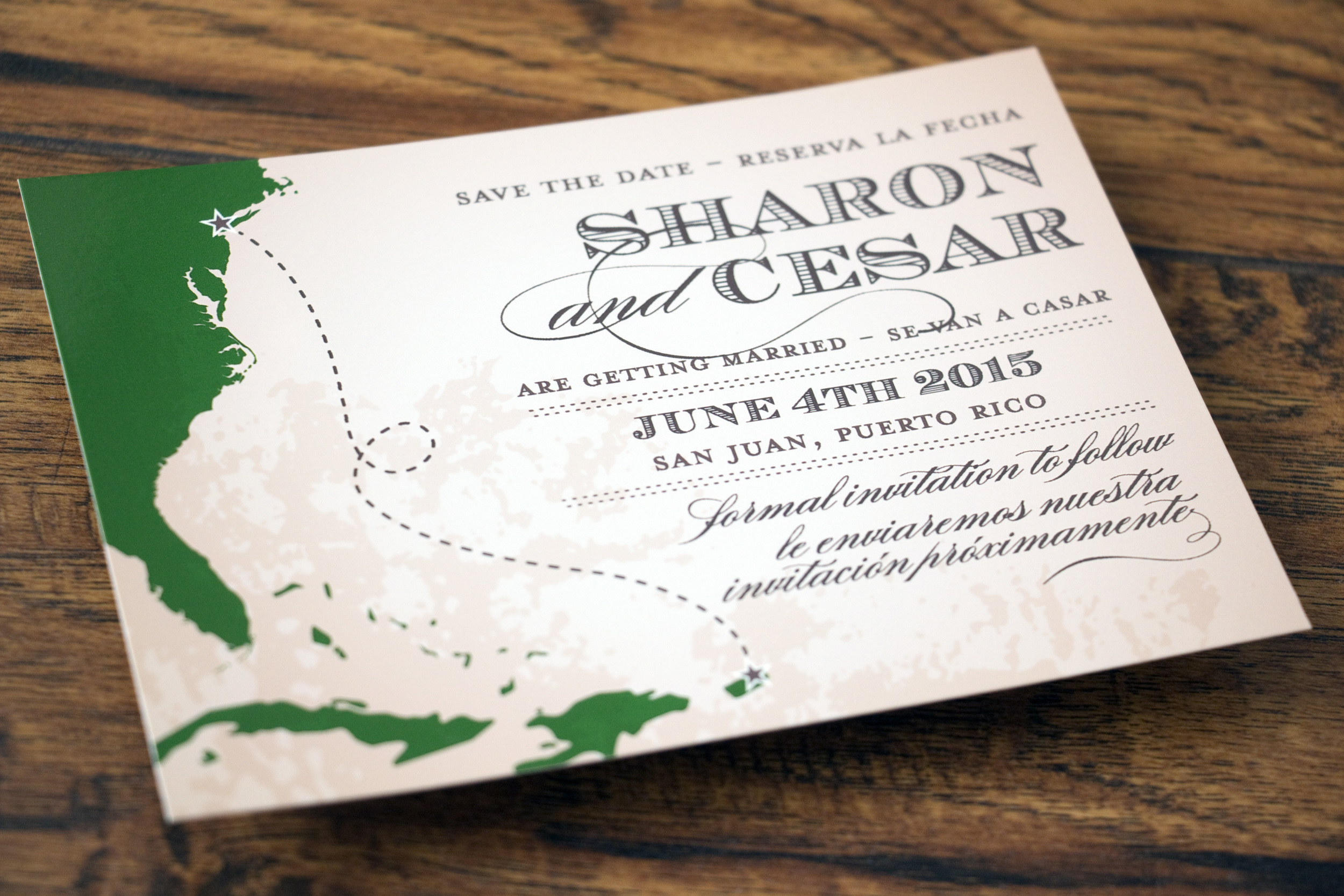
Sharon first contacted me to create a save-the-date for her and Cesar's destination wedding in San Juan, Puerto Rico. We brainstormed some really fun ideas and we came up with this vintage map style and included one of their engagement photos that was taken in New York's Central Park. We even managed to make it bilingual! I really love how it turned out.

When it was time to work on invitations, we discussed a variety of different options and styles. In the end, I created a couple of mixed media illustrations using watercolor and pen & ink to make something special for the couple.  

Their bilingual wedding invitations features a watercolor and pen & ink drawing of one of the many sentry boxes from Fort San Felipe de Morro in Old San Juan. 

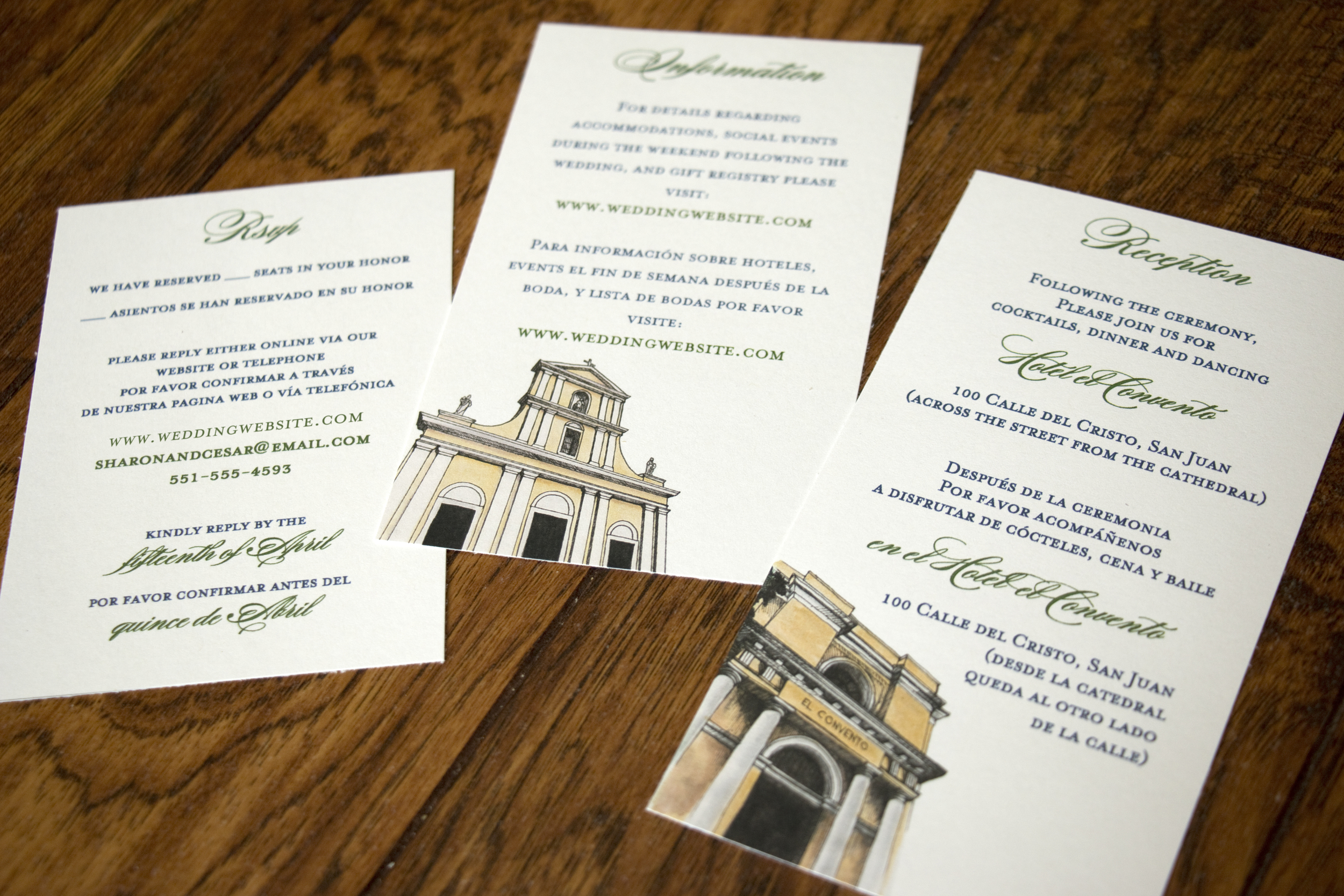
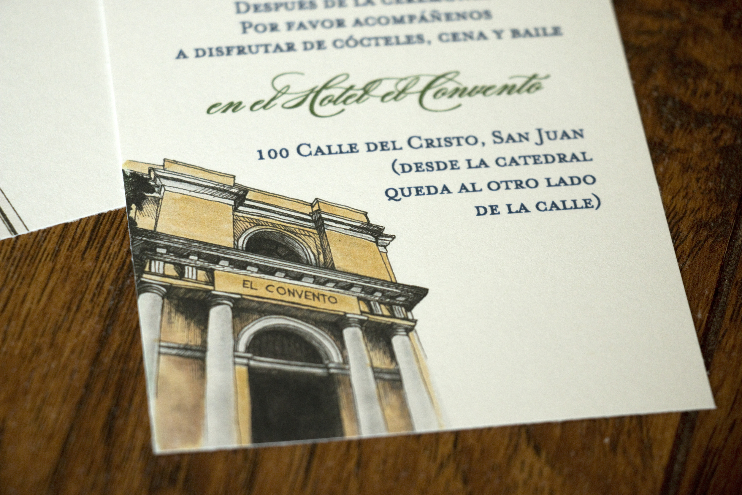
For the inserts, I created small illustrations of the two historic venues along with keeping the information bilingual.

La Catedral San Juan Bautista:

el Hotel el Convento

On the back of one insert I created a map of Viejo San Juan (Historic San Juan), where both the wedding and reception would take place. 

Another insert back displayed an engagement photo of Sharon and Cesar along with the monogram I created for them.

It was an honor to get to work with Sharon on the items for her and Cesar's wedding. Congratulations!!

Jackie's Bridal Shower

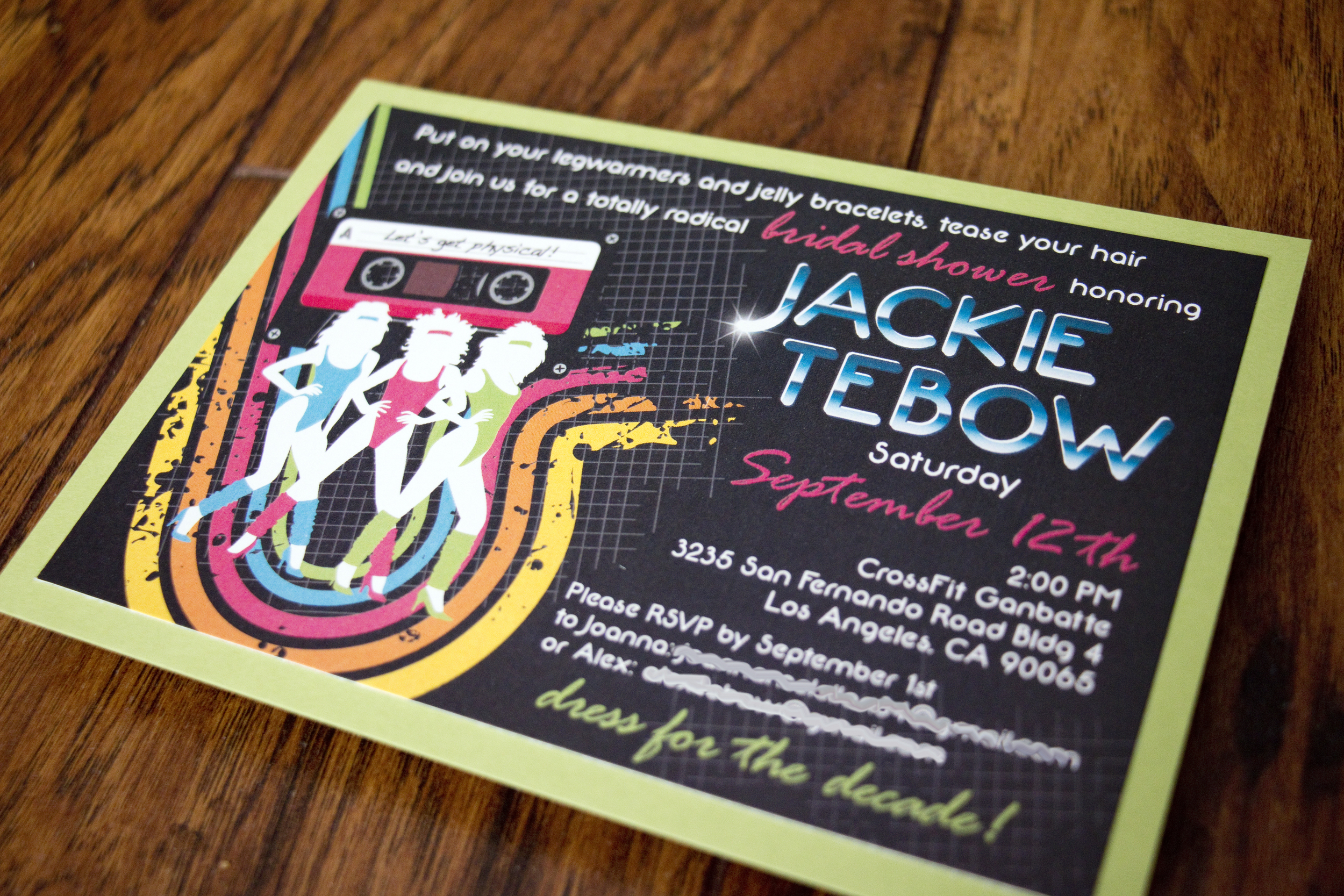
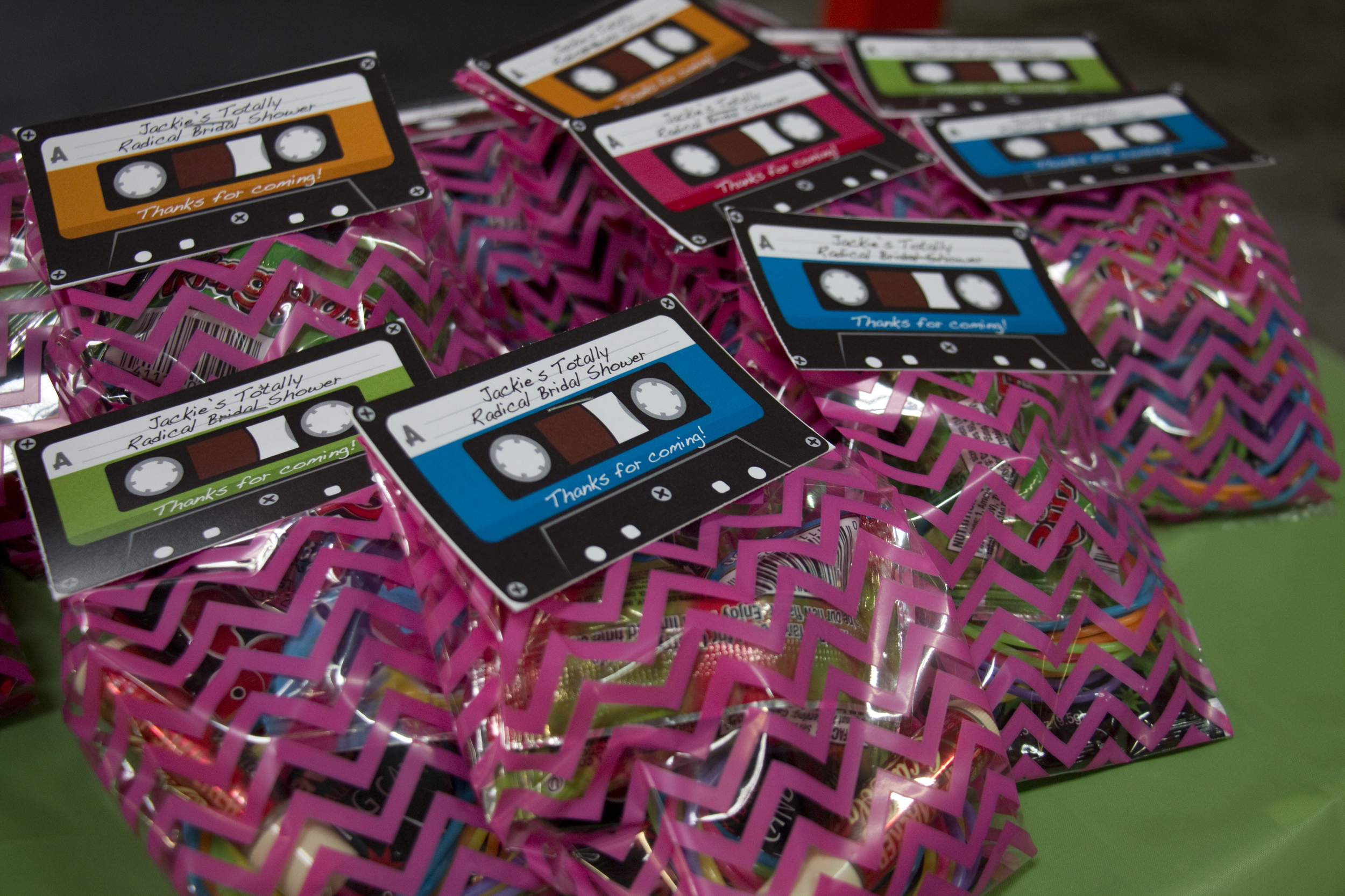
My sister Jackie got married last October, but before she walked down the aisle, her BFF Joanna and I planned a super fun 1980s-themed bridal shower for her.

When we got started, we were kind of at a loss for theme ideas. The venue was going to be the CrossFit gym where Jackie works, so that somewhat limited theme ideas. She had mentioned doing a "sporty spice" theme, but we really had no great ideas to go with it. 

Finally, Joanna and I ran across some inspiration on Pinterest for a 1980s theme, complete with big hair, leg warmers, Jazzercise, and lots of Spandex. We loved it! So we decided to change the theme and not tell Jackie about it. My sister is a planner and admittedly, a bit of a control freak. It was a struggle for her to not be involved at all in the planning of her shower. Joanna and I loved every minute!

I'm really proud of how the invitation turned out.

I printed them at my local Office Depot and mounted them onto Sour Apple card stock that I purchased from Cards & Pockets.

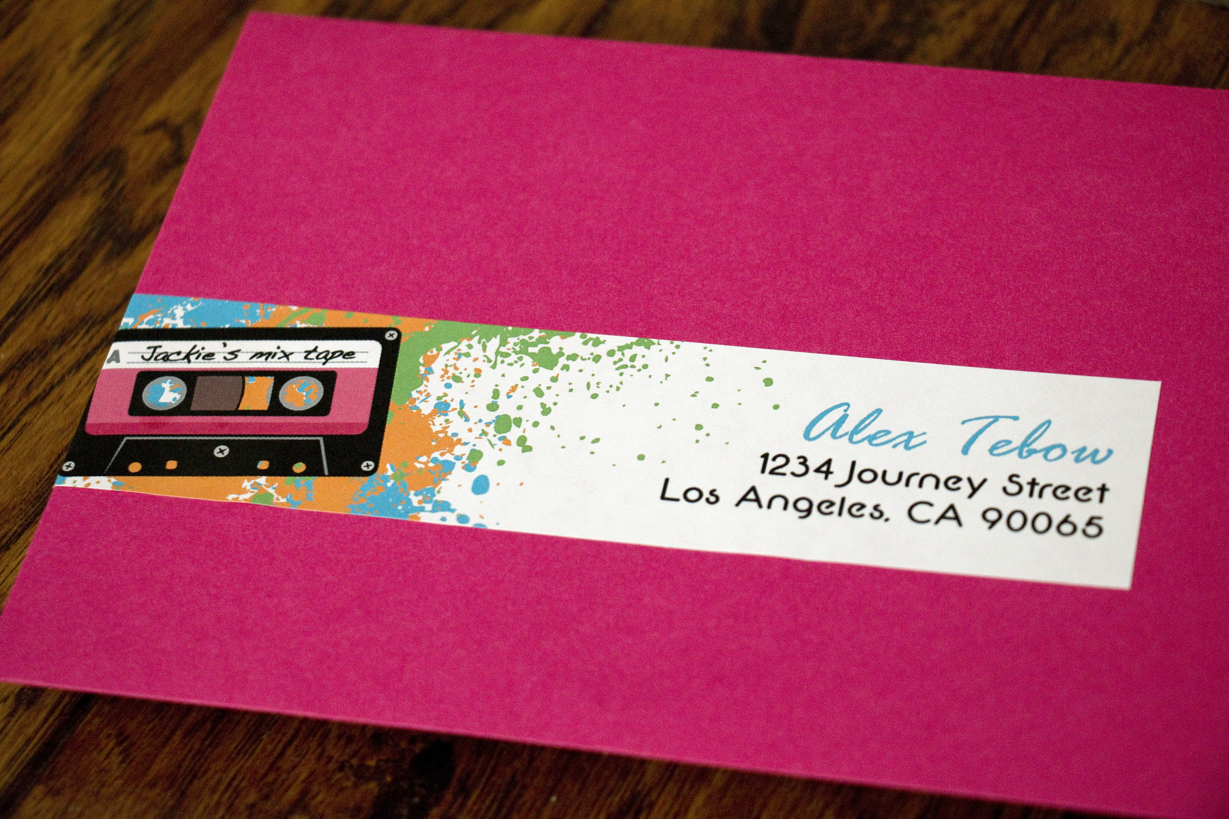
I created a wraparound address label that continued the theme and used Watermelon envelopes, also from Cards & Pockets. 

For favors, we filled cellophane bags with jelly bracelets, Pop Rocks and a Ring Pop and I created a tag that was folded and stapled to each bag.

I created a water bottle label too. Is the theme from Flashdance stuck in your head yet?

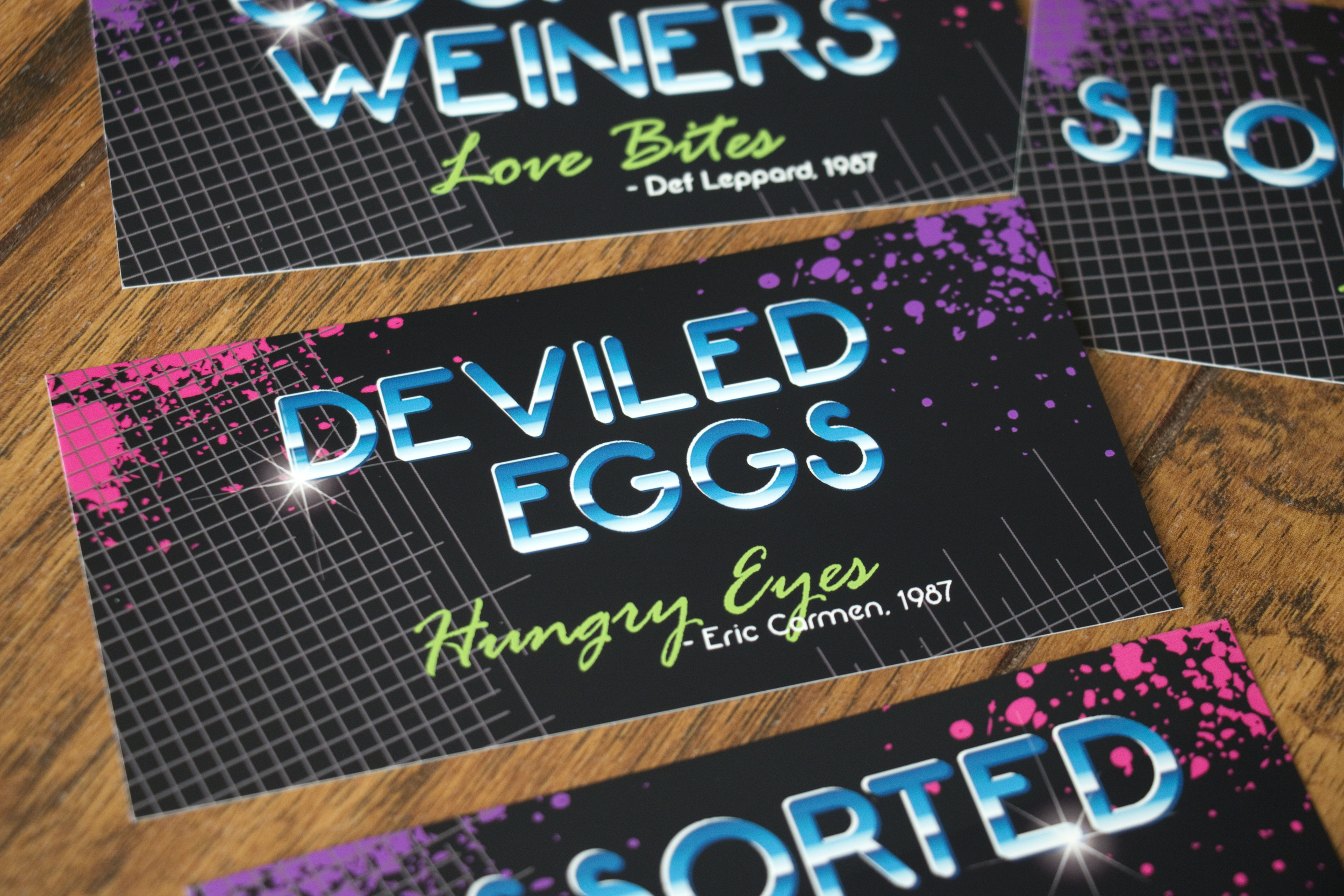
For refreshments we came up with foods that were popular in the 80s, so friends made Sloppy Joes, cocktail weiners, 7-layer dip, and deviled eggs. We also had Capri Suns and wine coolers. We tried to find the old school Bartles & Jaymes wine coolers, but the local BevMo didn't carry them.  

For the food labels, I tried to pair each item with a hit song from the 80s.

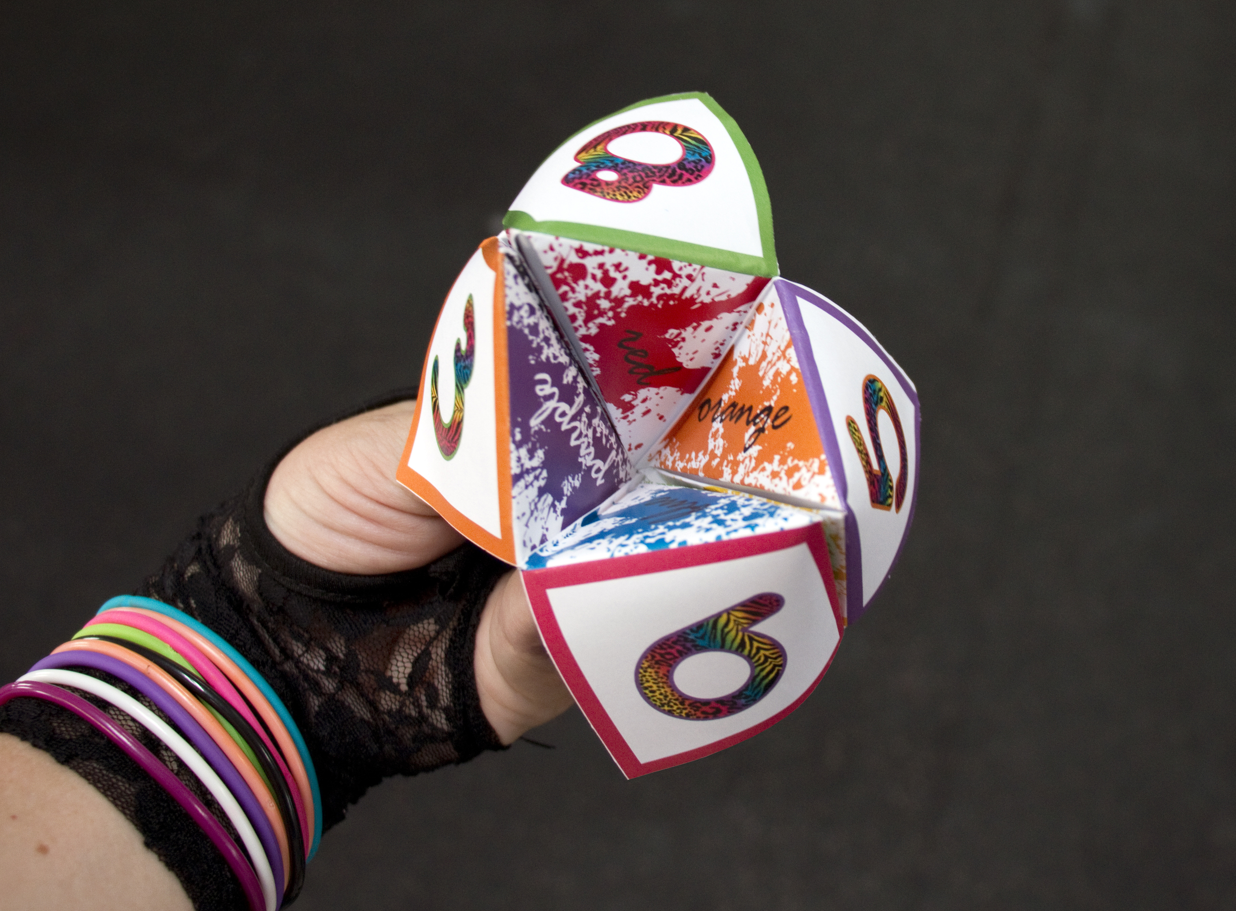
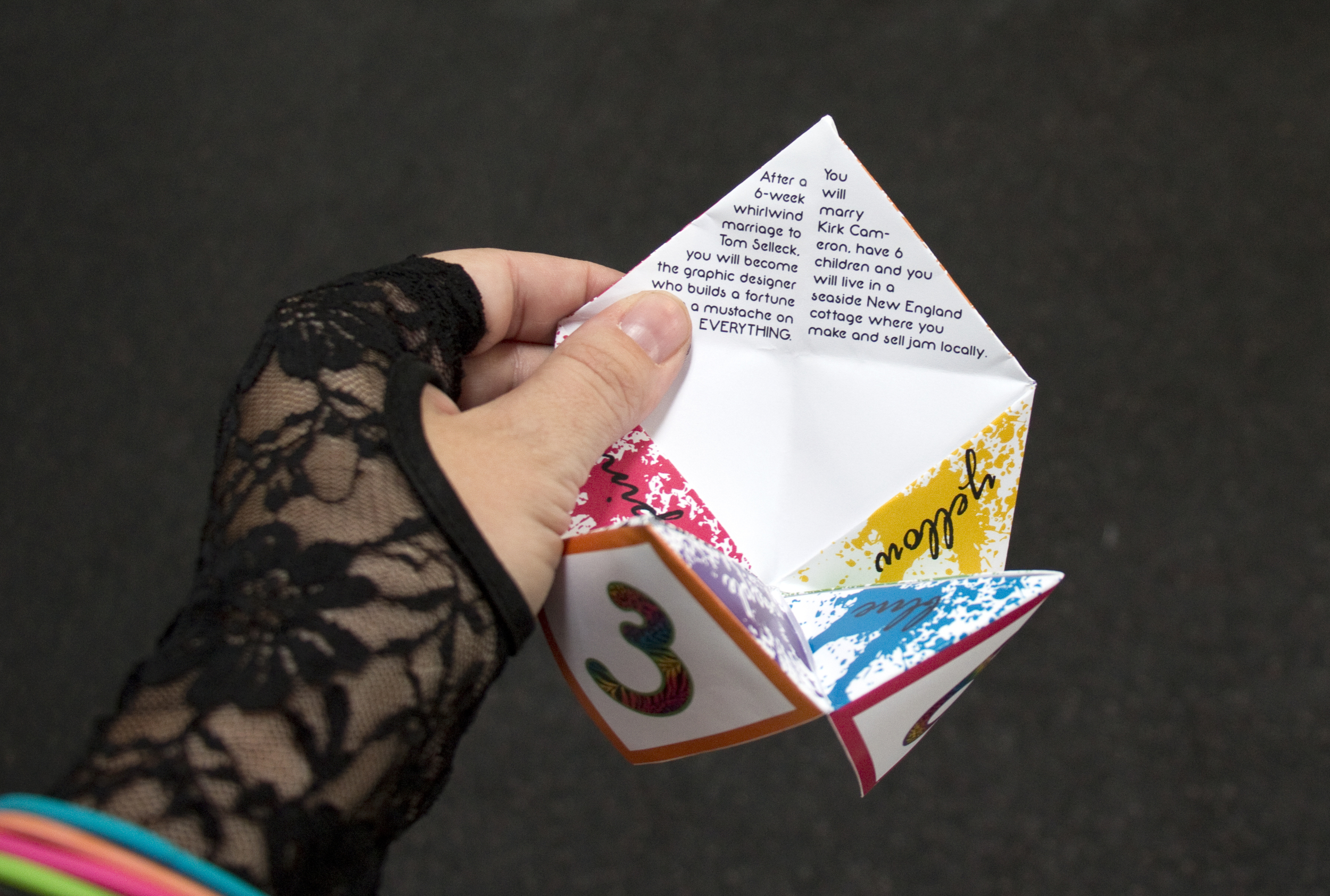
For a fun little extra, I created a cootie catcher that I had a blast creating. I was definitely chaneling Lisa Frank with the rainbow animal prints.

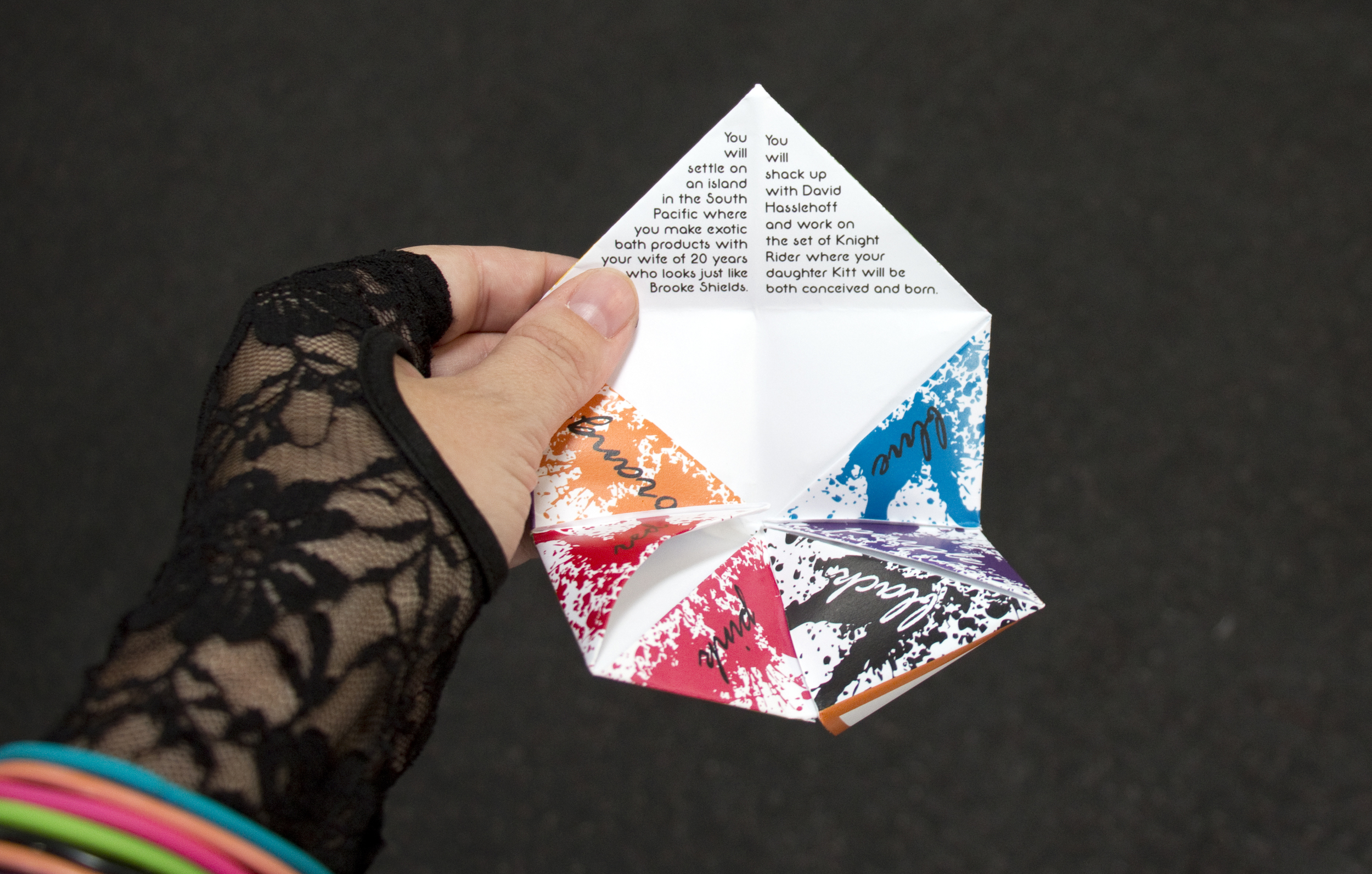
Just like the cootie catchers we created as kids, I created "fortunes" for the insides, describing your future, in full 1980s style.

These two futures say:

1. You will settle on an island in the South Pacific where you make exotic bath products with your wife of 20 years who looks just like Brooke Shields.

2. You will shack up with David Hasslehoff and work on the set of Knight Rider where your daughter Kitt will be both conceived and born.

These two fortunes say:

1. After a 6-week whirlwind marriage to Tom Selleck, you will become the graphic designer who builds a fortune putting a mustache on EVERYTHING. (This one is one of my favorites)

2. You will marry Kirk Cameron, have 6 children, and you will live in a seaside New England cottage where you make and sell jam locally.

I created six more futures that I'd be happy to share if you ask. ;-)

This shower was such a blast to create, I am going to try and create a version I can put in my Etsy shop! 

Amely & Ben

I had a blast working on a bunch of different items for Ben and Amely's September wedding. They got married at a lodge in Heber Valley in the mountains of Utah surrounded by close friends and family. 

Amely wanted to go big when it came to their invitations. She fell in love with these scroll invites and I was happy to create the graphics that were printed on each scroll. In case you're wondering, yes! They were really expensive to mail!

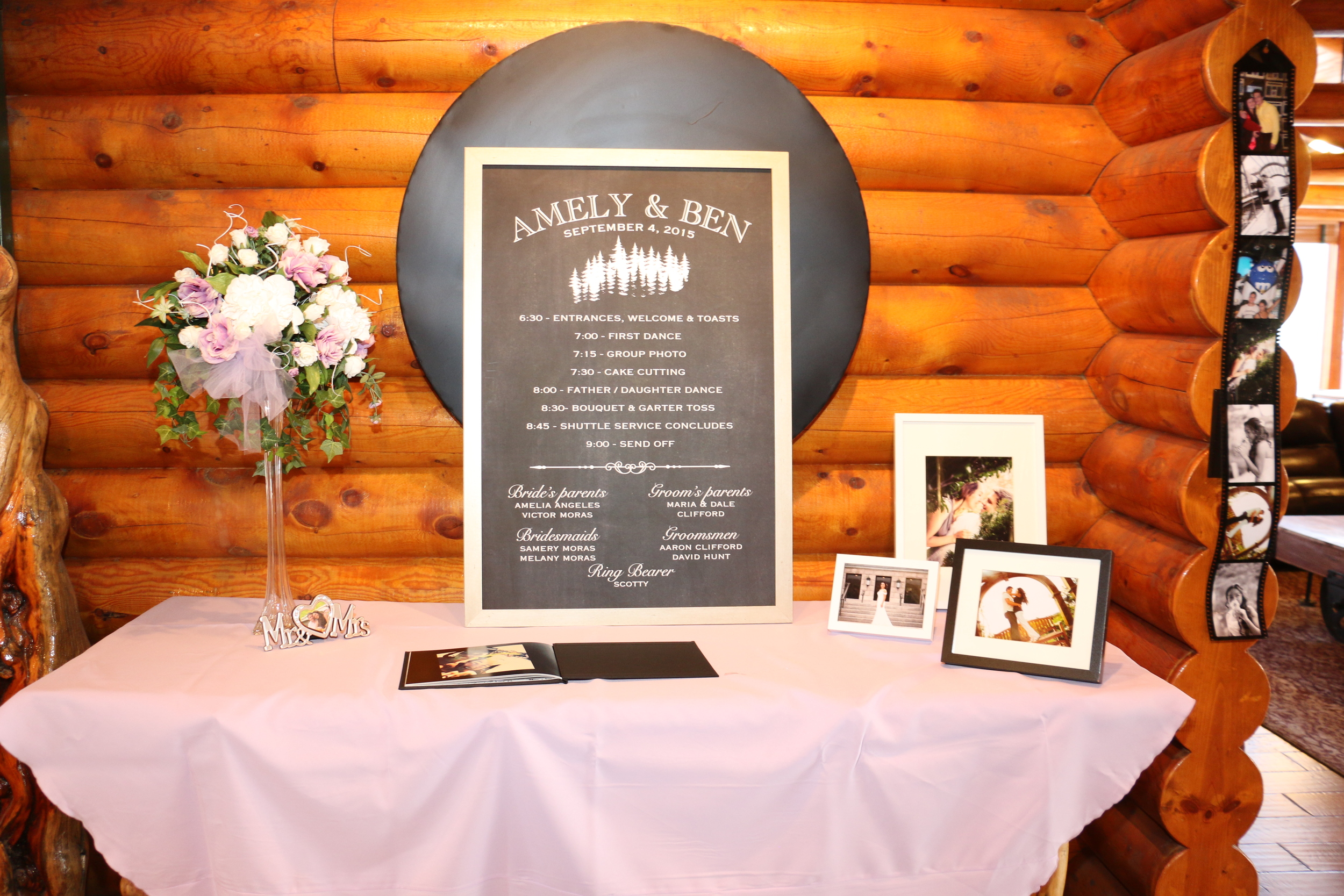
Rather than print a hundred program for guests, we opted to print one giant program that was framed and on display with their guestbook. I scaled this faux chalkboard to 24x36, had it printed at FedEx and we stuck it in a frame we picked up at Michael's. FedEx is my current favorite place to print big stuff since they usually print while I wait.

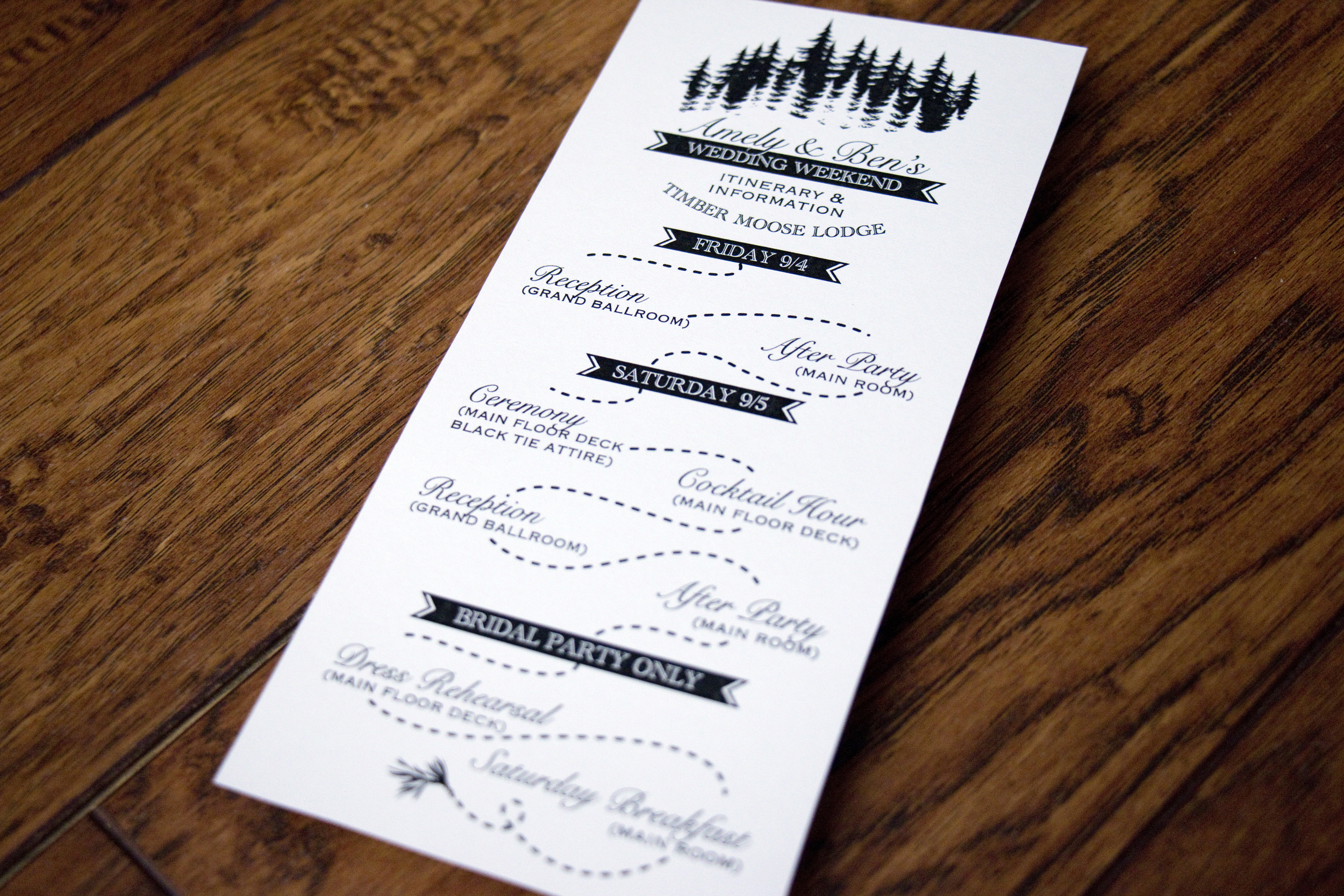
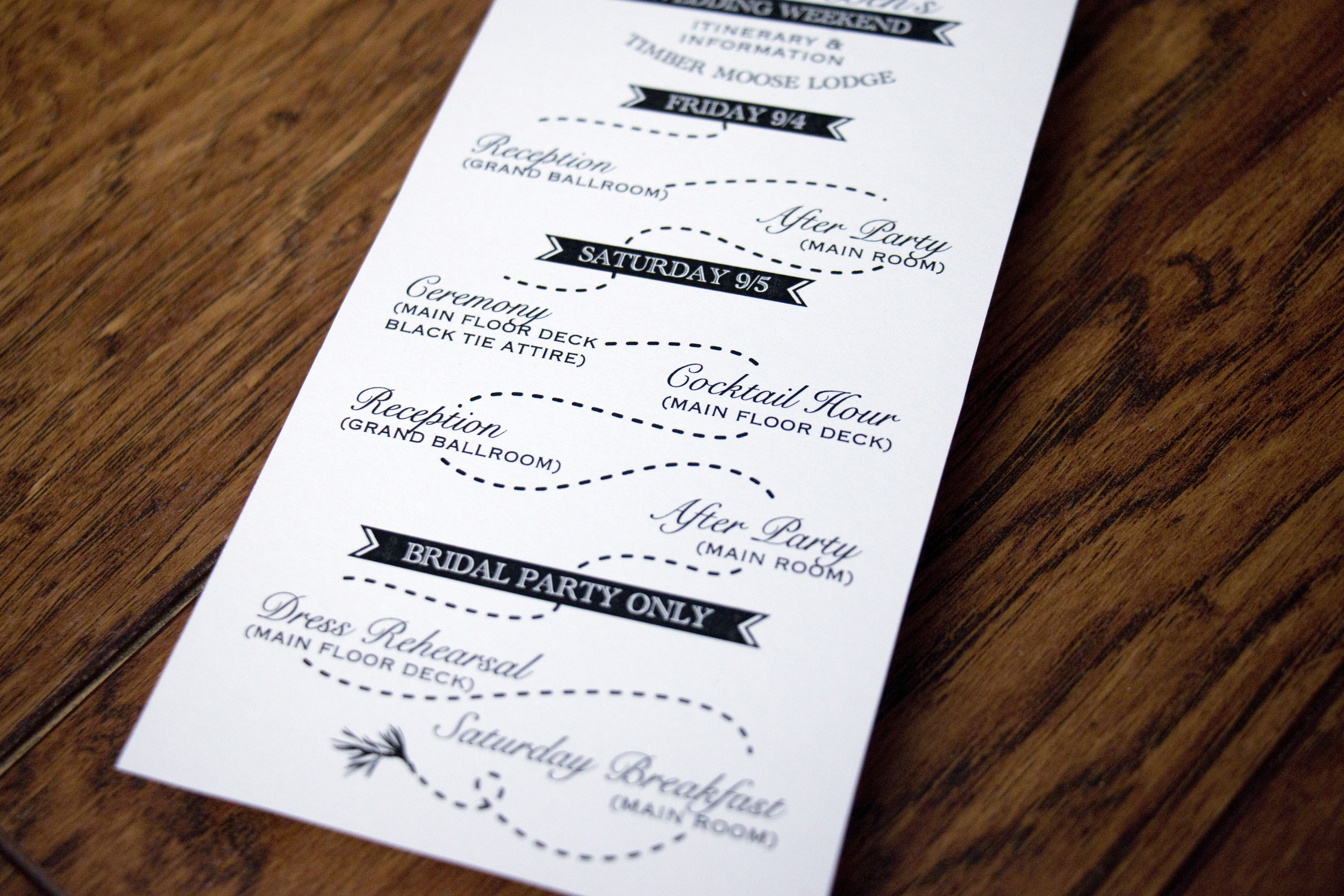
A number of guests were coming in from out of town and were actually staying at the lodge where the wedding took place. Amely and Ben put together welcome baskets for them and we included this itinerary to let them know the weekend's events.

The back (not pictured) included information about local events and attractions.

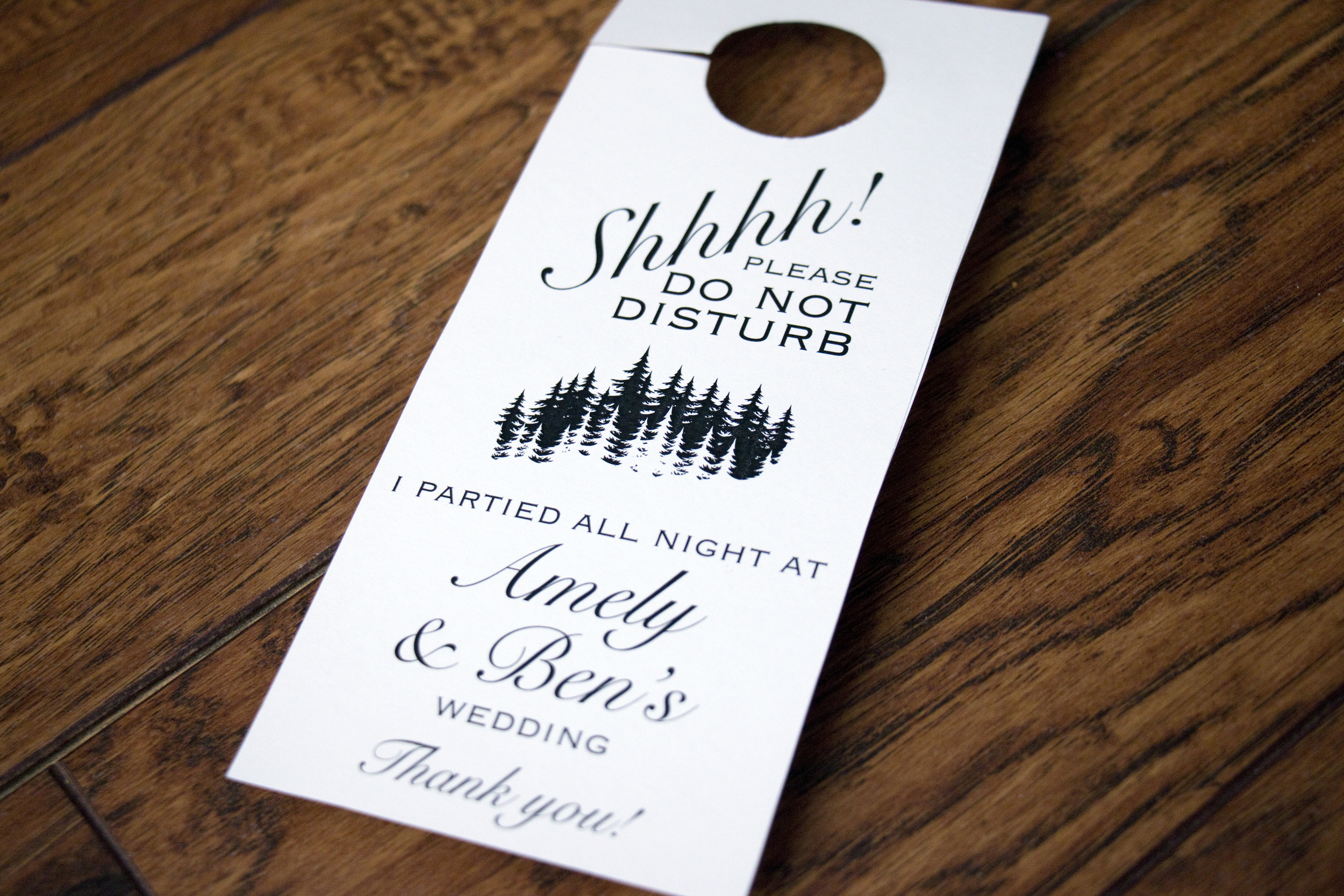
This fun door knob sign was also included in the welcome baskets.

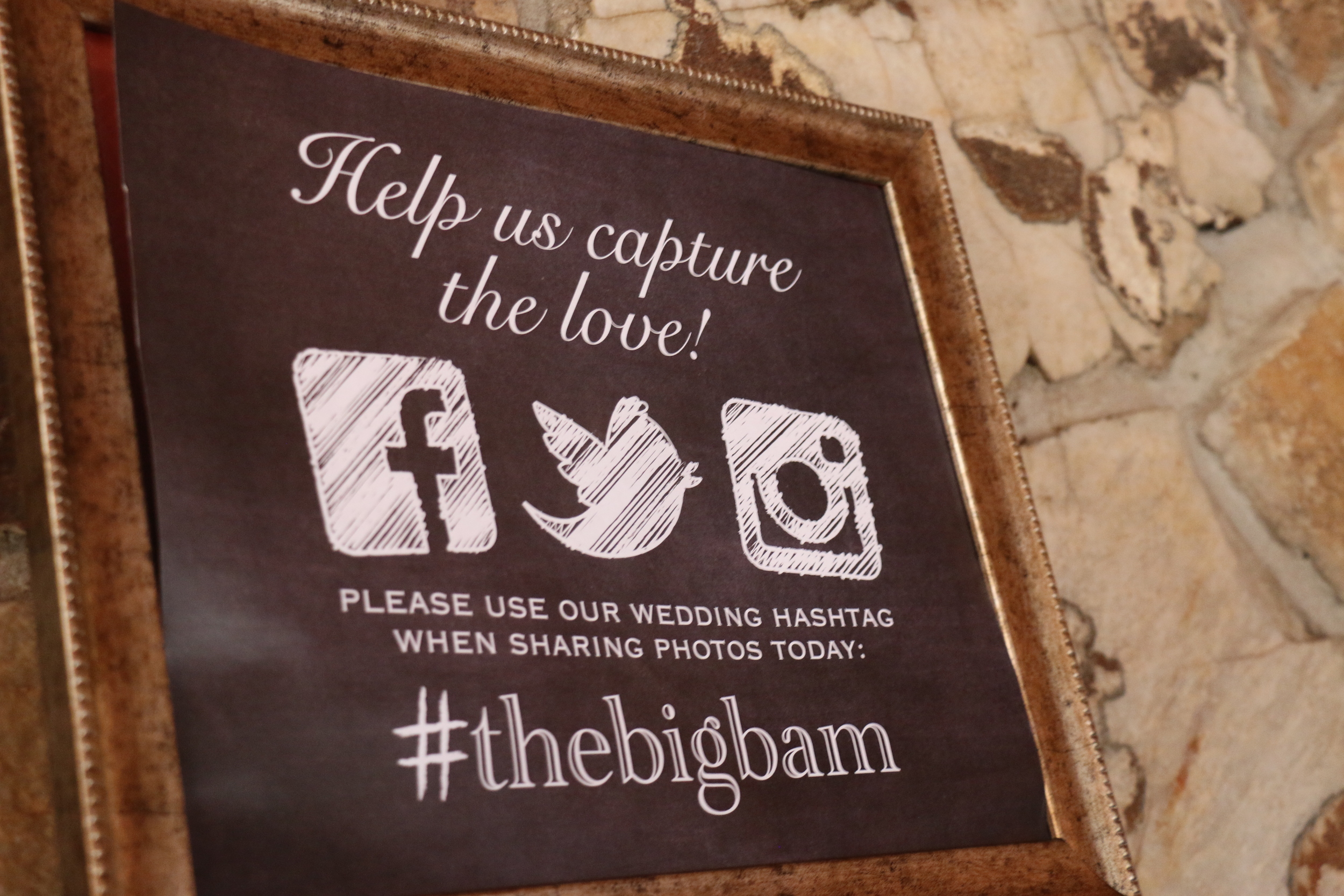
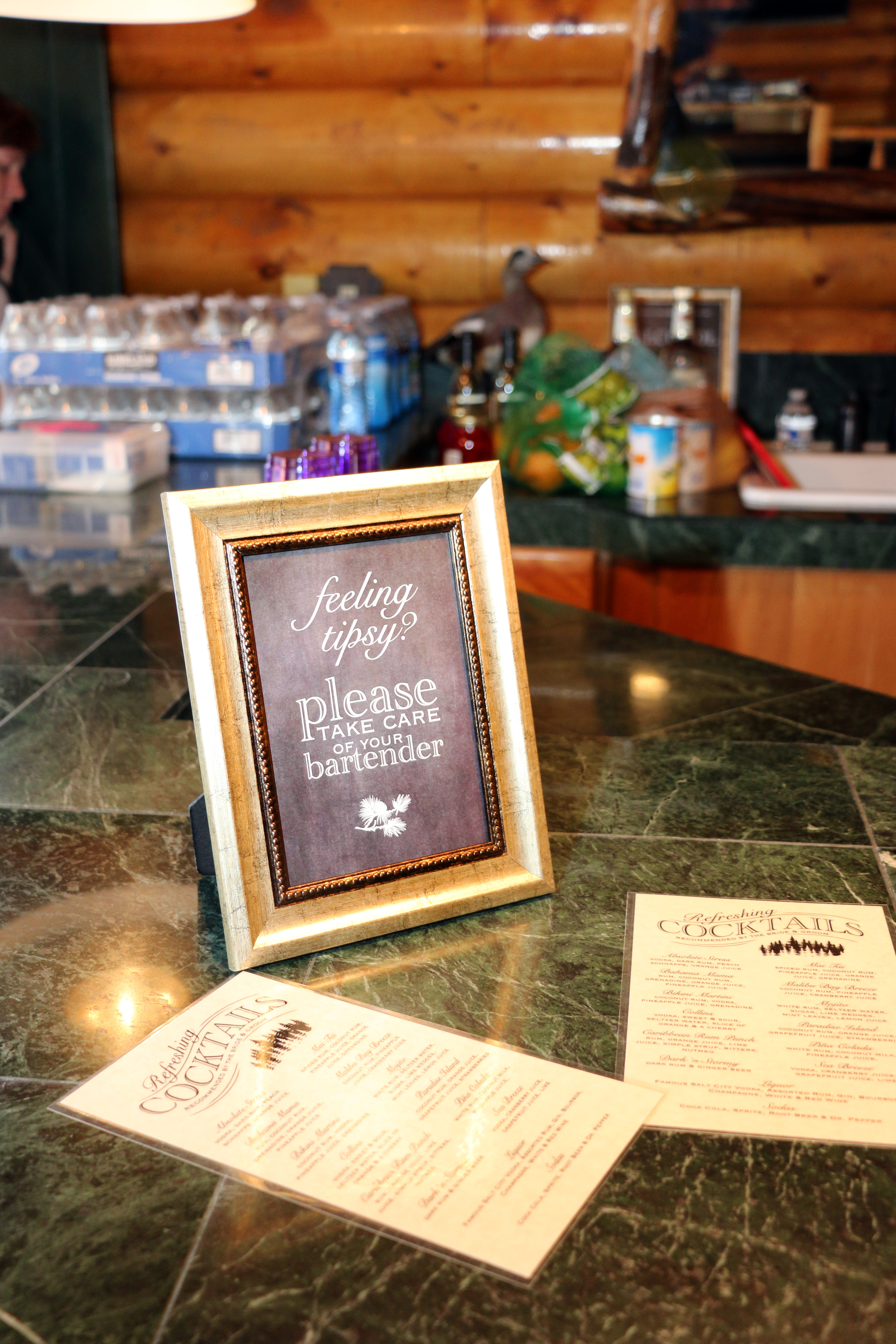
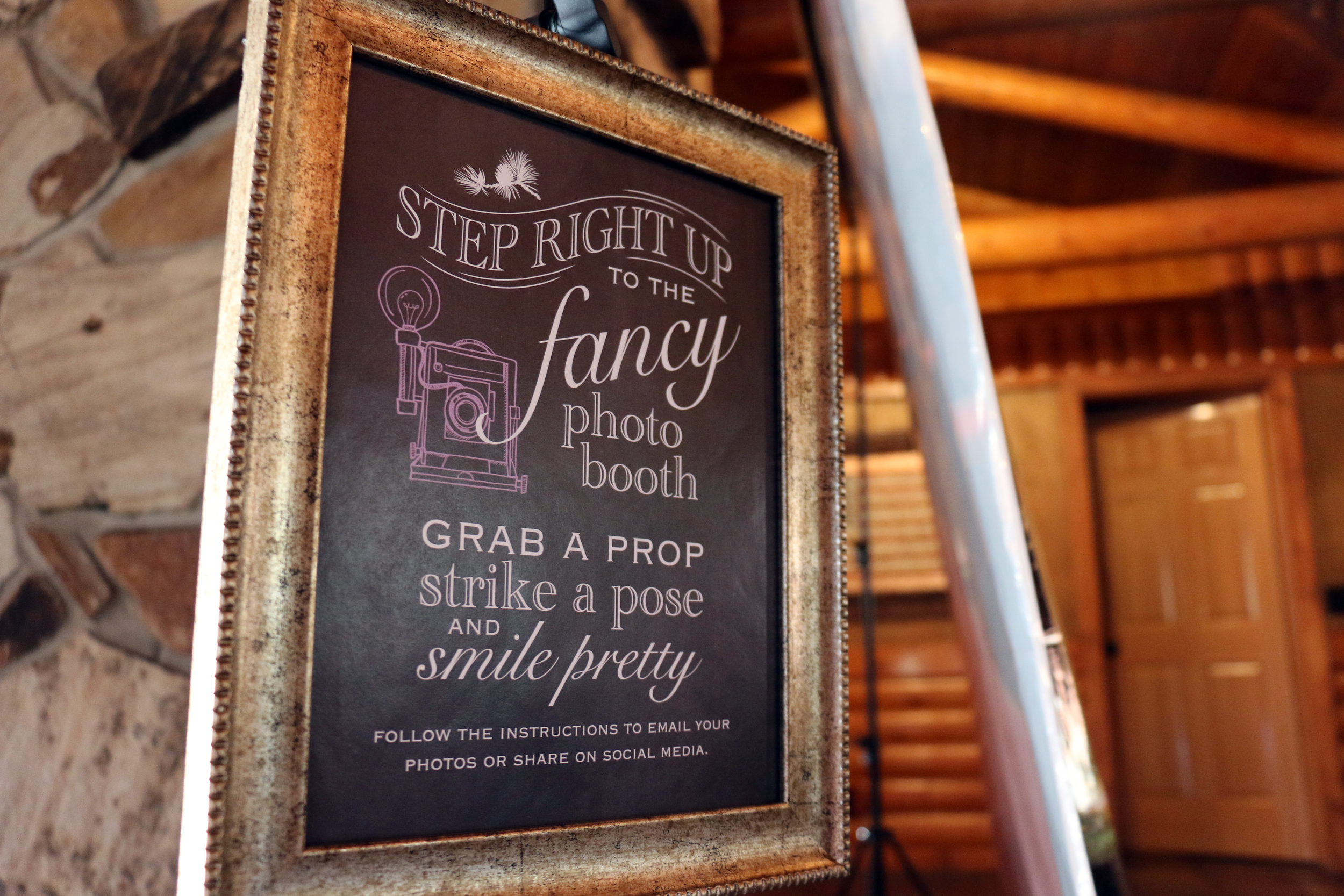
Lastly, these are some of the signs that I created and were displayed in different spots throughout the venue on the wedding day.

We printed a handful of the cocktails menus and had them laminated.

They set up a fun photo booth using an iPad on a tripod.

This last sign is my favorite!