pen & ink

Hike it Baby 30 Challenge - 2019

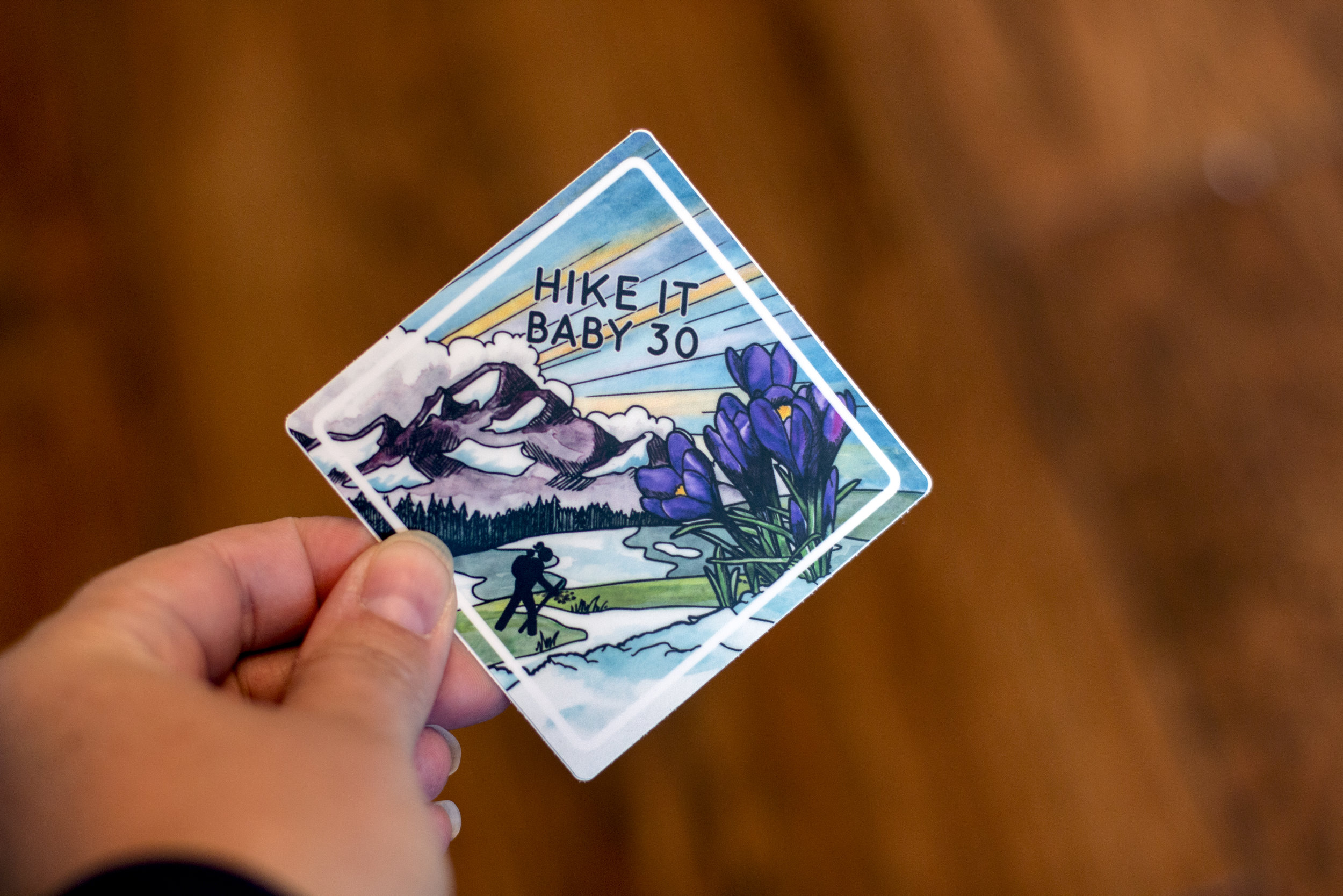
I had the pleasure of creating stickers to commemorate the two Hike it Baby 30 Challenges for 2019. In previous years, they used to have four challenges every year, but decided to cut it down to just two in April and September. You can see the stickers I created for 2018 here.

For 2019, we stuck with a similar watercolor and ink style and I made the April sticker quintessential to spring with blooming crocus, green grass, patches of melting snow, and the sky streaked for a sunrise.

IMG_9275.jpg

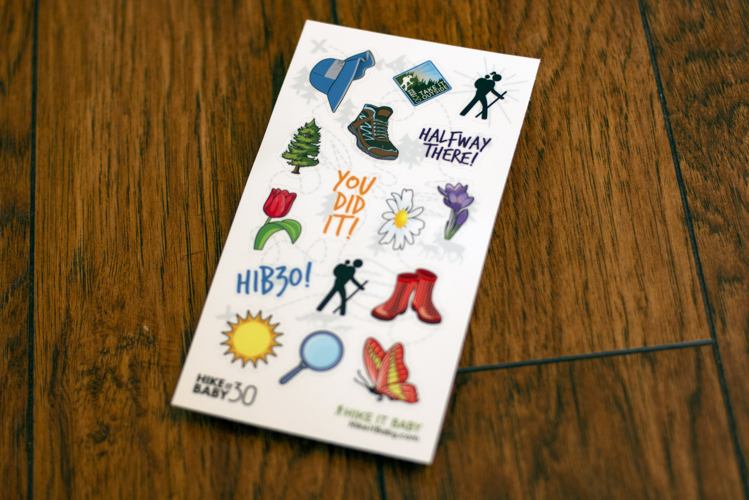
In an effort to get more folks out on trail with their kids, they created a secondary challenge called Take it Outside. Participants received a sticker that loosely coordinated with the HiB30 sticker along with two sheets of little stickers to use on a calendar page that they printed out. Each day on the calendar page gave ideas for a daily activity designed to motivate people to get outside every day. I love how these turned out and it was awesome to see folks using the calendar page and stickers throughout the challenge.

IMG_9273.jpg

Here’s the calendar page that I created for participants to download and print:

They received this sticker sheet in the mail shortly after signing up:

IMG_9278.jpg

You can see a mini version of the Take it Outside sticker too!

IMG_9279.jpg
IMG_9281.jpg

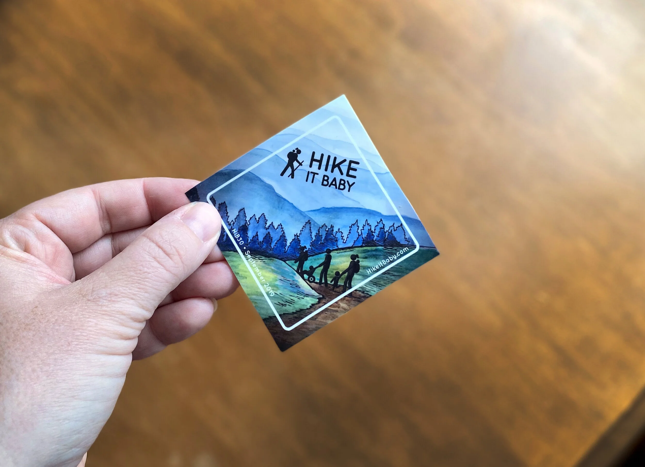
When the September challenge rolled around, I created a new sticker and we added a few more hikers to the artwork, wanting to give more of a community feel. The Smoky Mountains in Tennessee and North Carolina were the inspiration for this sticker.

Hike it Baby 30 Sticker, Alex Tebow Designs

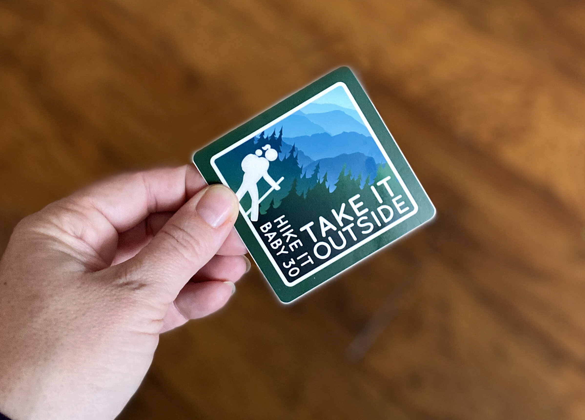
To go with the September sticker, they did another Take it Outside challenge for new members too, this was the coordinating sticker.
Hike it Baby Sticker Alex Tebow Designs

Sharon & Cesar

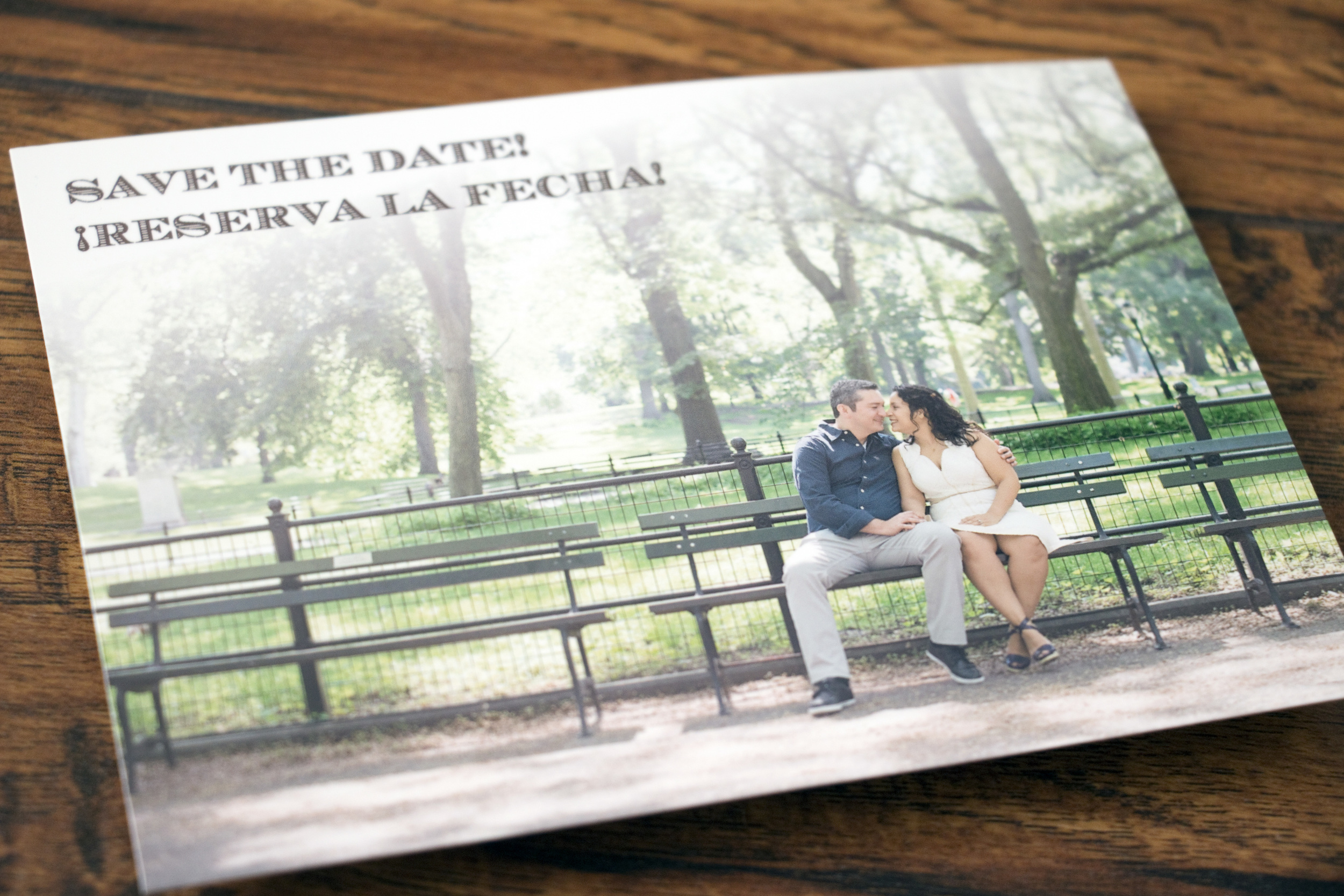
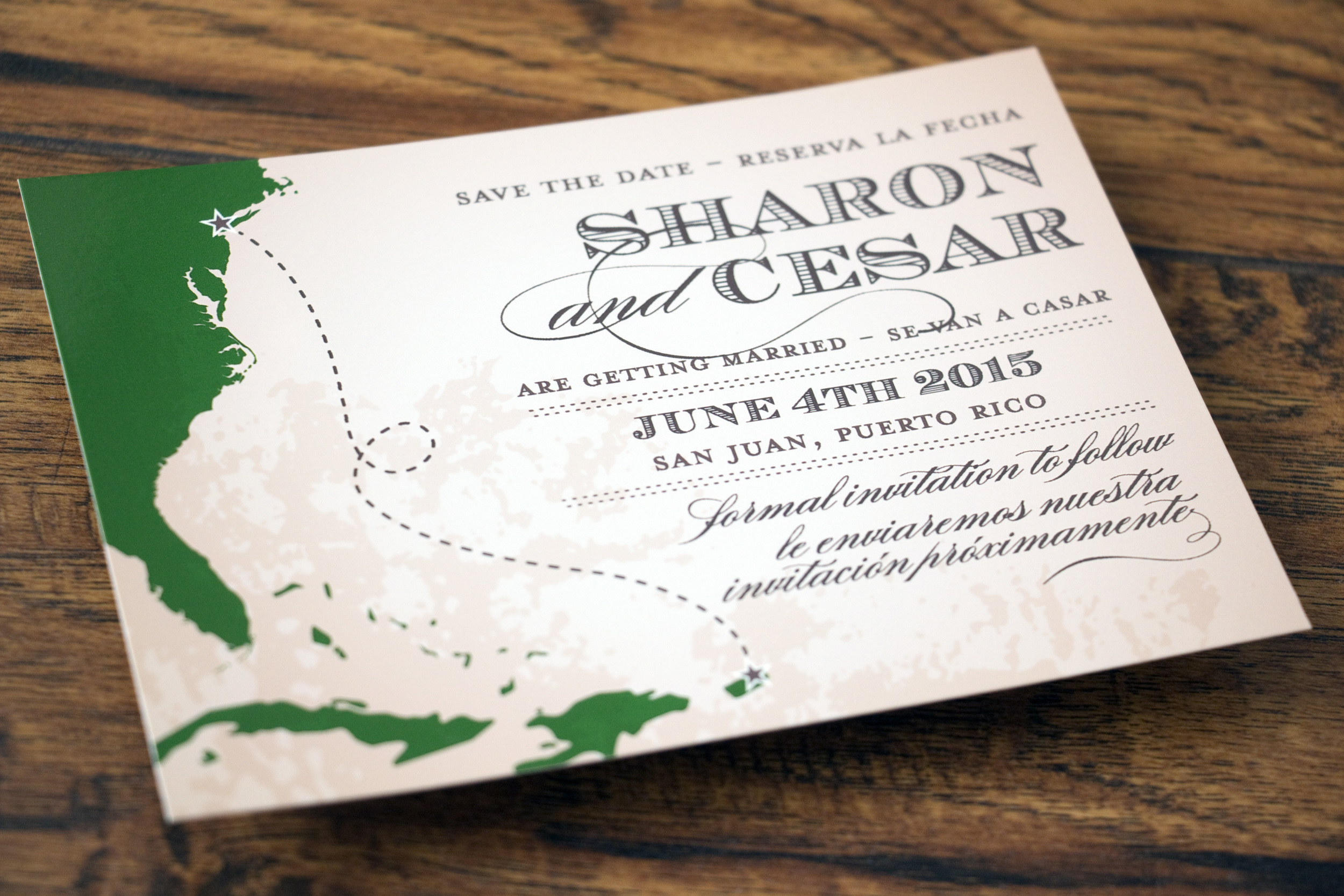
Sharon first contacted me to create a save-the-date for her and Cesar's destination wedding in San Juan, Puerto Rico. We brainstormed some really fun ideas and we came up with this vintage map style and included one of their engagement photos that was taken in New York's Central Park. We even managed to make it bilingual! I really love how it turned out.

When it was time to work on invitations, we discussed a variety of different options and styles. In the end, I created a couple of mixed media illustrations using watercolor and pen & ink to make something special for the couple.  

Their bilingual wedding invitations features a watercolor and pen & ink drawing of one of the many sentry boxes from Fort San Felipe de Morro in Old San Juan. 

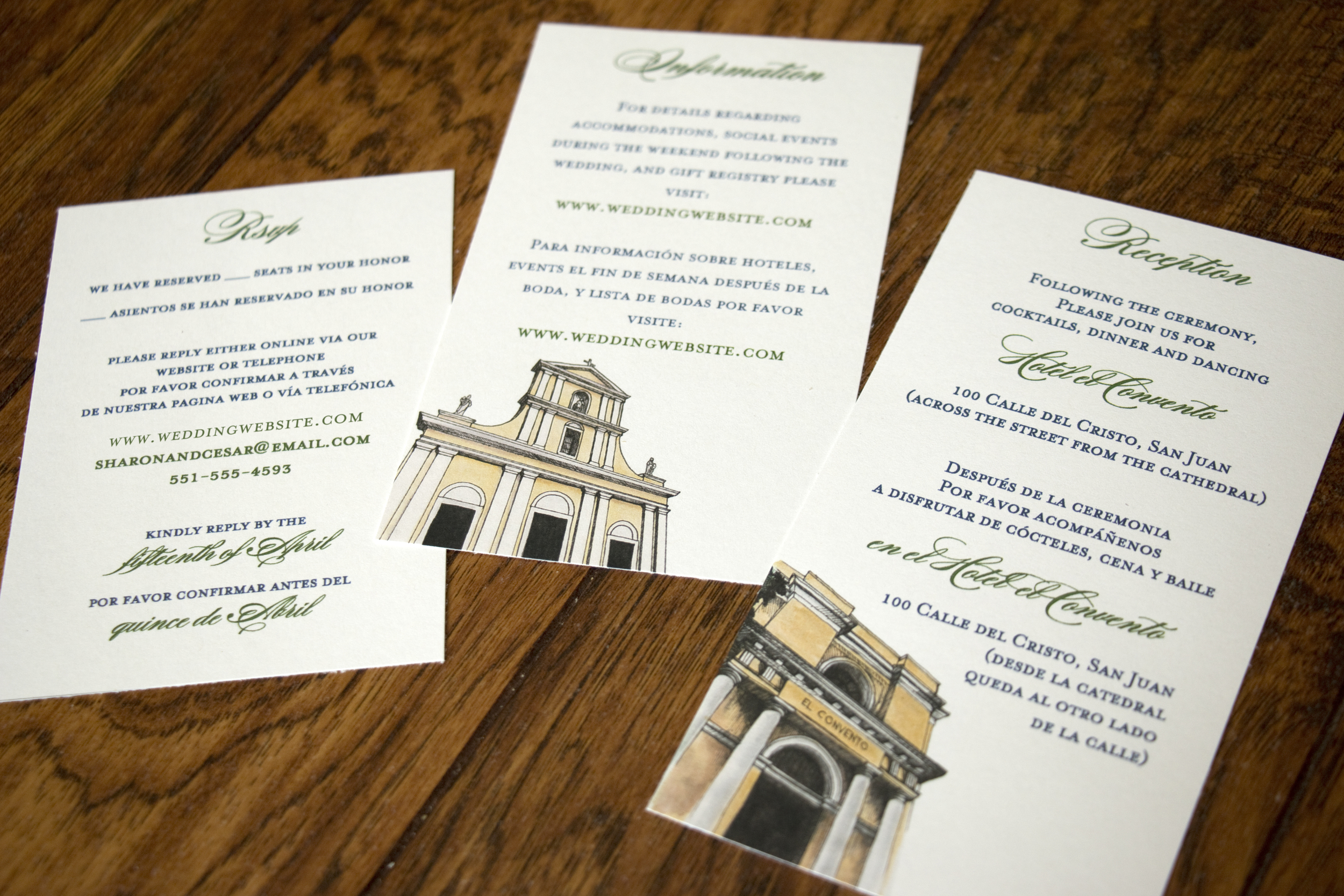
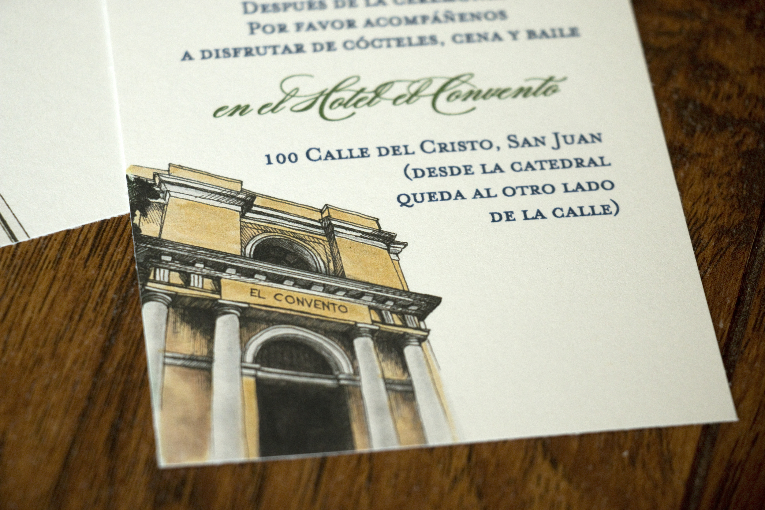
For the inserts, I created small illustrations of the two historic venues along with keeping the information bilingual.

La Catedral San Juan Bautista:

el Hotel el Convento

On the back of one insert I created a map of Viejo San Juan (Historic San Juan), where both the wedding and reception would take place. 

Another insert back displayed an engagement photo of Sharon and Cesar along with the monogram I created for them.

It was an honor to get to work with Sharon on the items for her and Cesar's wedding. Congratulations!!

Twin Castle Cellars Wine Label

I created this wine label for a very small vintner in the Livermore Valley in California. She wanted to use an illustration of a pair of castles that are close to where she grew up in the label. She grew up near Manderschied, Germany and used to play in these castles when she was a little girl.

Here's what I came up with: 

I created the image using watercolor along with pen and ink. Then I scanned the illustration and added the text in Photoshop. 

I really love how it turned out, and when it's printed on a textured, adhesive paper, it looks like an original watercolor.